В дизайне StackOverflow используются праздничные модальные окна, поэтому команда SO разработала удобный способ отображения конфетти.
Первым решением был простой статический SVG с конфетти на заднем плане. Позже команда обнаружила 12 разных статических конфетти по всему коду и поняла, что нужен другой подход. Подробностями решения делимся под катом, пока начинается наш курс по Frontend-разработке.
Первое решение
Вот так выглядело первое решение:

Всего несколько месяцев спустя мы обнаружили, что этот же подход используется в продукте 12 раз, каждая итерация отличается от других. Появились другие варианты, например
confetti-bold.svg.
Поиск подхода
Как известно многим пользователям Stack Overflow, лучший способ начать работу — это опереться на хороший пример. К счастью, в интернете можно найти множество примеров конфетти.
Кто-то визуализируют его на JavaScript, а кто-то решает проблему при помощи gif. Иногда для конфетти используются целые сцены WebGL, написанные на Three.JS
Нам же нужно было нечто предельно портативное, максимально близкое простым HTML и CSS. Не хотелось вводить зависимости или инициализировать JS каждый раз, когда нужно показать конфетти.
В поиске решения распространённых проблем я часто начинаю с Codepen. И этот поиск привёл меня к Энди О'Браена.
Его подход прост и элегантен, анимация зацикливается! Используется Sass-генерируемый CSS для анимации отдельных элементов DOM. И конфетти похоже на последнюю итерацию от нашего дизайнера Вивиан Чжан.
Чтобы разобраться, я форкнул Codepen, настроил цвета и начал возиться с переменными времени. А разобравшись, я доработал цвета и разместил элемент конфетти в одном из наших модальных окон.
Надо сказать, что у этого подхода есть некоторые проблемы. В наших контекстах мы не имеем компонентного подхода в необходимом масштабе. Иными словами, инженерам приходится копировать и вставлять десяток div'ов с конфетти и заботиться о том, чтобы управлять z-index и событиями указателя.
И работает это через абсолютное позиционирование и flexbox для распределения кусочков конфетти по всей площади, то есть, если вы захотите использовать его на широком контейнере, он будет растягиваться, а не выкладываться плиткой. Но эстетика нам очень понравилась.
Готов поспорить, что вместо представления в виде элементов DOM мы могли бы поместить всё это в SVG и представить как фоновое изображение, это дало бы нам гораздо больший контроль над позиционированием, размером и повторением элементов.
Организация SVG
А что насчёт SVG в качестве фонового изображения? Давайте попробуем. Здесь придётся создать SVG-элемент для размещения кусочков конфетти — и это вопрос распределения прямоугольников на холсте, а ещё выбора размеров, которые нам нравятся.
Заменим DOM из предыдущих Codepen, чтобы код был переносимым. Чтобы работать быстро, я воспользовался Figma, но всё это можно написать и от руки:

<svg width="600" height="90" viewBox="0 0 600 90" fill="none" xmlns="http://www.w3.org/2000/svg">
    <rect x="42" y="0" width="6" height="10"/>
    <rect x="84" y="0" width="6" height="10"/>
    <rect x="126" y="0" width="5" height="13"/>
    <rect x="168" y="0" width="5" height="13"/>
    <rect x="210" y="0" width="6" height="10"/>
    <rect x="252" y="0" width="5" height="13"/>
    <rect x="294" y="0" width="6" height="10"/>
    <rect x="336" y="0" width="5" height="13"/>
    <rect x="378" y="0" width="5" height="13"/>
    <rect x="420" y="0" width="6" height="10"/>
    <rect x="462" y="0" width="6" height="10"/>
    <rect x="504" y="0" width="5" height="13"/>
    <rect x="546" y="0" width="6" height="10"/>
</svg>
Теперь у меня есть элемент SVG, и я могу встроить в него CSS. Подход Энди заключался в том, чтобы раскрасить, повернуть и расположить различные элементы конфетти с помощью селектора CSS
nth-child. Мой SVG вначале был структурирован так:<svg>
<style type="text/css">...</style>
<rect />
</svg>
И теперь все селекторы CSS
nth-child смещены на один, потому что CSS считает элемент стиля дочерним. Думаю, мы перенесём этот элемент в самый низ.Кроме того, функции Sass не будут работать в SVG, поэтому придётся компилировать код в CSS и вставлять его в SVG. Codepen может выполнить компиляцию, а я скопирую и вставлю результат.
<svg width="600" height="90" viewBox="0 0 600 90" fill="none" xmlns="http://www.w3.org/2000/svg">
    <rect x="42" y="0" width="6" height="10"/>
    <rect x="84" y="0" width="6" height="10"/>
    <rect x="126" y="0" width="5" height="13"/>
    <rect x="168" y="0" width="5" height="13"/>
    <rect x="210" y="0" width="6" height="10"/>
    <rect x="252" y="0" width="5" height="13"/>
    <rect x="294" y="0" width="6" height="10"/>
    <rect x="336" y="0" width="5" height="13"/>
    <rect x="378" y="0" width="5" height="13"/>
    <rect x="420" y="0" width="6" height="10"/>
    <rect x="462" y="0" width="6" height="10"/>
    <rect x="504" y="0" width="5" height="13"/>
    <rect x="546" y="0" width="6" height="10"/>

    <style type="text/css">
        rect {
            opacity: 0;
        }
        rect:nth-child(1) {
            transform: rotate(-145deg);
            animation: blast 700ms infinite ease-out;
            animation-delay: 88ms;
            animation-duration: 631ms;
        }
        rect:nth-child(2) {
            transform: rotate(164deg);
            animation: blast 700ms infinite ease-out;
            animation-delay: 131ms;
            animation-duration: 442ms;
        }
        rect:nth-child(3) {
            transform: rotate(4deg);
            animation: blast 700ms infinite ease-out;
            animation-delay: 92ms;
            animation-duration: 662ms;
        }
        rect:nth-child(4) {
            transform: rotate(-175deg);
            animation: blast 700ms infinite ease-out;
            animation-delay: 17ms;
            animation-duration: 593ms;
        }
        rect:nth-child(5) {
            transform: rotate(-97deg);
            animation: blast 700ms infinite ease-out;
            animation-delay: 122ms;
            animation-duration: 476ms;
        }
        rect:nth-child(6) {
            transform: rotate(57deg);
            animation: blast 700ms infinite ease-out;
            animation-delay: 271ms;
            animation-duration: 381ms;
        }
        rect:nth-child(7) {
            transform: rotate(-46deg);
            animation: blast 700ms infinite ease-out;
            animation-delay: 131ms;
            animation-duration: 619ms;
        }
        rect:nth-child(8) {
            transform: rotate(-65deg);
            animation: blast 700ms infinite ease-out;
            animation-delay: 85ms;
            animation-duration: 668ms;
        }
        rect:nth-child(9) {
            transform: rotate(13deg);
            animation: blast 700ms infinite ease-out;
            animation-delay: 128ms;
            animation-duration: 377ms;
        }
        rect:nth-child(10) {
            transform: rotate(176deg);
            animation: blast 700ms infinite ease-out;
            animation-delay: 311ms;
            animation-duration: 508ms;
        }
        rect:nth-child(11) {
            transform: rotate(108deg);
            animation: blast 700ms infinite ease-out;
            animation-delay: 108ms;
            animation-duration: 595ms;
        }
        rect:nth-child(12) {
            transform: rotate(62deg);
            animation: blast 700ms infinite ease-out;
            animation-delay: 105ms;
            animation-duration: 375ms;
        }
        rect:nth-child(13) {
            transform: rotate(16deg);
            animation: blast 700ms infinite ease-out;
            animation-delay: 149ms;
            animation-duration: 491ms;
        }
        rect:nth-child(odd) {
            fill: #65BB5C;
        }
        rect:nth-child(even) {
            z-index: 1;
            fill: #33AAFF;
        }
        rect:nth-child(4n) {
            animation-duration: 1400ms;
            fill: #F23B14;
        }
        rect:nth-child(3n) {
            animation-duration: 1750ms;
            animation-delay: 700ms;
        }
        rect:nth-child(4n-7) {
            fill: #2A2F6A;
        }
        rect:nth-child(6n) {
            fill: #FBBA23;
        }

        @keyframes blast {
            from {
                opacity: 0;
            }
            20% {
                opacity: 1;
            }
            to {
                transform: translateY(90px);
            }
        }
    </style>
</svg>
Сохраните код как SVG и откройте в браузере. Вы увидите анимированное конфетти. Но есть проблема с расположением кусочков. В SVG преобразования начинаются из другой точки: начало координат расположено в левом верхнем углу. Эту проблему я решил, измерив расстояния в Figma и захардкодив некоторые исходные данные, например
transform-origin: 45px 5px. Не идеально, но достаточно близко к центру:<svg width="600" height="90" viewBox="0 0 600 90" fill="none" xmlns="http://www.w3.org/2000/svg">
<rect x="42" y="0" width="6" height="10"/>
<rect x="84" y="0" width="6" height="10"/>
<rect x="126" y="0" width="5" height="13"/>
<rect x="168" y="0" width="5" height="13"/>
<rect x="210" y="0" width="6" height="10"/>
<rect x="252" y="0" width="5" height="13"/>
<rect x="294" y="0" width="6" height="10"/>
<rect x="336" y="0" width="5" height="13"/>
<rect x="378" y="0" width="5" height="13"/>
<rect x="420" y="0" width="6" height="10"/>
<rect x="462" y="0" width="6" height="10"/>
<rect x="504" y="0" width="5" height="13"/>
<rect x="546" y="0" width="6" height="10"/>
<style type="text/css">
rect {
opacity: 0;
}
rect:nth-child(1) {
transform-origin: 45px 5px;
transform: rotate(-145deg);
animation: blast 700ms infinite ease-out;
animation-delay: 88ms;
animation-duration: 631ms;
}
rect:nth-child(2) {
transform-origin: 87px 5px;
transform: rotate(164deg);
animation: blast 700ms infinite ease-out;
animation-delay: 131ms;
animation-duration: 442ms;
}
rect:nth-child(3) {
transform-origin: 128px 6px;
transform: rotate(4deg);
animation: blast 700ms infinite ease-out;
animation-delay: 92ms;
animation-duration: 662ms;
}
rect:nth-child(4) {
transform-origin: 170px 6px;
transform: rotate(-175deg);
animation: blast 700ms infinite ease-out;
animation-delay: 17ms;
animation-duration: 593ms;
}
rect:nth-child(5) {
transform-origin: 213px 5px;
transform: rotate(-97deg);
animation: blast 700ms infinite ease-out;
animation-delay: 122ms;
animation-duration: 476ms;
}
rect:nth-child(6) {
transform-origin: 255px 6px;
transform: rotate(57deg);
animation: blast 700ms infinite ease-out;
animation-delay: 271ms;
animation-duration: 381ms;
}
rect:nth-child(7) {
transform-origin: 297px 5px;
transform: rotate(-46deg);
animation: blast 700ms infinite ease-out;
animation-delay: 131ms;
animation-duration: 619ms;
}
rect:nth-child(8) {
transform-origin: 338px 6px;
transform: rotate(-65deg);
animation: blast 700ms infinite ease-out;
animation-delay: 85ms;
animation-duration: 668ms;
}
rect:nth-child(9) {
transform-origin: 380px 6px;
transform: rotate(13deg);
animation: blast 700ms infinite ease-out;
animation-delay: 128ms;
animation-duration: 377ms;
}
rect:nth-child(10) {
transform-origin: 423px 5px;
transform: rotate(176deg);
animation: blast 700ms infinite ease-out;
animation-delay: 311ms;
animation-duration: 508ms;
}
rect:nth-child(11) {
transform-origin: 465px 5px;
transform: rotate(108deg);
animation: blast 700ms infinite ease-out;
animation-delay: 108ms;
animation-duration: 595ms;
}
rect:nth-child(12) {
transform-origin: 506px 6px;
transform: rotate(62deg);
animation: blast 700ms infinite ease-out;
animation-delay: 105ms;
animation-duration: 375ms;
}
rect:nth-child(13) {
transform-origin: 549px 5px;
transform: rotate(16deg);
animation: blast 700ms infinite ease-out;
animation-delay: 149ms;
animation-duration: 491ms;
}
rect:nth-child(odd) {
fill: #65BB5C;
}
rect:nth-child(even) {
z-index: 1;
fill: #33AAFF;
}
rect:nth-child(4n) {
animation-duration: 1400ms;
fill: #F23B14;
}
rect:nth-child(3n) {
animation-duration: 1750ms;
animation-delay: 700ms;
}
rect:nth-child(4n-7) {
fill: #2A2F6A;
}
rect:nth-child(6n) {
fill: #FBBA23;
}
@keyframes blast {
from {
opacity: 0;
}
20% {
opacity: 1;
}
to {
transform: translateY(90px);
}
}
</style>
</svg>И позволим себе последнее изящество. Заметно, что из-за специфического начала координат SVG в нижней части некоторые кусочки конфетти обрываются в конце анимации. Эта проблема решается подталкиванием кусочка вверх и в сторону от canvas:
<rect x="42" y="-10" width="6" height="10"/>
<rect x="84" y="-10" width="6" height="10"/>
<rect x="126" y="-13" width="5" height="13"/>
<rect x="168" y="-13" width="5" height="13"/>
<rect x="210" y="-10" width="6" height="10"/>
<rect x="252" y="-13" width="5" height="13"/>
<rect x="294" y="-10" width="6" height="10"/>
<rect x="336" y="-13" width="5" height="13"/>
<rect x="378" y="-13" width="5" height="13"/>
<rect x="420" y="-10" width="6" height="10"/>
<rect x="462" y="-10" width="6" height="10"/>
<rect x="504" y="-13" width="5" height="13"/>
<rect x="546" y="-10" width="6" height="10"/>
Доставка
Отлично! У нас есть один SVG-файл, который теперь отвечает за всю анимацию, и мы можем сделать его фоном любого элемента. Инкапсуляцию можно продолжить, закодировав весь SVG (вместе с CSS) в CSS-файл дизайн-системы. Получится CSS в SVG в CSS. Почему бы и нет? Достаточно указать SVG как фоновое изображение:
.bg-confetti-animated {
    background-repeat: repeat-x;
    background-position: top -10px center;
    background-image: url("data:image/svg+xml,%3Csvg width='600' height='90' viewBox='0 0 600 90' fill='none' xmlns='http://www.w3.org/2000/svg'%3E%3Crect x='42' y='-10' width='6' height='10'/%3E%3Crect x='84' y='-10' width='6' height='10'/%3E%3Crect x='126' y='-13' width='5' height='13'/%3E%3Crect x='168' y='-13' width='5' height='13'/%3E%3Crect x='210' y='-10' width='6' height='10'/%3E%3Crect x='252' y='-13' width='5' height='13'/%3E%3Crect x='294' y='-10' width='6' height='10'/%3E%3Crect x='336' y='-13' width='5' height='13'/%3E%3Crect x='378' y='-13' width='5' height='13'/%3E%3Crect x='420' y='-10' width='6' height='10'/%3E%3Crect x='462' y='-10' width='6' height='10'/%3E%3Crect x='504' y='-13' width='5' height='13'/%3E%3Crect x='546' y='-10' width='6' height='10'/%3E%3Cstyle type='text/css'%3E rect %7B opacity: 0; %7D rect:nth-child(1) %7B transform-origin: 45px 5px; transform: rotate(-145deg); animation: blast 700ms infinite ease-out; animation-delay: 88ms; animation-duration: 631ms; %7D rect:nth-child(2) %7B transform-origin: 87px 5px; transform: rotate(164deg); animation: blast 700ms infinite ease-out; animation-delay: 131ms; animation-duration: 442ms; %7D rect:nth-child(3) %7B transform-origin: 128px 6px; transform: rotate(4deg); animation: blast 700ms infinite ease-out; animation-delay: 92ms; animation-duration: 662ms; %7D rect:nth-child(4) %7B transform-origin: 170px 6px; transform: rotate(-175deg); animation: blast 700ms infinite ease-out; animation-delay: 17ms; animation-duration: 593ms; %7D rect:nth-child(5) %7B transform-origin: 213px 5px; transform: rotate(-97deg); animation: blast 700ms infinite ease-out; animation-delay: 122ms; animation-duration: 476ms; %7D rect:nth-child(6) %7B transform-origin: 255px 6px; transform: rotate(57deg); animation: blast 700ms infinite ease-out; animation-delay: 271ms; animation-duration: 381ms; %7D rect:nth-child(7) %7B transform-origin: 297px 5px; transform: rotate(-46deg); animation: blast 700ms infinite ease-out; animation-delay: 131ms; animation-duration: 619ms; %7D rect:nth-child(8) %7B transform-origin: 338px 6px; transform: rotate(-65deg); animation: blast 700ms infinite ease-out; animation-delay: 85ms; animation-duration: 668ms; %7D rect:nth-child(9) %7B transform-origin: 380px 6px; transform: rotate(13deg); animation: blast 700ms infinite ease-out; animation-delay: 128ms; animation-duration: 377ms; %7D rect:nth-child(10) %7B transform-origin: 423px 5px; transform: rotate(176deg); animation: blast 700ms infinite ease-out; animation-delay: 311ms; animation-duration: 508ms; %7D rect:nth-child(11) %7B transform-origin: 465px 5px; transform: rotate(108deg); animation: blast 700ms infinite ease-out; animation-delay: 108ms; animation-duration: 595ms; %7D rect:nth-child(12) %7B transform-origin: 506px 6px; transform: rotate(62deg); animation: blast 700ms infinite ease-out; animation-delay: 105ms; animation-duration: 375ms; %7D rect:nth-child(13) %7B transform-origin: 549px 5px; transform: rotate(16deg); animation: blast 700ms infinite ease-out; animation-delay: 149ms; animation-duration: 491ms; %7D rect:nth-child(odd) %7B fill: %2365BB5C; %7D rect:nth-child(even) %7B z-index: 1; fill: %2333AAFF; %7D rect:nth-child(4n) %7B animation-duration: 1400ms; fill: %23F23B14; %7D rect:nth-child(3n) %7B animation-duration: 1750ms; animation-delay: 700ms; %7D rect:nth-child(4n-7) %7B fill: %232A2F6A; %7D rect:nth-child(6n) %7B fill: %23FBBA23; %7D @keyframes blast %7B from %7B opacity: 0; %7D 20%25 %7B opacity: 1; %7D to %7B transform: translateY(90px); %7D %7D %3C/style%3E%3C/svg%3E%0A");
}
В таких случаях я пользуюсь инструментом от yoksel.
Тонкости анимации
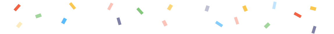
Некоторые люди с трудом переносят анимацию. Другие предпочитают избегать её в принципе. К счастью, браузеры предлагают медиазапрос media (prefers-reduced-motion). Давайте воспользуемся им, чтобы показать статически отрисованное конфетти. Статическую версию в Figma нарисовала Вивиан:
Остаётся встроить её в медиа-запрос:
.bg-confetti-animated {
    background-repeat: repeat-x;
    background-position: top -10px center;
    background-image: url("data:image/svg+xml,%3Csvg width='600' height='90' viewBox='0 0 600 90' fill='none' xmlns='http://www.w3.org/2000/svg'%3E%3Crect x='42' y='-10' width='6' height='10'/%3E%3Crect x='84' y='-10' width='6' height='10'/%3E%3Crect x='126' y='-13' width='5' height='13'/%3E%3Crect x='168' y='-13' width='5' height='13'/%3E%3Crect x='210' y='-10' width='6' height='10'/%3E%3Crect x='252' y='-13' width='5' height='13'/%3E%3Crect x='294' y='-10' width='6' height='10'/%3E%3Crect x='336' y='-13' width='5' height='13'/%3E%3Crect x='378' y='-13' width='5' height='13'/%3E%3Crect x='420' y='-10' width='6' height='10'/%3E%3Crect x='462' y='-10' width='6' height='10'/%3E%3Crect x='504' y='-13' width='5' height='13'/%3E%3Crect x='546' y='-10' width='6' height='10'/%3E%3Cstyle type='text/css'%3E rect %7B opacity: 0; %7D rect:nth-child(1) %7B transform-origin: 45px 5px; transform: rotate(-145deg); animation: blast 700ms infinite ease-out; animation-delay: 88ms; animation-duration: 631ms; %7D rect:nth-child(2) %7B transform-origin: 87px 5px; transform: rotate(164deg); animation: blast 700ms infinite ease-out; animation-delay: 131ms; animation-duration: 442ms; %7D rect:nth-child(3) %7B transform-origin: 128px 6px; transform: rotate(4deg); animation: blast 700ms infinite ease-out; animation-delay: 92ms; animation-duration: 662ms; %7D rect:nth-child(4) %7B transform-origin: 170px 6px; transform: rotate(-175deg); animation: blast 700ms infinite ease-out; animation-delay: 17ms; animation-duration: 593ms; %7D rect:nth-child(5) %7B transform-origin: 213px 5px; transform: rotate(-97deg); animation: blast 700ms infinite ease-out; animation-delay: 122ms; animation-duration: 476ms; %7D rect:nth-child(6) %7B transform-origin: 255px 6px; transform: rotate(57deg); animation: blast 700ms infinite ease-out; animation-delay: 271ms; animation-duration: 381ms; %7D rect:nth-child(7) %7B transform-origin: 297px 5px; transform: rotate(-46deg); animation: blast 700ms infinite ease-out; animation-delay: 131ms; animation-duration: 619ms; %7D rect:nth-child(8) %7B transform-origin: 338px 6px; transform: rotate(-65deg); animation: blast 700ms infinite ease-out; animation-delay: 85ms; animation-duration: 668ms; %7D rect:nth-child(9) %7B transform-origin: 380px 6px; transform: rotate(13deg); animation: blast 700ms infinite ease-out; animation-delay: 128ms; animation-duration: 377ms; %7D rect:nth-child(10) %7B transform-origin: 423px 5px; transform: rotate(176deg); animation: blast 700ms infinite ease-out; animation-delay: 311ms; animation-duration: 508ms; %7D rect:nth-child(11) %7B transform-origin: 465px 5px; transform: rotate(108deg); animation: blast 700ms infinite ease-out; animation-delay: 108ms; animation-duration: 595ms; %7D rect:nth-child(12) %7B transform-origin: 506px 6px; transform: rotate(62deg); animation: blast 700ms infinite ease-out; animation-delay: 105ms; animation-duration: 375ms; %7D rect:nth-child(13) %7B transform-origin: 549px 5px; transform: rotate(16deg); animation: blast 700ms infinite ease-out; animation-delay: 149ms; animation-duration: 491ms; %7D rect:nth-child(odd) %7B fill: %2365BB5C; %7D rect:nth-child(even) %7B z-index: 1; fill: %2333AAFF; %7D rect:nth-child(4n) %7B animation-duration: 1400ms; fill: %23F23B14; %7D rect:nth-child(3n) %7B animation-duration: 1750ms; animation-delay: 700ms; %7D rect:nth-child(4n-7) %7B fill: %232A2F6A; %7D rect:nth-child(6n) %7B fill: %23FBBA23; %7D @keyframes blast %7B from %7B opacity: 0; %7D 20%25 %7B opacity: 1; %7D to %7B transform: translateY(90px); %7D %7D %3C/style%3E%3C/svg%3E%0A");

    @media (prefers-reduced-motion) {
        background-image: url("data:image/svg+xml,%3Csvg width='574' height='60' viewBox='0 0 574 60' fill='none' xmlns='http://www.w3.org/2000/svg'%3E%3Crect opacity='0.8' x='27.1224' y='20.0458' width='5' height='13' transform='rotate(-139 27.1224 20.0458)' fill='%23F23B14'/%3E%3Crect opacity='0.8' x='118.478' y='7.00201' width='5' height='13' transform='rotate(-38.8114 118.478 7.00201)' fill='%23FBBA23'/%3E%3Crect opacity='0.8' x='504.616' y='25.4479' width='5' height='13' transform='rotate(-60.2734 504.616 25.4479)' fill='%23F23B14'/%3E%3Crect opacity='0.6' x='538.983' y='45.555' width='5' height='13' transform='rotate(16.7826 538.983 45.555)' fill='%232A2F6A'/%3E%3Crect opacity='0.3' x='470.322' y='2.63625' width='5' height='13' transform='rotate(11.295 470.322 2.63625)' fill='%2333AAFF'/%3E%3Crect opacity='0.3' x='190.295' y='4.58138' width='5' height='13' transform='rotate(27.5954 190.295 4.58138)' fill='%23F23B14'/%3E%3Crect opacity='0.8' x='234.303' y='16.3233' width='5' height='13' transform='rotate(-41.8233 234.303 16.3233)' fill='%2365BB5C'/%3E%3Crect opacity='0.6' x='369.702' y='40.9875' width='5' height='13' transform='rotate(-56.419 369.702 40.9875)' fill='%2333AAFF'/%3E%3Crect opacity='0.3' x='402.121' y='31.0848' width='5' height='13' transform='rotate(-17.9234 402.121 31.0848)' fill='%23F23B14'/%3E%3Crect opacity='0.6' x='200.316' y='31.9328' width='5' height='13' transform='rotate(-15.8896 200.316 31.9328)' fill='%232A2F6A'/%3E%3Crect opacity='0.6' x='69.6745' y='23.4725' width='6' height='10' transform='rotate(70.0266 69.6745 23.4725)' fill='%2365BB5C'/%3E%3Crect opacity='0.6' x='291.945' y='7.16931' width='6' height='10' transform='rotate(30.4258 291.945 7.16931)' fill='%23FBBA23'/%3E%3Crect opacity='0.3' x='33.7754' y='38.2208' width='6' height='10' transform='rotate(38.6056 33.7754 38.2208)' fill='%23FBBA23'/%3E%3Crect opacity='0.8' x='109.752' y='31.1743' width='6' height='10' transform='rotate(28.5296 109.752 31.1743)' fill='%2333AAFF'/%3E%3Crect opacity='0.3' x='278.081' y='37.8695' width='6' height='10' transform='rotate(-26.5651 278.081 37.8695)' fill='%23F23B14'/%3E%3Crect opacity='0.8' x='416.294' y='11.5573' width='6' height='10' transform='rotate(-22.8498 416.294 11.5573)' fill='%23FBBA23'/%3E%3Crect opacity='0.3' x='354.667' y='9.32341' width='6' height='10' transform='rotate(17.7506 354.667 9.32341)' fill='%232A2F6A'/%3E%3Crect opacity='0.8' x='532.404' y='16.6372' width='6' height='10' transform='rotate(-75.3432 532.404 16.6372)' fill='%23FBBA23'/%3E%3Crect opacity='0.6' x='460.463' y='39.3557' width='6' height='10' transform='rotate(45.4982 460.463 39.3557)' fill='%2365BB5C'/%3E%3C/svg%3E");
    }
}
Или предоставить код как отдельный класс
.bg-confetti-static:.bg-confetti-static {
background-repeat: repeat-x;
background-position: top -10px center;
background-image: url("data:image/svg+xml,%3Csvg width='574' height='60' viewBox='0 0 574 60' fill='none' xmlns='http://www.w3.org/2000/svg'%3E%3Crect opacity='0.8' x='27.1224' y='20.0458' width='5' height='13' transform='rotate(-139 27.1224 20.0458)' fill='%23F23B14'/%3E%3Crect opacity='0.8' x='118.478' y='7.00201' width='5' height='13' transform='rotate(-38.8114 118.478 7.00201)' fill='%23FBBA23'/%3E%3Crect opacity='0.8' x='504.616' y='25.4479' width='5' height='13' transform='rotate(-60.2734 504.616 25.4479)' fill='%23F23B14'/%3E%3Crect opacity='0.6' x='538.983' y='45.555' width='5' height='13' transform='rotate(16.7826 538.983 45.555)' fill='%232A2F6A'/%3E%3Crect opacity='0.3' x='470.322' y='2.63625' width='5' height='13' transform='rotate(11.295 470.322 2.63625)' fill='%2333AAFF'/%3E%3Crect opacity='0.3' x='190.295' y='4.58138' width='5' height='13' transform='rotate(27.5954 190.295 4.58138)' fill='%23F23B14'/%3E%3Crect opacity='0.8' x='234.303' y='16.3233' width='5' height='13' transform='rotate(-41.8233 234.303 16.3233)' fill='%2365BB5C'/%3E%3Crect opacity='0.6' x='369.702' y='40.9875' width='5' height='13' transform='rotate(-56.419 369.702 40.9875)' fill='%2333AAFF'/%3E%3Crect opacity='0.3' x='402.121' y='31.0848' width='5' height='13' transform='rotate(-17.9234 402.121 31.0848)' fill='%23F23B14'/%3E%3Crect opacity='0.6' x='200.316' y='31.9328' width='5' height='13' transform='rotate(-15.8896 200.316 31.9328)' fill='%232A2F6A'/%3E%3Crect opacity='0.6' x='69.6745' y='23.4725' width='6' height='10' transform='rotate(70.0266 69.6745 23.4725)' fill='%2365BB5C'/%3E%3Crect opacity='0.6' x='291.945' y='7.16931' width='6' height='10' transform='rotate(30.4258 291.945 7.16931)' fill='%23FBBA23'/%3E%3Crect opacity='0.3' x='33.7754' y='38.2208' width='6' height='10' transform='rotate(38.6056 33.7754 38.2208)' fill='%23FBBA23'/%3E%3Crect opacity='0.8' x='109.752' y='31.1743' width='6' height='10' transform='rotate(28.5296 109.752 31.1743)' fill='%2333AAFF'/%3E%3Crect opacity='0.3' x='278.081' y='37.8695' width='6' height='10' transform='rotate(-26.5651 278.081 37.8695)' fill='%23F23B14'/%3E%3Crect opacity='0.8' x='416.294' y='11.5573' width='6' height='10' transform='rotate(-22.8498 416.294 11.5573)' fill='%23FBBA23'/%3E%3Crect opacity='0.3' x='354.667' y='9.32341' width='6' height='10' transform='rotate(17.7506 354.667 9.32341)' fill='%232A2F6A'/%3E%3Crect opacity='0.8' x='532.404' y='16.6372' width='6' height='10' transform='rotate(-75.3432 532.404 16.6372)' fill='%23FBBA23'/%3E%3Crect opacity='0.6' x='460.463' y='39.3557' width='6' height='10' transform='rotate(45.4982 460.463 39.3557)' fill='%2365BB5C'/%3E%3C/svg%3E");
}Вот и всё! У наших инженеров и дизайнеров есть единый портативный класс .bg-confetti-animated, который они могут добавить к любому блочному элементу. Документацию вы найдёте в Stacks, а ещё вы можете узнать, как мы стилизовали модальные окна.
Продолжить изучение CSS вы сможете на наших курсах:

Узнайте подробности здесь.
Другие профессии и курсы
Data Science и Machine Learning
Python, веб-разработка
Мобильная разработка
Java и C#
От основ — в глубину
А также
- Профессия Data Scientist
- Профессия Data Analyst
- Курс «Математика для Data Science»
- Курс «Математика и Machine Learning для Data Science»
- Курс по Data Engineering
- Курс «Machine Learning и Deep Learning»
- Курс по Machine Learning
Python, веб-разработка
- Профессия Fullstack-разработчик на Python
- Курс «Python для веб-разработки»
- Профессия Frontend-разработчик
- Профессия Веб-разработчик
Мобильная разработка
Java и C#
- Профессия Java-разработчик
- Профессия QA-инженер на JAVA
- Профессия C#-разработчик
- Профессия Разработчик игр на Unity
От основ — в глубину
А также
