Have you ever seen an attractive Toggle Button on various web-pages or apps? Today we will create it with you together!
Why you need it?
Toggle buttons are widely used in modern apps and web-pages. It makes users click on it with its attractiveness and smooth transition.
Creation. HTML
At first, we need to add the skeleton for our button using HTML. It is just an input with type=”checked” and a label for this input.
<div class="container">
  <input type="checkbox" id="toggle-button" class="toggle-button">
  <label for="toggle-button" class="text">Toggle Button</label>
</div>
In order to bind label with the input, we use for=”toggle-button” where toggle-button is an id of our input.
Creation. CSS
Now we start to customize our toggle button.
Primarily, we need to remove the standard view of the input in the browser. We can do this by adding the appearance: none property to the class .toogle-button.
.toggle-button {
  -webkit-appearance: none;
  -moz-appearance: none;
  appearance: none;
}
But here is one problem… The property appearance doesn’t work in Edge and IE.
Despite it, this property works correctly in all modern browsers.
-webkit-: browsers Chrome, Safari, Opera;
-moz-: browser Mozilla Firefox;
Okay, let’s continue. And what will we see after adding appearance: none? Our checkbox will just disappear. And now we can add own styles which we want. Let’s add some styles to .toogle-button for beauty.
.toggle-button {
 position: relative;
 display: inline-block;
 width: 100px;
 height: 50px;
 margin: 0;
 vertical-align: top;
 background: #ffffff;
 border: 1px solid #bbc1e1;
 border-radius: 30px;
 outline: none;
 cursor: pointer;
 -webkit-appearance: none;
 -moz-appearance: none;
 appearance: none;
}
After applying these styles our toggle button will look as follows.

Note: I don’t show you applied styles for the label and body’s background-color because our theme is the Toggle Button
Now it is time to add circle inside our button. We can do it by adding a pseudo-element ::after.
.toggle-button::after {
content: "";
display: inline-block;
position: absolute;
left: 3px;
top: 1.5px;
width: 45px;
height: 45px;
background-color: blue;
border-radius: 50%;
transform: translateX(0);
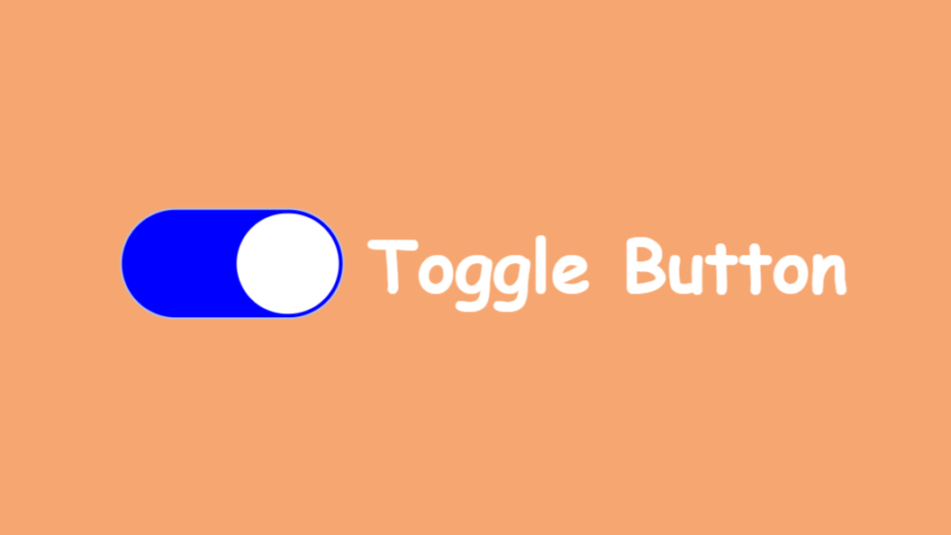
}Now it looks like the real Toggle Button on the web-page.

But furthermore, we need to add the effect of the circle’s moving after the user’s click. We can achieve this by using the transform: translate(x) property.
If you look at the previous code of the .toogle-button you will see transform: translateX(0). “0” here is an initial position of the circle in which it will return after unchecking.
In order to move the circle to the right side, we need to use pseudo-class :checked for the class .toggle-button.
.toggle-button:checked::after {
  transform: translateX(calc(100% + 3px));
  background-color: #fff;
}
.toggle-button:checked {
  background-color: blue;
}
In this code we can see translateX(calc(100% + 3px)) where calc(100% + 3px) calculates the position of the circle after user’s click. It is simpler to understand with the formula:
calc(A + B)
Where:
A — the entire inner width of the .toggle-button;
B — property left of the .toggle-button::after (remember, we wrote left: 3px in .toggle-button::after)
If you don’t understand the formula you can look at the explanation with a picture:

Moreover, we change background-color of the circle and the .toggle-button class.
Okay, I’ m sure that all things are clear. Now our toggle button looks so:

Smooth Transition
And at least we will add the smooth movement of our circle. We can just add simple transitions for .toggle-button and .toggle-button::after.
transition: 0.3s;But we need a more attractive effect. Let’s use cubic-bezier. You need just add the code below it to .toggle-button and .toggle-button::after.
transition: all 0.3s cubic-bezier(0.2, 0.85, 0.32, 1.2);And after it, we will see a great animation.

The circle seems to bounce off the walls of the white frame. It’s cool, isn’t it?
Conclusion
Yeah, we did it! Today we created an awesome and cool tool that you can use in your app or web-page.
The full code you can find here: Toggle Button.
If this article was useful to you and gave you new knowledge about CSS I would be great to see likes or comments below with feedback.
I’ll also be glad to read some proposals for my articles.
