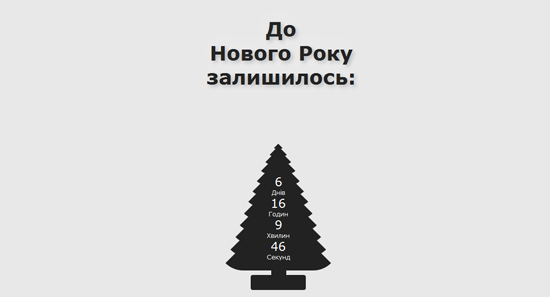
Буквально неделю назад я загорелся идеей, максимально использовать для создания своих сайтов CSS3. И так как в последнее время меня мучает бессонница, я стал развивать эти навыки. Расслабляясь и смотря очередное видео, я пропитался новогодним настроением и решил сделать новогоднюю елку на CSS. Идея была в том, что все должно быть максимально простым, классическим и без использования картинок. В то время когда я делал елку, я решил сделать еще и таймер обратного отсчета к Новому году. На все это я потратил не очень много времени и масса удовольствия была мне обеспечена.
Итак, приступим.
HTML-код будет предельно простой:
<!DOCTYPE html>
<html>
<head>
<meta http-equiv="Content-Type" content="text/html; charset=utf-8" />
<title>До Нового Року залишилось...</title>
<link rel="stylesheet" type="text/css" href="style.css" />
<script src="js/jquery-1.7.min.js" type="text/javascript"></script></script>
<script src="js/jquery.countdown.js" type="text/javascript"></script>
<script type="text/javascript">
$(function () {
	var austDay = new Date(2011, 1, 1, 00, 00, 00) ;
	austDay = new Date(austDay.getFullYear() + 1, 1 - 1, 1);
	$('#defaultCountdown').countdown({until: austDay});
	$('#year').text(austDay.getFullYear());
});
</script>
<script src="js/pseudocursor.js" type="text/javascript"></script>
</head>
<body>
<div class="fir-tree"><div class="stem"><div class="text">До
Нового Року
 залишилось<span id="pseudoCursor">:</span></div></div>
<div class="conf-stem"></div>
<div class="a"></div>
<div class="b"></div>
<div class="c"></div>
<div class="d"></div>
<div class="e"></div>
<div class="f"></div>
<div class="g"></div>
<div class="h"></div>
<div class="i"></div>
<div class="j"></div>
<div class="k"></div>
<div class="l"></div>
<div class="timer">
<div id="defaultCountdown">
</div></div>
</body>
</html>
Пишем стили
Для начала мы создадим фон для нашей елки:
 body {
	background: #E8E8E8;
}
Для создания елки я использовал легкую схему из двенадцати треугольников, ножки, и подставки — придавая им соответствующие стили.
Получилось следующее:
.fir-tree {
position: absolute;
top: 80%;
left: 45%;
width: 100px;
height: 30px;
background: #222222;
-moz-border-radius: 4px;
-webkit-border-radius: 4px;
border-radius: 4px;
}

.fir-tree .conf-stem {
position: absolute;
top: 0%;
left: 10%;
width: 100px;
height: 30px;
background: #222222;
-moz-border-radius: 4px;
-webkit-border-radius: 4px;
border-radius: 4px;
}

.fir-tree .stem {
position: absolute;
top: -120%;
left: 41%;
width: 30px;
height: 60px;
background: #222222;
}

.fir-tree .a {
position: inherit;
top: -430%;
left: -65%;
width:0;
height: 0;
border-left: 120px solid transparent;
border-right: 120px solid transparent;
border-bottom: 120px solid #222222;
/* Only FF, Safari, Chrome (I don't use this in IE and Opera because this function doesn't work correctly) */
-moz-border-radius: 50px;
-webkit-border-radius: 50px;
}

.fir-tree .b {
position: inherit;
top: -485%;
left: -55%;
width:0;
height: 0;
border-left: 110px solid transparent;
border-right: 110px solid transparent;
border-bottom: 110px solid #222222;
/* Only FF, Safari, Chrome (I don't use this in IE and Opera because this function doesn't work correctly) */
-moz-border-radius: 50px;
-webkit-border-radius: 50px;
}

.fir-tree .c {
position: inherit;
top: -535%;
left: -45%;
width:0;
height: 0;
border-left: 100px solid transparent;
border-right: 100px solid transparent;
border-bottom: 100px solid #222222;
/* Only FF, Safari, Chrome (I don't use this in IE and Opera because this function doesn't work correctly) */
-moz-border-radius: 50px;
-webkit-border-radius: 50px;
}

.fir-tree .d {
position: inherit;
top: -585%;
left: -35%;
width:0;
height: 0;
border-left: 90px solid transparent;
border-right: 90px solid transparent;
border-bottom: 90px solid #222222;
/* Only FF, Safari, Chrome (I don't use this in IE and Opera because this function doesn't work correctly) */
-moz-border-radius: 50px;
-webkit-border-radius: 50px;
}

.fir-tree .e {
position: inherit;
top: -635%;
left: -25%;
width:0;
height: 0;
border-left: 80px solid transparent;
border-right: 80px solid transparent;
border-bottom: 80px solid #222222;
/* Only FF, Safari, Chrome (I don't use this in IE and Opera because this function doesn't work correctly) */
-moz-border-radius: 50px;
-webkit-border-radius: 50px;
}

.fir-tree .f {
position: inherit;
top: -685%;
left: -15%;
width:0;
height: 0;
border-left: 70px solid transparent;
border-right: 70px solid transparent;
border-bottom: 70px solid #222222;
/* Only FF, Safari, Chrome (I don't use this in IE and Opera because this function doesn't work correctly) */
-moz-border-radius: 50px;
-webkit-border-radius: 50px;
}

.fir-tree .g {
position: inherit;
top: -725%;
left: -5%;
width:0;
height: 0;
border-left: 60px solid transparent;
border-right: 60px solid transparent;
border-bottom: 60px solid #222222;
/* Only FF, Safari, Chrome (I don't use this in IE and Opera because this function doesn't work correctly) */
-moz-border-radius: 50px;
-webkit-border-radius: 50px;
}

.fir-tree .h {
position: inherit;
top: -765%;
left: 5%;
width:0;
height: 0;
border-left: 50px solid transparent;
border-right: 50px solid transparent;
border-bottom: 50px solid #222222;
/* Only FF, Safari, Chrome (I don't use this in IE and Opera because this function doesn't work correctly) */
-moz-border-radius: 50px;
-webkit-border-radius: 50px;
}

.fir-tree .i {
position: inherit;
top: -805%;
left: 15%;
width:0;
height: 0;
border-left: 40px solid transparent;
border-right: 40px solid transparent;
border-bottom: 40px solid #222222;
/* Only FF, Safari, Chrome (I don't use this in IE and Opera because this function doesn't work correctly) */
-moz-border-radius: 50px;
-webkit-border-radius: 50px;
}

.fir-tree .j {
position: inherit;
top: -835%;
left: 25%;
width:0;
height: 0;
border-left: 30px solid transparent;
border-right: 30px solid transparent;
border-bottom: 30px solid #222222;
/* Only FF, Safari, Chrome (I don't use this in IE and Opera because this function doesn't work correctly) */
-moz-border-radius: 50px;
-webkit-border-radius: 50px;
}

.fir-tree .k {
position: inherit;
top: -855%;
left: 35%;
width:0;
height: 0;
border-left: 20px solid transparent;
border-right: 20px solid transparent;
border-bottom: 20px solid #222222;
/* Only FF, Safari, Chrome (I don't use this in IE and Opera because this function doesn't work correctly) */
-moz-border-radius: 50px;
-webkit-border-radius: 50px;
}

.fir-tree .l {
position: inherit;
top: -872%;
left: 45%;
width:0;
height: 0;
border-left: 10px solid transparent;
border-right: 10px solid transparent;
border-bottom: 10px solid #222222;
/* Only FF, Safari, Chrome (I don't use this in IE and Opera because this function doesn't work correctly) */
-moz-border-radius: 50px;
-webkit-border-radius: 50px;
}
Елка у нас уже есть и теперь нужно сделать таймер. Для его создания я выбрал плагин для JS под названием Countdown.
Что бы сделать обратный отсчет, я использовал такой шаблонный код:
$(function () {
	var austDay = new Date(2011, 1, 1, 00, 00, 00) ;
	austDay = new Date(austDay.getFullYear() + 1, 12 - 1, 32);
	$('#defaultCountdown').countdown({until: austDay});
	$('#year').text(austDay.getFullYear());
});
Для плагина конечно же можно добавить стили по вкусу, вот мои:
.countdown_show1 .countdown_section {
width: 200%;
}
.countdown_show2 .countdown_section {
width: 100%;
}
.countdown_show3 .countdown_section {
width: 100%;
}
.countdown_show4 .countdown_section {
width: 100%;
}
.countdown_show5 .countdown_section {
width: 100%;
}
.countdown_show6 .countdown_section {
width: 100%;
}
.countdown_show7 .countdown_section {
width: 60%;
}
.countdown_section {
display: block;
float: left;
font-size: 80%;
text-align: center;
}
.countdown_amount {
font-size: 200%;
}
.countdown_descr {
display: block;
width: 100%;
}
Полноценная елка у нас уже есть, осталось лишь сделать надпись. Для надписи можно использовать какой-нибудь красивый шрифт, но в данном примере я решил удержаться и следовать простоте.
.text {
position: absolute;
top: -800%;
left: -430%;
font-size: 40px;
color: #222222;
font-family:  Verdana, Arial;
text-align: center;
font-weight:bold;
text-shadow: 4px 4px 7px rgba(0,0,0,0.2),
                 0px -6px 38px rgba(255,255,255,0.3);
}
И вот что у нас в результате получилось:
Демонстрация
Заключение
Итак, у нас получился красивый таймер в виде елки. Все довольно просто и красиво.
С наступающим!
