For those who do not like long intros, let’s go straight to the conclusions — write tests for your components. Seriously, this is all that I want to say. But let’s not take this too seriously, imagine that these are the conclusions of a theorem, a frontend theorem. And now, we will need to come up with evidence.
So, let’s imagine. What is common in IT-development, not only in the frontend, backend or design, programming languages, management, methodologies and go on? I guess there is the one main principle — decomposition and components.
Whether we want it or not, whether we understand what we write or not, we work with components, we always decompose tasks into smaller ones.
And getting together for the millionth time to write the next implementation of the table for our inner beautiful UI-kit, I thought — what preliminary work do I need to do? What exactly should be written? And where to start?

After talking with teammates, I heard a few tips. I just really liked one. Since I am a fan of singularity and a bit of graphql, I was asked not to write anything at all. Use the {table} tag and some neural network will process this table, create a graphql query, and populate the table with data. Easy one :).
But as they say — “there is a fatal flaw in any system”, I began to think about “how to invent my own wheel”. And smart people have already come up with everything before us. We, the millennials, can only rearrange the plates and name things differently.
I am ready to introduce my own set of principles of prototyping UI-kits — I.D.O.L.S.! Let’s take a look!
I stands for Interface segregation, D stands for Dependency inversion, O stands… just kidding, of course, it is S.O.L.I.D.
All attempts to formalize work with components are reduced to this. These principles can be expanded indefinitely, but everything is always the final result is reduced to this five. If we are, of course, talking about OOP or CBP (component-based programming).
Let’s load these principles into our “RAM” and go through the points.

Hmm, please don’t …
Use a special component for different cases. You should NOT make a component, which will able to cut something off and wrench something down at the same time. Make two different pieces.
The principle says that your components should be open for improvements and closed for modifications, in other words, you can reuse your component within another component, but you should not change your component if it already obeys the principle of single responsibility.
A small extension of the previous principle, any instance of a subclass can be used instead of an instance of the base class. I’m not sure how this principle fit the components’ context, most likely it will be just a duplication of the previous principle.
We’ll talk about this even further, now we can say that it’s better to give the other developer a lot of small interfaces than one big one but for everything. Let’s compare the examples below.

Everything is configuring in one place, unmaintainable, non-reusable…
Everything as a constructor, assemble as you like and conveniently
The principle that the various parts of the application should not know anything about each other, and should be inherited only through common interfaces. Here we are talking more about reuse and reducing the connectedness of components. The component of the Table does not need to know where and how the data comes from, it only needs to know the conditional DataLoader, which can be anything.

But one point of view is not enough for us. Since in this situation, it is very easy to become a hostage to this idea. Therefore, we look at the development of components on the other hand, from the design side.
In this case, we will consider one of the increasingly popular design approaches, namely atomic design. Relatively speaking, the atomic design is another way to decompose UI elements by comparing them with a hierarchy from physics and biology.
So let’s take a look, what is atomic design.
The first level is tokens, someone includes this in the model, someone does not, but it’s worth mentioning. Tokens (colours, font sizes, spacings, animations) are all the primitives that we can reuse on any platform.
It is worth noting that the higher we are in the hierarchy in atomic design, the more re-usability decreases. But more on that later.
Next are the atoms (simple components without logic, inputs, buttons). The first level is where the components appear and what they output. Atoms have not any state, only show static styled markup.
The atoms then assemble into molecules (more complex component bonds). Molecules can have own state, but this is not a business state, it can be a configurational state (like isOpen). We can guess that molecules are more like a proxy between top business state and how we align our atoms or children content depending on this state.
Molecules are the last level where we can meet styling.
Molecules make up organisms (integral working groups of components), for example, a header, footer and so on. Organisms do not know anything about other organisms and styles, this is our “containers of DNA” our business logic, which know how to show this and when it should be changed.
The last one level of atomic design. This level represents the groups of organisms, which current page included.
We can make the composition of organisms on the page via molecules and then call that page as “layout” and reuse it changing our organisms inside it.
Using these two approaches (S.O.L.I.D. and Atomic), we will try to formulate some recommendations when developing components. So, those recommendations will be needed for us to understand, what exactly we are doing when we say “create another one component”.
Considering that, these components will get to work with other developers, we will keep this in mind when we will lay the interface and API.
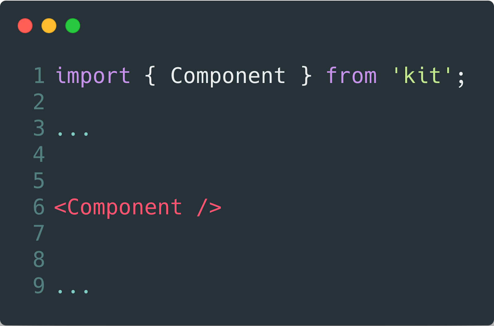
We can start developing our ideal interface.
The first thing to start with is not to start developing an ideal interface. The ideal interface is its lack. An interface is an obstacle between what you did and when it starts to work. This is a pain, which has to be avoided.
Thus, the best solution would be the following:
This smoothly brings us to the following:
If a developer who uses this component sees it for the first time, do a little onboarding for it, translate the component into new states as the complexity of the settings increases and tell the developer about it.
The states can be completely different at different times.
Empty → Downloading → Loading → Loading another part → Fully loaded → Error, etc.
Guide the developers through all possible combinations of states, teach them while they work.
When dealing with state issues, one involuntarily stumbles upon the problem of default states. Because of it, the second recommendation.
With this item, you can kill two birds with one stone, you not only provide basic information to the developer what is happening with the application but for you, the absence of one or another variable will not be a surprise that breaks everything. Also, ugly checks for their presence in principle are not needed.

Further, if the developer still wants to add settings, it is necessary to help him in this, and not to interfere.
Given Richard Gregory’s theory, people explore the world around them based on previous visual experiences. And if your component changes something under its hood and you want to let the developer know about it, then call your hooks and callback predictably.
Not changePasswordInputValue, but onChange, because if it is your “molecule”, it will always be clear what the value will change.
Well, try to follow the general naming rules, the on prefix for events, verbs for actions, and if you use the boolean flag isDisabled in one place, then use it everywhere, you no longer need isEnabled, be consistent.
The next thing you should pay attention to is that when you finish working on the component, you pass it on, other developers will work with it further. And if something goes wrong with your component, you will have to start a new development circle: the developer finds a bug or cannot do something that they wants → opens issue → you are looking for a time to fix it → consider the consistency → fix → update packages → announce to developers → update packages → try to do what they wanted a week ago.
As if they wrote this component right now — a direct conclusion of one of the principles of S.O.L.I.D.
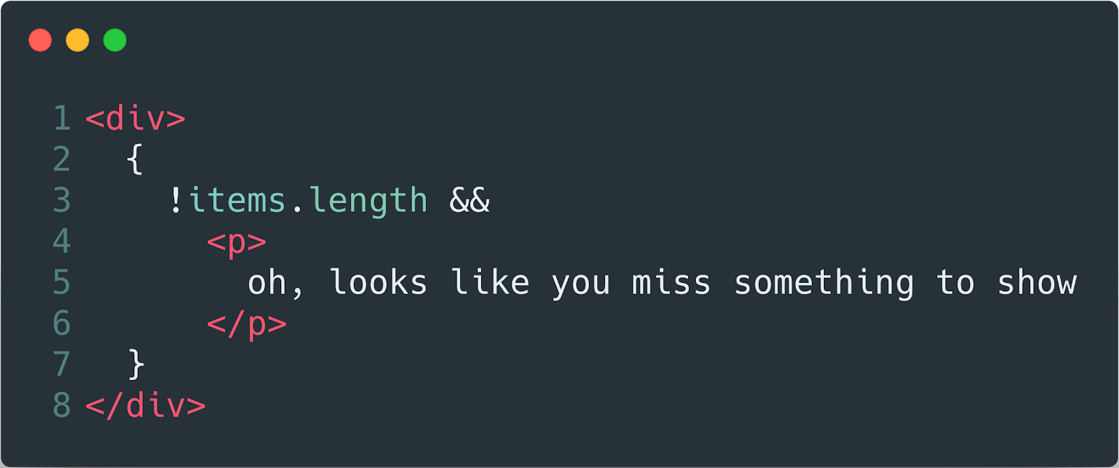
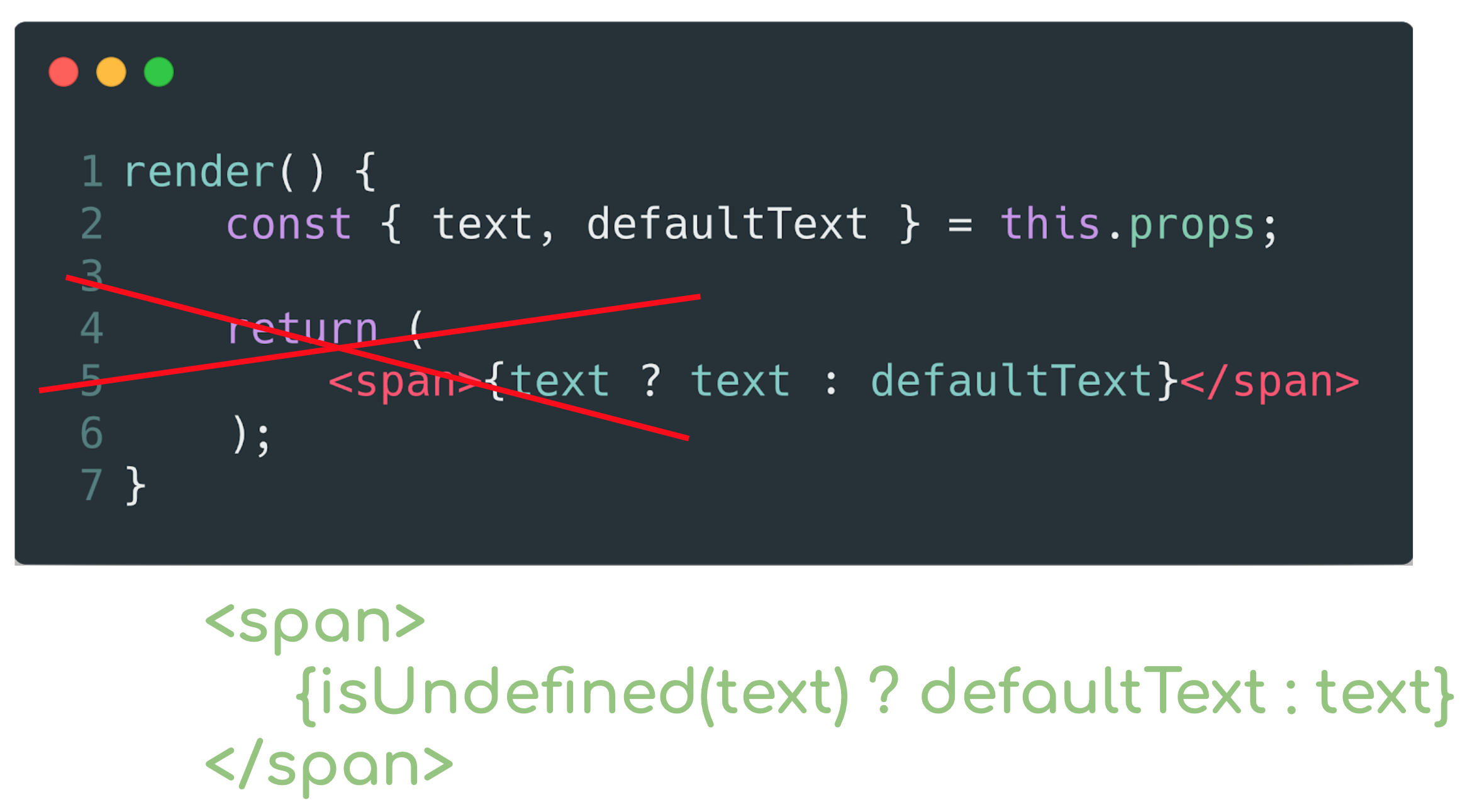
Suppose you allow a piece of text to be passed to your component. If this text is present, then it will be displayed, but you also remember the rule about default states and write the condition that if the text is not transmitted, then show the default text. So, in a good tone, it will give the developer explicitly indicate that the text is not needed here.

Well, if you consider that in the first place we start working with atomic components, then the following recommendation comes from here.
How to follow this? — quite simply, do not write code in your component. Only the template and how it draws the input data. If you need to make map, filter, reduce on the data, you have constants that cannot be redefined outside, your template uses literals, which is wrong — it’s not an atom anymore, but something else, it’s more difficult to maintain. This must be avoided.
So, we got a shortlist of recommendations that it would be nice to follow.
But our brain is so arranged that after writing a couple of three components — we begin to think that we do not need to look into this list to check all the points. And we know that among the more complex task and the easier one, we always choose the easier one because it works like that. We love saving our energy, we need it, in reserve. Therefore, such lists are always lost in the confluence until better times, and we continue to bugfix to the master.
Only if we understand that making it wise for us, in general, will be easier than not to sleep for two weeks in a row, fixing bugs in production, we will make the task more difficult (for objective reasons) and easier (for our reasons).
How then to deceive our brain and make recommendations work?
Well, let’s try to automate this.
We can use the eslint + lefthook bundle or any other git-hooks tool.

We describe the rules of how we want to see our variables and how our code should be styled. We forbid magic numbers and literals in templates, we expect from us that we will write docks for our code immediately. We hang up these checks for a git hook and get automatic notifications that our code is bad and should be updated.
But this is not a silver bullet and we cannot fulfil all the recommendations. Only a part.
In this way, we cannot handle our possible states and can’t guarantee that other devs will get what they want. We can just assume, for example, that something will return anyway (aka default value) but no more.
Then you can try another way. Develop our components through SDD. Storybook Driven Development.
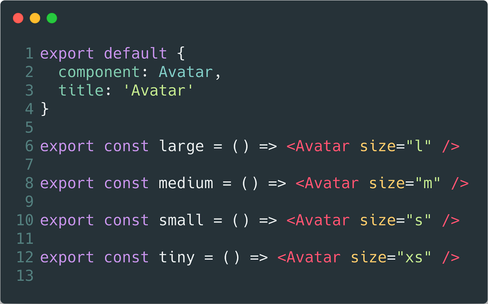
We have a story file in the form where we describe all the possible states of the component. And a storybook collecting these stories.

Our stories about component

How storybook show stories to us
Developing your components in isolation from the working environment is not only a plus to the purity of the components, but it will also allow you to immediately see which states are not covered by the tests, and which, in principle, are absent.
But in the end, this also will not give us everything that we want.
Therefore, only one thing remains.
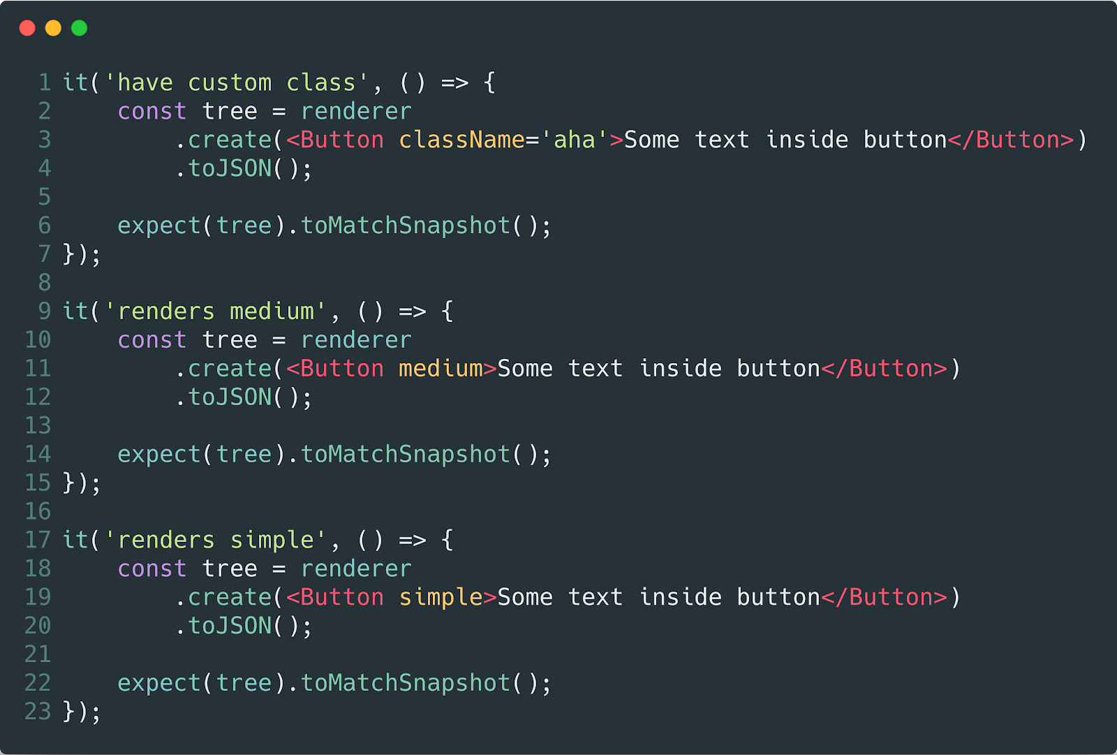
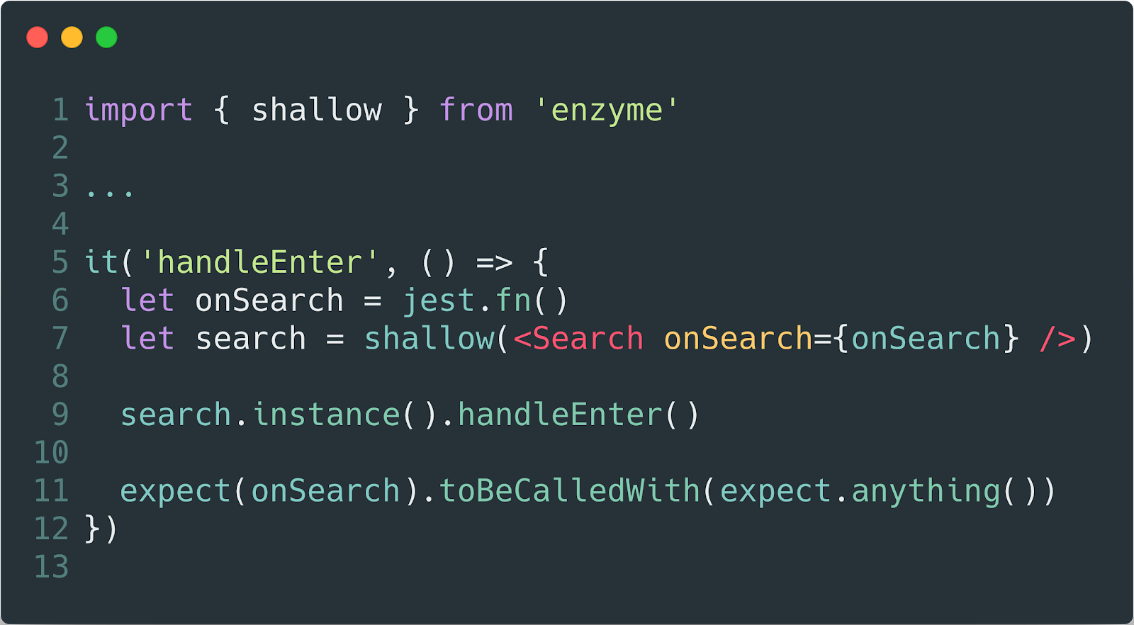
Since our components are atoms and molecules, it becomes a pleasure to write unit tests, each component is responsible for one functionality that we can easily test by discarding several items from the list of recommendations at once.
We can set up snapshot checks, which will allow us to monitor the state of our components and to learn all the changes in the future.
We can use a bundle with an enzyme to control our expectations during development. And strangely enough, when it comes to recommendations in which we expect something from a developer who writes code, only tests and their writing can best suit. They were literally invented for this.

And here we go…

Write tests for your components. Thanks.
So, let’s imagine. What is common in IT-development, not only in the frontend, backend or design, programming languages, management, methodologies and go on? I guess there is the one main principle — decomposition and components.
Whether we want it or not, whether we understand what we write or not, we work with components, we always decompose tasks into smaller ones.
And getting together for the millionth time to write the next implementation of the table for our inner beautiful UI-kit, I thought — what preliminary work do I need to do? What exactly should be written? And where to start?

After talking with teammates, I heard a few tips. I just really liked one. Since I am a fan of singularity and a bit of graphql, I was asked not to write anything at all. Use the {table} tag and some neural network will process this table, create a graphql query, and populate the table with data. Easy one :).
But as they say — “there is a fatal flaw in any system”, I began to think about “how to invent my own wheel”. And smart people have already come up with everything before us. We, the millennials, can only rearrange the plates and name things differently.
I am ready to introduce my own set of principles of prototyping UI-kits — I.D.O.L.S.! Let’s take a look!
I stands for Interface segregation, D stands for Dependency inversion, O stands… just kidding, of course, it is S.O.L.I.D.
All attempts to formalize work with components are reduced to this. These principles can be expanded indefinitely, but everything is always the final result is reduced to this five. If we are, of course, talking about OOP or CBP (component-based programming).
Let’s load these principles into our “RAM” and go through the points.
S — Single Responsibility
Hmm, please don’t …
Use a special component for different cases. You should NOT make a component, which will able to cut something off and wrench something down at the same time. Make two different pieces.
O — Open/Closed
The principle says that your components should be open for improvements and closed for modifications, in other words, you can reuse your component within another component, but you should not change your component if it already obeys the principle of single responsibility.
L — Liskov substitution
A small extension of the previous principle, any instance of a subclass can be used instead of an instance of the base class. I’m not sure how this principle fit the components’ context, most likely it will be just a duplication of the previous principle.
I — Interface segregation
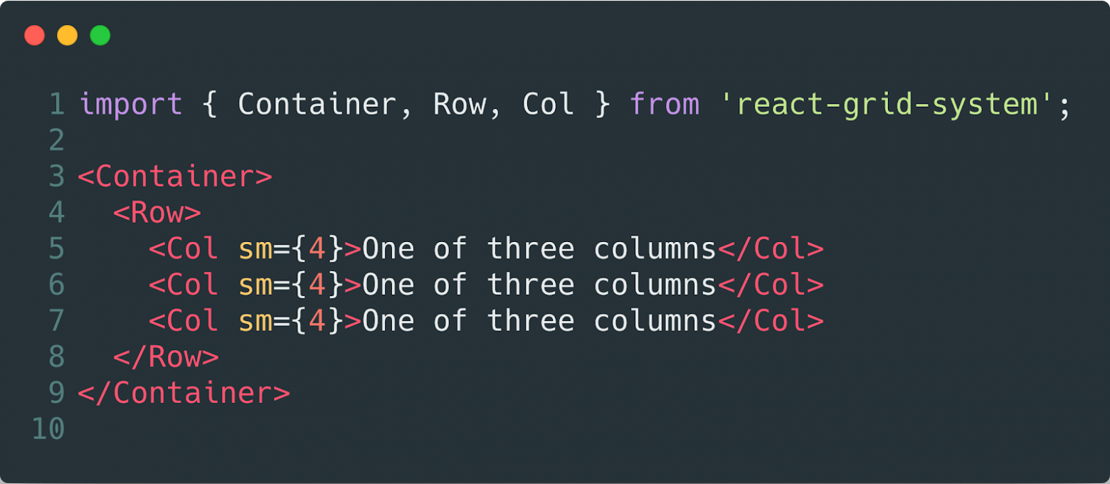
We’ll talk about this even further, now we can say that it’s better to give the other developer a lot of small interfaces than one big one but for everything. Let’s compare the examples below.
Everything is configuring in one place, unmaintainable, non-reusable…
Everything as a constructor, assemble as you like and conveniently
D — Dependency inversion
The principle that the various parts of the application should not know anything about each other, and should be inherited only through common interfaces. Here we are talking more about reuse and reducing the connectedness of components. The component of the Table does not need to know where and how the data comes from, it only needs to know the conditional DataLoader, which can be anything.
But one point of view is not enough for us. Since in this situation, it is very easy to become a hostage to this idea. Therefore, we look at the development of components on the other hand, from the design side.
In this case, we will consider one of the increasingly popular design approaches, namely atomic design. Relatively speaking, the atomic design is another way to decompose UI elements by comparing them with a hierarchy from physics and biology.
So let’s take a look, what is atomic design.
Tokens
The first level is tokens, someone includes this in the model, someone does not, but it’s worth mentioning. Tokens (colours, font sizes, spacings, animations) are all the primitives that we can reuse on any platform.
It is worth noting that the higher we are in the hierarchy in atomic design, the more re-usability decreases. But more on that later.
Atoms
Next are the atoms (simple components without logic, inputs, buttons). The first level is where the components appear and what they output. Atoms have not any state, only show static styled markup.
Molecules
The atoms then assemble into molecules (more complex component bonds). Molecules can have own state, but this is not a business state, it can be a configurational state (like isOpen). We can guess that molecules are more like a proxy between top business state and how we align our atoms or children content depending on this state.
Molecules are the last level where we can meet styling.
Organisms
Molecules make up organisms (integral working groups of components), for example, a header, footer and so on. Organisms do not know anything about other organisms and styles, this is our “containers of DNA” our business logic, which know how to show this and when it should be changed.
Templates/Pages
The last one level of atomic design. This level represents the groups of organisms, which current page included.
We can make the composition of organisms on the page via molecules and then call that page as “layout” and reuse it changing our organisms inside it.
Using these two approaches (S.O.L.I.D. and Atomic), we will try to formulate some recommendations when developing components. So, those recommendations will be needed for us to understand, what exactly we are doing when we say “create another one component”.
Considering that, these components will get to work with other developers, we will keep this in mind when we will lay the interface and API.
We can start developing our ideal interface.
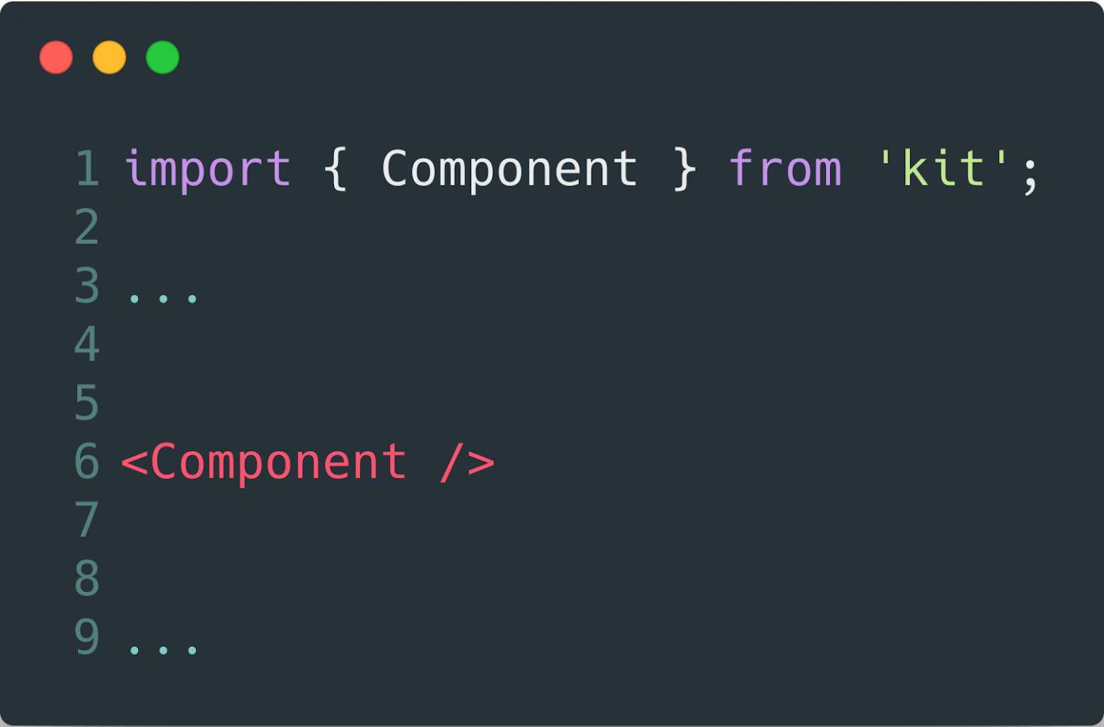
The first thing to start with is not to start developing an ideal interface. The ideal interface is its lack. An interface is an obstacle between what you did and when it starts to work. This is a pain, which has to be avoided.
Thus, the best solution would be the following:
This smoothly brings us to the following:
1. Determine the state of the component
If a developer who uses this component sees it for the first time, do a little onboarding for it, translate the component into new states as the complexity of the settings increases and tell the developer about it.
The states can be completely different at different times.
Empty → Downloading → Loading → Loading another part → Fully loaded → Error, etc.
Guide the developers through all possible combinations of states, teach them while they work.
When dealing with state issues, one involuntarily stumbles upon the problem of default states. Because of it, the second recommendation.
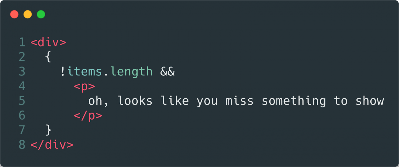
2. Define default values
With this item, you can kill two birds with one stone, you not only provide basic information to the developer what is happening with the application but for you, the absence of one or another variable will not be a surprise that breaks everything. Also, ugly checks for their presence in principle are not needed.
Further, if the developer still wants to add settings, it is necessary to help him in this, and not to interfere.
Given Richard Gregory’s theory, people explore the world around them based on previous visual experiences. And if your component changes something under its hood and you want to let the developer know about it, then call your hooks and callback predictably.
3. No need to reinvent the wheel
Not changePasswordInputValue, but onChange, because if it is your “molecule”, it will always be clear what the value will change.
Well, try to follow the general naming rules, the on prefix for events, verbs for actions, and if you use the boolean flag isDisabled in one place, then use it everywhere, you no longer need isEnabled, be consistent.
The next thing you should pay attention to is that when you finish working on the component, you pass it on, other developers will work with it further. And if something goes wrong with your component, you will have to start a new development circle: the developer finds a bug or cannot do something that they wants → opens issue → you are looking for a time to fix it → consider the consistency → fix → update packages → announce to developers → update packages → try to do what they wanted a week ago.
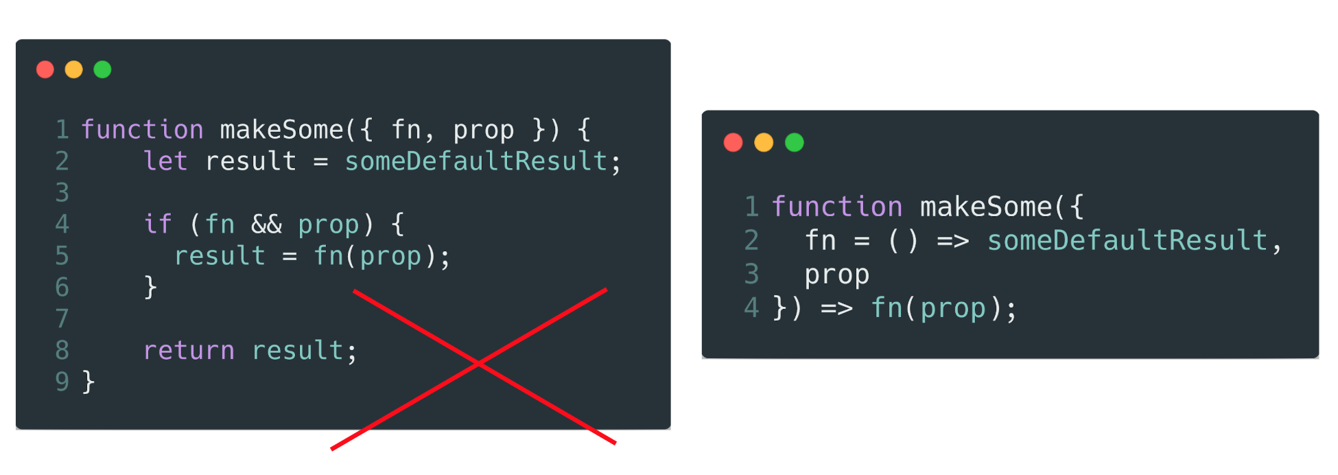
4. Try to give developers as much control as possible
As if they wrote this component right now — a direct conclusion of one of the principles of S.O.L.I.D.
Suppose you allow a piece of text to be passed to your component. If this text is present, then it will be displayed, but you also remember the rule about default states and write the condition that if the text is not transmitted, then show the default text. So, in a good tone, it will give the developer explicitly indicate that the text is not needed here.
Well, if you consider that in the first place we start working with atomic components, then the following recommendation comes from here.
5. Keep your components clean and dry so that abstractions do not leak (KISS).
How to follow this? — quite simply, do not write code in your component. Only the template and how it draws the input data. If you need to make map, filter, reduce on the data, you have constants that cannot be redefined outside, your template uses literals, which is wrong — it’s not an atom anymore, but something else, it’s more difficult to maintain. This must be avoided.
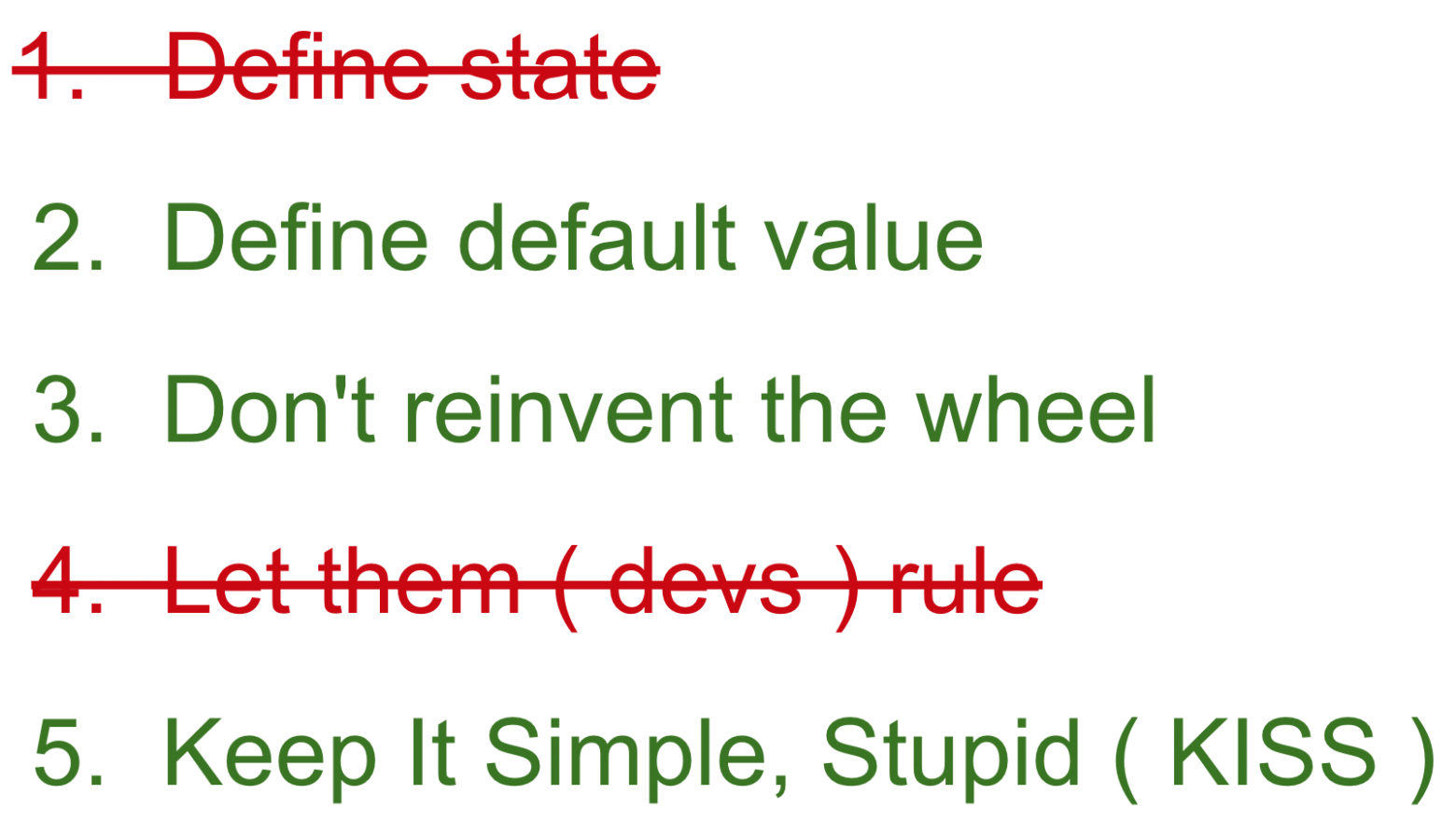
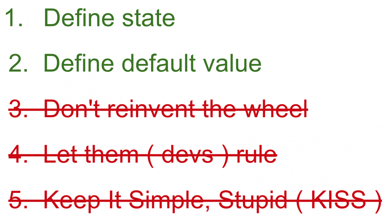
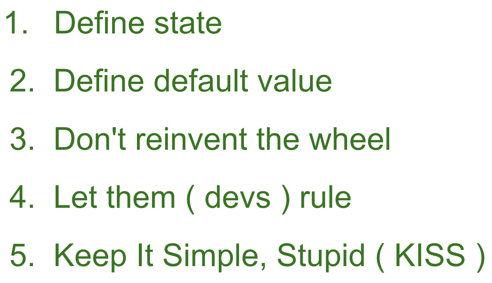
So, we got a shortlist of recommendations that it would be nice to follow.
- Define state
- Define default value
- Don’t reinvent the wheel
- Let them ( devs ) rule
- Keep It Simple, Stupid ( KISS )
But our brain is so arranged that after writing a couple of three components — we begin to think that we do not need to look into this list to check all the points. And we know that among the more complex task and the easier one, we always choose the easier one because it works like that. We love saving our energy, we need it, in reserve. Therefore, such lists are always lost in the confluence until better times, and we continue to bugfix to the master.
Only if we understand that making it wise for us, in general, will be easier than not to sleep for two weeks in a row, fixing bugs in production, we will make the task more difficult (for objective reasons) and easier (for our reasons).
How then to deceive our brain and make recommendations work?
Well, let’s try to automate this.
Automatization
We can use the eslint + lefthook bundle or any other git-hooks tool.

We describe the rules of how we want to see our variables and how our code should be styled. We forbid magic numbers and literals in templates, we expect from us that we will write docks for our code immediately. We hang up these checks for a git hook and get automatic notifications that our code is bad and should be updated.
But this is not a silver bullet and we cannot fulfil all the recommendations. Only a part.

In this way, we cannot handle our possible states and can’t guarantee that other devs will get what they want. We can just assume, for example, that something will return anyway (aka default value) but no more.
Then you can try another way. Develop our components through SDD. Storybook Driven Development.
Storybook Driven Development
We have a story file in the form where we describe all the possible states of the component. And a storybook collecting these stories.
Our stories about component
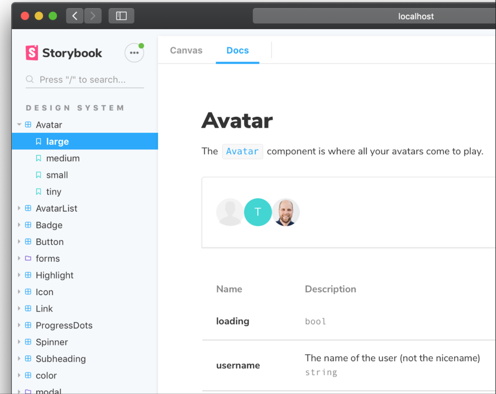
How storybook show stories to us
Developing your components in isolation from the working environment is not only a plus to the purity of the components, but it will also allow you to immediately see which states are not covered by the tests, and which, in principle, are absent.
But in the end, this also will not give us everything that we want.

Therefore, only one thing remains.
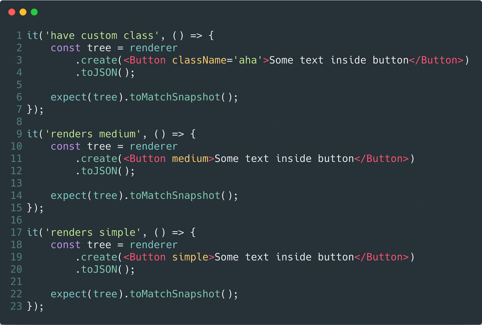
Tests and Snapshots
Since our components are atoms and molecules, it becomes a pleasure to write unit tests, each component is responsible for one functionality that we can easily test by discarding several items from the list of recommendations at once.
We can set up snapshot checks, which will allow us to monitor the state of our components and to learn all the changes in the future.
We can use a bundle with an enzyme to control our expectations during development. And strangely enough, when it comes to recommendations in which we expect something from a developer who writes code, only tests and their writing can best suit. They were literally invented for this.
And here we go…
Write tests for your components. Thanks.
