Introduction
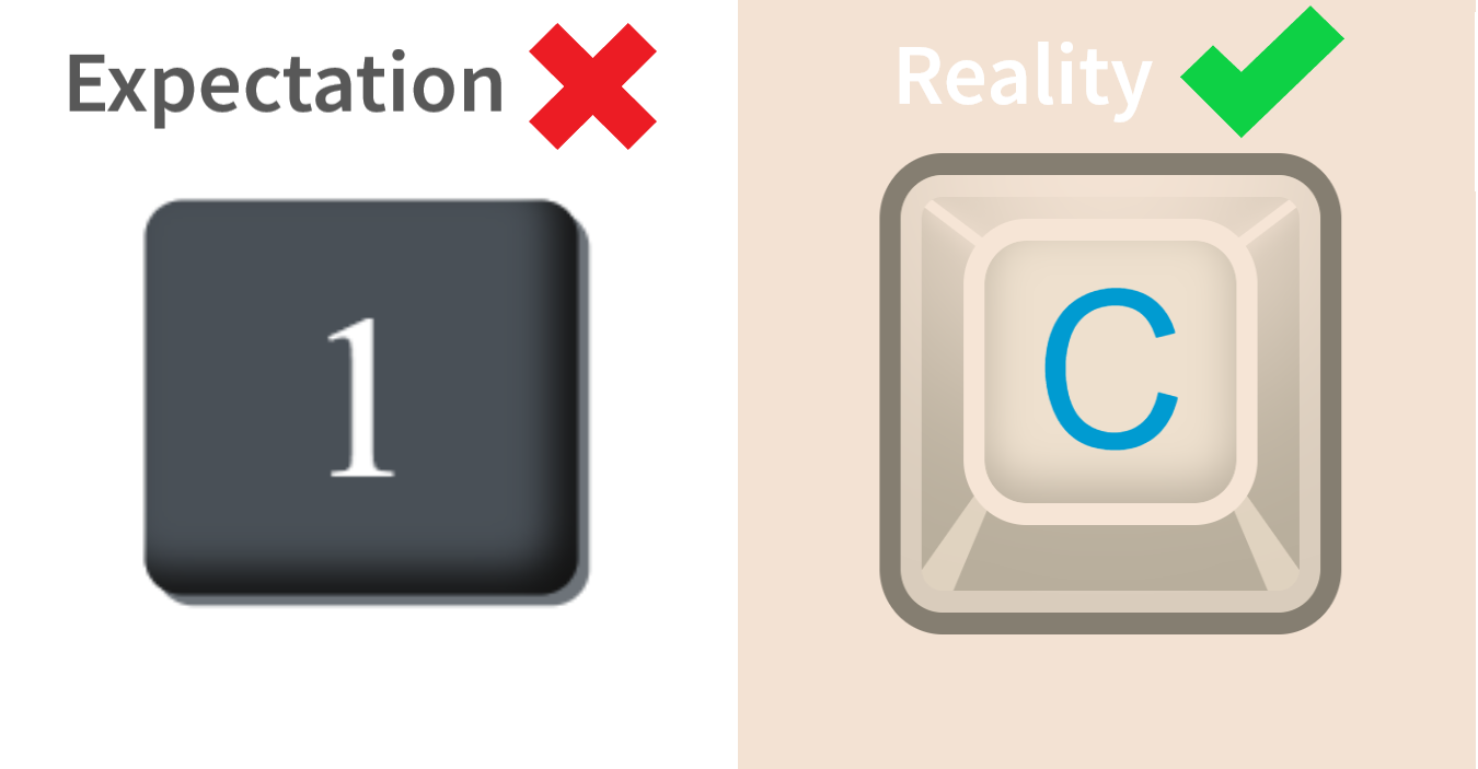
Hello, today we will create a 3D Keyboard Key like on the picture below (of course this will be a reality).
Prehistory
I have already written an article about how to create a 3D Keyboard Key. But it had a little portion of deception (just look at the expectation above). I inserted an image above in the article but created the key with very different styles.
I didn't do it on purpose. I understood my mistake when I had read one comment.

I promised that I would create a Keyboard Key like on the preview image. I kept my promise.
Let's start the creation!
Creation process
The creation of such key in CSS is a hard task. I spend a whole evening (~ 3 hours) to implement this 3D Keyboard Key. It will be very cool if you vote for this article and leave any comment below.
Before we start writing CSS we need to create an HTML structure.
<div class="key" type="button">
  <span class="text">C</span>
</div>
Okay, we have a container with class .button and .text which contains the needed key letter. Let's add CSS to the .key class.
.key {
  position: relative;
  z-index: 50;

  display: flex;
  justify-content: center;
  width: 20rem;
  height: 20rem;
  overflow: hidden;

  background-color: #b7ad9b;
  border: 1rem solid #857e71;
  border-radius: 3rem;
  cursor: pointer;

  transition: 0.1s;
}
Let's discuss some CSS properties.
z-index allows placing an item on a layer above or below it. For example, an element with z-index: 100 will be positioned higher and overlap the element with z-index: 50.
display: flex is a part of Flexbox which allows to position elements on the web-page. In our class .key justify-content: center; places elements in the center of the page along the X-axis.
Note: Flexbox is a great tool nowadays. It is a modern approach to the creation of web-page layouts. I highly recommend you to learn it. There is a Flexbox Froggy. It is a fascinating game to learn Flexbox.
overflow: hidden removes scrolling inside an element, and if there is too much content, it hides some of that content.
cursor: pointer change the cursor on the image of a pointing hand after hovering the cursor over an element.

Okay, we got it covered. Now let's add styles to the class .text inside the class .key.
.key .text {
  position: relative;
  top: 2rem;
  z-index: 100;

  display: flex;
  justify-content: center;
  align-items: center;
  width: 12rem;
  height: 12rem;

  font-size: 10rem;
  font-family: Arial, Helvetica, sans-serif;
  color: #009bd1;

  background-color: #eee0ce;
  border: 1rem solid #f6e5d6;
  border-radius: 3rem;
  box-shadow:
    0 -10rem 10rem 3rem #f6e5d6,
    inset 0rem -0.8rem 2rem #baaf9e;

  transition: 0.1s;

  -webkit-user-select:      none;
     -moz-user-select: -moz-none;
          user-select:      none;

   -khtml-user-select:      none;
       -o-user-select:      none;
}
I understand that you are now looking at the end of the class and your face looks like this picture:

But keep calm. This set of weird properties just removes a selection of the text in different browsers. If you wish you can omit it.
Let's discuss the most unclear properties of the class .text.
- top: 2rem; translates element with class .text on 2rem from the top of an element with class .key. It works only if you will write the property position: value.
Note: the rem unit sets the size relative to the font size of the html tag.
transition: 0.1s; allows you to define the transition between two states of an element.
box-shadow creates the shadow for the element. If you write inset before its value the shadow will be inside.
The full template of the box-shadow property: offset-x | offset-y | blur-radius | spread-radius | color.
The result of our manipulations with .key and .text classes gives us something like this:

We also need to add another stroke of a different color, as in this picture:

It will be more rational if we do this with the pseudo-element ::before.
Note: you can read about pseudo-elements here.
.key::before {
  content: "";
  position: absolute;
  top: 0;
  left: 0;
  z-index: 50;

  width: 90%;
  height: 90%;

  border: 1rem solid #d9ccbc;
  border-radius: 2rem;
}
Okay, now we need to add an animation of the pressing on the 3D Keyboard Key. We can do it by using pseudo-class :active. it is triggered after we click on the element.
Note: you can read about pseudo-classes here.
.key:active {
  box-shadow: inset 0 -10rem 7rem #857e71;
}

.key:active .text {
  width: 11rem;
  height: 11rem;

  font-size: 9rem;
}

.key:active .text {
  width: 11rem;
  height: 11rem;

  font-size: 9rem;

  box-shadow: 0 -10rem 10rem 3rem #f6e5d6,
  inset 0rem 1rem 2rem #baaf9e;
}
This code creates a complex animation by changing some CSS property values after the user clicks on our Keyboad Key. It looks like this:

It already looks cool and awesome. But it doesn't look like a preview image yet. We need to create a bulge effect on the key. We will do it by adding 4 elements in the HTML structure with an absolute position.
 <div class="key" type="button">
        <span class="text">C</span>

        <div class="angle-shadow left-top top-section"></div>
        <div class="angle-shadow right-top top-section"></div>
        <div class="angle-shadow left-bottom bottom-section"></div>
        <div class="angle-shadow right-bottom bottom-section"></div>
 </div>
Each of our elements has 3 classes:
.angle-shadow adds common styles for each 4 elements.
.left(right)-top(bottom) adds styles that are unique to a particular element.
.top-section and .bottom-section classify styles to the elements that are placed at the top and bottom of the element with class .key.
Let's look at the CSS code for these 4 elements.
1) .angle-shadow:
.angle-shadow {
  position: absolute;
}
2) .left(right)-top(bottom):
.angle-shadow.top-section {
  top: 3rem;

  width: 7rem;
  height: 0.5rem;

  background-color: #f6e5d6;
  box-shadow: 0 0 1rem #f6e5d6;
}

.angle-shadow.bottom-section {
  bottom: 0rem;

  border-right: 1rem solid transparent;
  border-bottom: 9rem solid #dfd2bf;
  border-left: 1rem solid transparent;
}
You maybe have a question: "Why do I use border-right, border-bottom, etc.?" The answer is very simple. It needs to create a triangle in CSS.
The value transparent just makes transparent the part of the rectangle.
We simply fill in the corresponding triangle in the square with the desired color. This will be more clear if you look at this picture:

Note: the code for the picture above you can find here.
3) Finally, we will add unique styles for every 4 elements:
.angle-shadow.left-top {
  left: 0.5rem;
  transform: rotate(36deg);
}

.angle-shadow.right-top {
  right: 0.5rem;
  transform: rotate(-36deg);
}

.angle-shadow.left-bottom {
  left: 2.5rem;
  transform: rotate(30deg);
}

.angle-shadow.right-bottom {
  right: 2.5rem;
  transform: rotate(-30deg);
}
The transform: rotate(90 deg) property simply rotates the element by the specified degree.
The final result of 3D Keyboard Key:

The Final Code
The final code of the 3D Keyboard Key you can find in my CodePen account.
Link: Single 3D Keyboard Key
The Final Code like on the preview image
Here is a code of 3 Keyboard Keys like on the preview image. it contains the code for a Long Keyboard Key.
Link: 3D Keyboard Keys (with long Key)
Conclusion
I think this article was useful for you and you learned something new about CSS and HTML. If so, you can vote below and leave a comment.
My social networks
Also if you want to get notifications about my new articles you can follow me in Medium and my Twitter account:
If you have questions or you interested in my articles, you can check and subscribe on my social media:
