Доброго времени суток уважаемые хабражители. На сегодняшний день большинство техник создания меню-гармошки включают в себя использование псевдо-класса
Поэтому хочется показать Вам пример реализации Accordion меню на чистом CSS с помощью псевдо-класса
Само меню будет находиться в
:target. Проблема использования :target заключается в невозможности закрыть какой либо блок в нашем меню, работать будет только «рыскрытие» гармошки. 
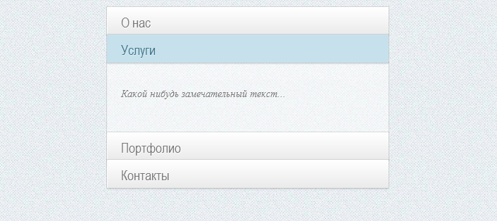
Пример 1: раскрывающийся список (checkbox)
Пример 2: схлопывающийся список (radio)
Поэтому хочется показать Вам пример реализации Accordion меню на чистом CSS с помощью псевдо-класса
:checked. С помощью этого метода у Вас появиться возможность контролировать открытие/закрытие блоков. Меню будет двух типов: полностью раскрывающееся и отображение одного блока при схлопывании других. Использовать будет checkbox и radio соответственно.HTML разметка
Само меню будет находиться в
 с классом ac-container. Внутри каждого раздела разместим checkbox и , который будет привязан к input по соответствующему ID.

<section class="ac-container">
    <div>
        <input id="ac-1" name="accordion-1" type="checkbox" checked />
        <label for="ac-1">О нас</label>
        <article>
            <p>Какой нибудь замечательный текст... </p>
        </article>
    </div>
    <div>
        <input id="ac-2" name="accordion-1" type="checkbox" />
        <label for="ac-2">Услуги</label>
        <article>
            <p>Какой нибудь замечательный текст...</p>
        </article>
    </div>
    <div>
        <input id="ac-3" name="accordion-1" type="checkbox" />
        <label for="ac-3">Портфолио</label>
        <article>
            <p>Какой нибудь замечательный текст...</p>
        </article>
    </div>
    <div>
        <input id="ac-4" name="accordion-1" type="checkbox" />
        <label for="ac-4">Контакты</label>
        <article>
            <p>Какой нибудь замечательный текст...</p>
        </article>
    </div>
</section>


CSS стили

Укажем ширину основного блока и размести его по центру страницы

.ac-container{
    width: 400px;
    margin: 10px auto 30px auto;
}


Простилизуем . C помощью него мы будем симулировать нажатие на input. Добавим относительное позиционирование и z-index. Для красоты отображения укажем градиент:


.ac-container label{
    font-family: 'BebasNeueRegular', 'Arial Narrow', Arial, sans-serif;
    padding: 5px 20px;
    position: relative;
    z-index: 20;
    display: block;
    height: 30px;
    cursor: pointer;
    color: #777;
    text-shadow: 1px 1px 1px rgba(255,255,255,0.8);
    line-height: 33px;
    font-size: 19px;
    background: -moz-linear-gradient(top, #ffffff 1%, #eaeaea 100%);
	background: -webkit-gradient(linear, left top, left bottom, color-stop(1%,#ffffff), color-stop(100%,#eaeaea));
	background: -webkit-linear-gradient(top, #ffffff 1%,#eaeaea 100%);
	background: -o-linear-gradient(top, #ffffff 1%,#eaeaea 100%);
	background: -ms-linear-gradient(top, #ffffff 1%,#eaeaea 100%);
	background: linear-gradient(top, #ffffff 1%,#eaeaea 100%);
	filter: progid:DXImageTransform.Microsoft.gradient( startColorstr='#ffffff', endColorstr='#eaeaea',GradientType=0 );
	box-shadow:
		0px 0px 0px 1px rgba(155,155,155,0.3),
		1px 0px 0px 0px rgba(255,255,255,0.9) inset,
		0px 2px 2px rgba(0,0,0,0.1);
}
}

.ac-container label:hover{
    background: #fff;
}


При нажатом input добавим стиль для соотвествующего выделенного  при открытом блоке меню:


.ac-container input:checked + label,
.ac-container input:checked + label:hover{
    background: #c6e1ec;
    color: #3d7489;
    text-shadow: 0px 1px 1px rgba(255,255,255, 0.6);
    box-shadow:
        0px 0px 0px 1px rgba(155,155,155,0.3),
        0px 2px 2px rgba(0,0,0,0.1);
}


С помощью псевдо-класса :after добавим иконки стрелочек вверх и вниз для label при наведении

.ac-container label:hover:after,
.ac-container input:checked + label:hover:after{
    content: '';
    position: absolute;
    width: 24px;
    height: 24px;
    right: 13px;
    top: 7px;
    background: transparent url(http://netcribe.com/example/arrow_down.png) no-repeat center center;
}

.ac-container input:checked + label:hover:after {
    background-image: url(http://netcribe.com/example/arrow_up.png);
}


Прячем input и стилизуем article:

.ac-container input{
    display: none;
}

.ac-container article{
    background: rgba(255, 255, 255, 0.5);
    margin-top: -1px;
    overflow: hidden;
    height: 0px;
    position: relative;
    z-index: 10;
    -webkit-transition: height 0.3s ease-in-out, box-shadow 0.6s linear;
	-moz-transition: height 0.3s ease-in-out, box-shadow 0.6s linear;
	-o-transition: height 0.3s ease-in-out, box-shadow 0.6s linear;
	-ms-transition: height 0.3s ease-in-out, box-shadow 0.6s linear;
	transition: height 0.3s ease-in-out, box-shadow 0.6s linear;
}
.ac-container input:checked ~ article{
     -webkit-transition: height 0.3s ease-in-out, box-shadow 0.6s linear;
	-moz-transition: height 0.3s ease-in-out, box-shadow 0.6s linear;
	-o-transition: height 0.3s ease-in-out, box-shadow 0.6s linear;
	-ms-transition: height 0.3s ease-in-out, box-shadow 0.6s linear;
	transition: height 0.3s ease-in-out, box-shadow 0.6s linear;
    box-shadow: 0px 0px 0px 1px rgba(155,155,155,0.3);
    height 100px;
}

.ac-container article p{
    font-style: italic;
    color: #777;
    line-height: 23px;
    font-size: 14px;
    padding: 20px;
    text-shadow: 1px 1px 1px rgba(255,255,255,0.8);
}


Обидно только, что для article необходимо указывать фиксированную высоту. Если параметр height будет auto то анимация не будет работать.


Спасибо всем за внимание.
