When you have an idea of a new game mechanic, or even flash of interesting concept — soon you'll be obsessed about it with an immense urge to start doing something already. Sometimes you write such ideas down somewhere and bring them a chance to ignite full development cycle later. But I've stumbled upon the opposite action. My current game became this giant monster eating finance and time, and grown much bigger than I ever thought. So, I've needed to put it back for a while. But I could not sit without game development, and in my free time I've started to work on my new project! Plus that one was quite different from the previous ones, because I've decided to target mobile. If you are interested in how this project was done, from a small idea to the final release, then let's dive into it!

Clearly, I'm telling about my experience and my vision, but many things would be common for any project, and maybe you'll find some useful tips for yourself.
The main idea was pretty simple — let's make a labyrinth, a maze! Although you can find some simple games in such genre at the store, but I believe that you should bring something more into the game than just following genre cliche. I have a deep concern about game-design in general, loving the stories and full adventure experiences with a distinct start and the prominent ending. I could not make here an exception to my ideals. Additionally I wanted some interesting gameplay mechanic. My approach was to add another variable to the whole escape the labyrinth concept. And after some brainstorming, the new idea was born. That was the chain and the system of chain-switches. So the main character's movement is restricted by the chain length and the paths that player chose. With that in mind, you'll need not only to find the exit but to find the shortest way possible! And what if I tell you that your chain is quite short and you can go further only after a Chain-switch that will provide the new anchor point and the new chain with different length. Now, the game starts to be more difficult, because you'll need to find the right order of those switches inside the labyrinth. And if that was not enough for you — then let's add doors, that you need to open with special activators somewhere inside a labyrinth and then to come back still thinking about the switches and the chain.
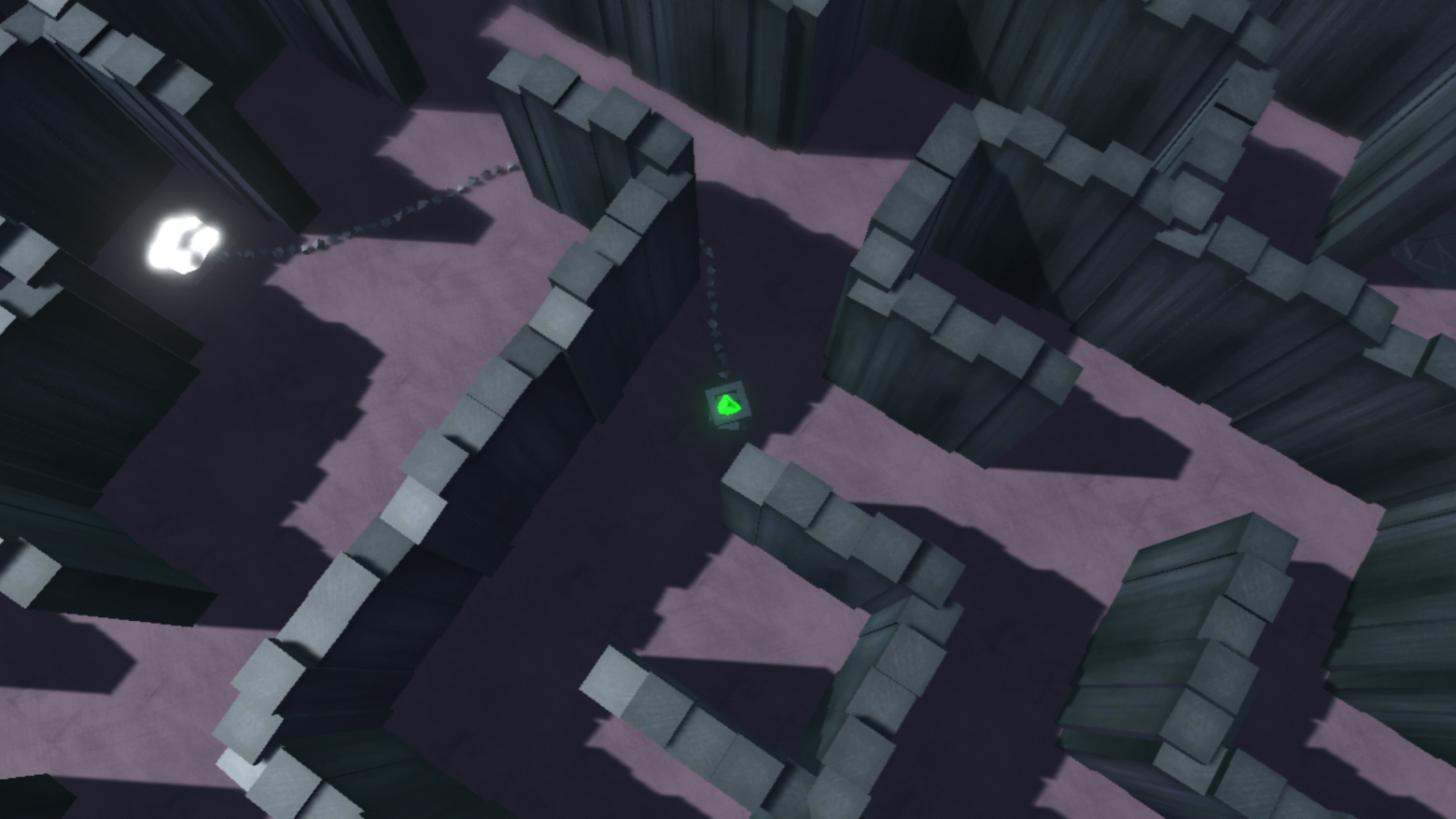
Certainly, it was not easy to plan all of those features ahead. Some of them were made because of technical limitations and strict time management. The purpose was to make it as fast as I can and not to dramatically increase the complexity of all game-aspects in the process of development. The chain was made using the joints, and could not be processed by game engine physics after some length, literally bursting into pieces. So I've needed to restrict its length and still be able to continue the path. Indeed, there was a solution to write fully custom chain scripts faking the real physics, but that was a time-consuming task that I could not afford.
Still, I've managed to maintain some length to the chain, and the initial thought was to make small labyrinth chambers where you need to find the shortest way, but that was not enough. If the whole game was like that, then it'll be quite tedious because you have just one repetitive task without changing the experience, or even the difficulty. Still, those ideas played a part in the final game.
After some prototyping, it was clear that labyrinths, where you have to go astray from the shortest route and even have some backtracking, were the most interesting ones. So the final decision was to add separate gameplay sections one after another — the big labyrinths with multiple switches and small labyrinths with the shortest way possible. All of them connected with some empty corridors to free the player's mind from the sense of constant challenge. But right in the time of testing came another idea that provided a new critical thought — we need more gameplay mechanics. Because being in the same walls of these labyrinths one after another, even with some difficulty curve, was still not enough to keep players attention.
To add up for the attention span, do not forget that the game is targeted for Mobile platform. Never design it to have lengthy game-sessions without any break. I've decided to make saves on every chain-switch, so the player can leave at any moment and never be far away from the previous game session. Of course, I' m having some intentions of how the game should be played, but my maximum intended uninterrupted session is about 5 minutes. That just includes scenes where the music is presented.
Returning to the mechanics variety, I've added puzzles involving chain as the tool to solve them. It is a great game-design solution — to reuse world objects that you already familiar with as the new purpose tool.
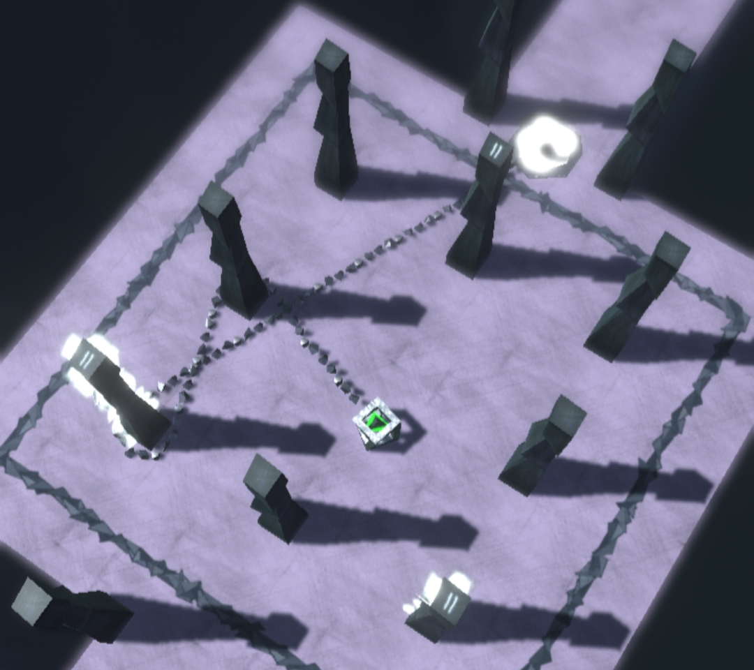
There were various ideas of many different puzzles with this new tool, but the final decision was to implement just one type with variation in its difficulty. If you think that your game needs all of your new ideas and its variations, but you have no time to implement them, then stop! Your goal here is to finish the game. In the case, you'll not implement those features now, or even till the end of the development cycle — the one solution is to update game later, and the second and more radical — to make a completely new game later with all the lacked features. If you'll have the core product in your hand, then it would be easier to continue. Just not let the features to stop the release. Do it only if they are the critical part of the complete product that adds a unique experience to it and you can not imagine the game without those features.
The chain was made with configurable joints with locked motion on all axes. Then instantiated as chain segments, with 4 rigidbodies connected together by 4 joints in one segment. The chain sources are similar to the wells. For proper functioning, I just removed segments that were going under the surface and instantiated new ones when the last joint of the segment went close to the surface. Also, the last joint's rigidbody was restricted to have vertical movement only to stand as the anchor. Additionally, the rope has special collision material without much friction.
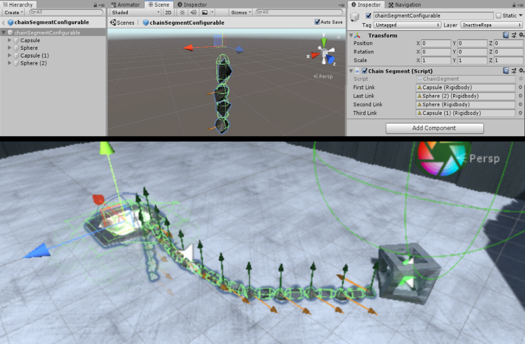
The player was made with a rigidbody that has simple follow to target script to move it. And the target has a navigation agent on it. So when we move our joystick, then we move the target only with the navigation system, and the player's rigidbody tried to reach the target by physical force. If we would have just the navigation system, then the chain could not stop it, and the player acted just as the kinematic rigidbody with absolute position control. The only issue with the force application is that with the variable count of chain segments, we also have the variable in attached mass to the player. Then if you have to much mass at the end limit of the chain, it will explode. And otherwise, the player would be dragged backwards by the chain or not move at all. So I applied a change in mass relative to the actual chain length. But the most interesting solution against the chain explosion — destabilization of its physics, was to limit the maximum velocity in its singular parts by a custom script.
The Labyrinth itself was made out of the smaller mazes, puzzles and the corridors that connected them all. When I first started to design those mazes — I just took my pen and squared paper and started to sketch them out wall by wall. But after numerous changes because of the real prototyping, and how it was affected by the chain, I was sure that it was the most ineffective way of doing things. So, I've made a custom editor window for my mazes. It was just like the pen and paper but with a saved state that could generate the complete maze out of walls, floor, and chain-sources prefabs. I've also added control over the chain-sources length, and it was the complete solution to the designing labyrinth problem.
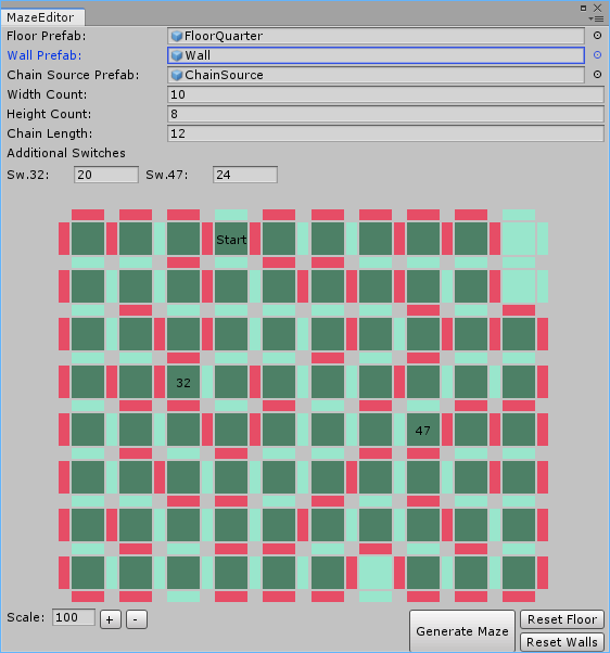
Just keep in mind that for editor time instantiation you should use PrefabUtility methods and not the common Instantiate because otherwise, you'll get clones of your prefab objects detached from the original prefab.
It is personal preference but I love post-processing and could not imagine my game without it. Bloom is a must-have option, but I also like Depth-of-Field and the simple FXAA solution. With the new post-processing stack the steps to implement it properly were quite simple. I've also added trigger sphere above the player, that had another profile with the Chromatic Aberration effect, which moved onto the player at the switch time. Plus, the separate profile for the ending cinematic. But after one of the updates, everything stopped working, and after testing on the device, I've stumbled on another issue. With a little bit of RenderDoc, the reason was clear and immediately fixed, but I hope that we would see the official fix from Unity team.
When the game was almost ready, and the initial playthrough on my device was done, I've tried to launch the game on not so powerful device that I had earlier in the development. That was pathetic. I have noticed small dips on my device before, but after the initial steps with solving the overheating problem, I thought that I would never see such a dramatic stutter.
For the overheating — the steps are straightforward, I did not need 60fps, so locked that to 30. Plus custom resolution scaler that limited the short screen size to 720p. One other trick with changing time-steps at Time Manager did not work for me, because of such a reliance on heavy physics calculations. When I've tried to increase the time-step, the chain quite frequently exploded reaching its limits.
All of that work was done prior to the weak device testing. So I've started to look closer into the profiler.
One interesting point was that I had too many audio sources that were enabled all the time. But I never needed them all simultaneously, and the events of playing them were quite deterministic. I've ended up with almost all the sources disabled by default, and enabling them only for the needed sound activation and then disabling them right after the end of the sound.
Some scripts benefited from manual updates instead of the proprietary ones, especially when I had many similar objects with the same script and an Update method inside them. Just rename your Update method to ManualUpdate and call it from outside. In my case, all of my puzzles were onto the scene, and they called their update methods, also every pillar inside every puzzle had its own update method, and even pillar's triggers had their own update methods. Without those multiple automatic updates and calling update method manually on every object from a single place, I've managed to significantly reduce the overhead of Unity's internal methods calls.
The last but one of the most important things within optimization is the rendering part. If you want to ship your mobile game with Standard shaders — then you are insane! Maybe in some rare cases with small materials count and small shader variants complexity, because standard shader has tons of them, you could accomplish it while targeting top-tier devices only. But in my case, I've ended up with almost all shaders changed to use custom ones, based on mobile surface variants. But I haven't found a good way to simulate metallic/smoothness with a custom lighting model, so only shiny metallic materials ended up with standard shader. However, if you see the compiled versions, then it is no brainer to choose the right one when you have over 190 operations in the standard shader versus less than 70 in a custom one. Remember that PBR approach, which includes the default standard shader, is really GPU intensive and far too complex for mobile. You should use shaders specifically optimized for mobile right from the beginning of development. Make them for yourself, or use those that are built into Unity.
The next performance tip is to check the frame debugger for unusual batching breaks. Or just to see how many drawcalls you need to render the whole scene.
I had strange behavior when debugger revealed that some objects rendered sequentially break the batch despite having the same material. Even the message was unclear because it said that I have different light sources for them. But the whole scene used the only one directional light source! Those objects had the same material, and all their properties were the same! But not all of them because I was looking only into the material and rendering properties. The true reason was that I changed my lightsource to custom culling by layers. And the breaking sequence object was in a specific layer that just was not lit.
Anyway, sometimes the frame debugger shows a strange order of rendering that breaks the batching. Some of those occurrences were ridiculous, and the manual material render-queue correction helped to resolve it.
Also, frame debugger showed that despite having almost all of the rendered objects as static, I had a lot of batches that did not make any sense. Just because I had so many of them, that the batcher made many static batch meshes, and never tried to group them by position. In that case, I had my labyrinth walls at one screen made up from 5 or 6 different batches. But those made of the same material! I've ended up with adding only floor objects as static because all of them made it inside one batched mesh. And the rest was left with the walls batched dynamically without any issues, with their material queue corrected to a unique one. The dynamic batching makes some hit on the CPU, but in my case, the difference even on the weak device was just marginal in comparison to the custom static batching through the StaticBatchingUtility. And dynamic batching was still more effective for me at saving drawcalls than custom static one at the edge cases.
The other things that the frame debugger pointed out were the shadows and cascades. If you are curious, then every shadow cascade is pretty much another shadowpass for the entire screen. So, if you have several batches inside shadowpass then multiply that number to the number of cascades you've got. I've just disabled the cascades after this discovery. But I still needed decent real-time shadows and ended up with adjusting the camera clipping distance and switching to the close-fit shadows at medium quality. I know that they are not the prettiest ones, but it was much better than having stable ones with inferior resolution or none shadows at all.
The last one inside frame debugger and performance is post processing. Even with only a couple effects enabled, those were almost the heaviest ones — Bloom and Depth of Field. Both of them used sampling the frame to low resolution but having different input texture and different filter shaders. I've had already changed Bloom to use fast-Mode — square filter inside the shader instead of more complex circular. Sadly that was not enough. So I've ended up with changing the resolution scale factor inside effect's initial frame buffer. It is using half-Res by default, but I've seen big improvements when used not the half resolution but just one-third of it. Shrinking it further to one-fourth had almost no effect with further degrading visuals. So my solution to post processing on mobile is one third! Or using completely custom solutions.
Naturally, every project is unique, and you should think about yours in particular, but here I just wanted to show which parts I've decided to put in my polish process and why.
The first steps of polish were made right after the first alpha test and before the performance optimizations. With the initial feedback, I've added minor features that were almost there, but have not quite stood out.
The first one was the colored floor, that I had a vision right from the start of development, but in the actual process all the pallets that I could think of looked kind of unnatural. So in the first round, I've ended just with the color gradient from bright to dark during the whole game path. But the test showed that this was not enough. With a bit of struggle through all the colors combinations, the right one was created. Even this small visual detail had a noticeable impact on overall game feeling. With the distinction between stages, you had more sense of accomplishment and progress.
The other notion was the urge to have more fun and dynamic feel of the player. Even though I was not a fan of it at first, but I've managed to find a small compromise that felt better but not overhauled the calm feel of the character. That was the locking of the crystal within the player to never rotate relatively to the world. But to the player that felt like the inner crystal turned on every move. Actually, when I was just a kid, I've had a ball that had another one inside of it. That inner part floated in a small amount of liquid substance that was not noticeable, and when you rolled it on the surface, it looked like it's hovering without any rolling at all. This feature slightly reminded me of that unique feeling.
After all of the performance changes the game started to work as intended even on that low-performance device. Not the lowest, but that was OK for me. And then I've got some time to think about other features that will impact on the overall game feeling and were critical to my vision.
The first one was leaving the scratches on the floor and was quite fast implemented as decals pool. Even though you may never see it, but it definitely adds up to the labyrinth atmosphere.
The second feature that affected the overall feel in my eyes were some stones in the corridors that should've to add more dynamic to the empty cold world. That was just the vision thing, and also without any trouble implemented into the final game. It presented an oddly satisfying feel every time when you see those small stones falling into the dark.
After all of the testing is done and you're satisfied with the polish, you're ready for the release!
For me, the main goal right from the beginning was to make single-player experience without any distractions. So the decision was clear: no Ads, no in-game purchases, no loot-boxes. For those features, you should design the game from the beginning to heavily rely on them to be an essential part of the experience. In my case, I knew that the whole game for an average player is going to be about three to four hours of experience. Thus I placed a reasonable fixed price and let it go. It is not enough time passed since the release to think of any substantial sales and also without any promotion yet. But as a developer, I am quite satisfied with the game, and if ever someone will like it then it is a success for me.
In the end, there were some features left behind. Particularly one still needs to be done to complete the game atmosphere, but it is not something radically changing the experience, so that can be done as a post-release update. The rest of the features could never go out. Sadly for me, I've got an exciting idea right at the time of testing the final release. I think that happened because there was a week pause in the development, and I've got a fresh look after a return. Maybe someday there would be the second game, but right now all the ideas will wait for their hour to be brought back on the new development cycle.

Clearly, I'm telling about my experience and my vision, but many things would be common for any project, and maybe you'll find some useful tips for yourself.
Sculpting on the idea foundation
The main idea was pretty simple — let's make a labyrinth, a maze! Although you can find some simple games in such genre at the store, but I believe that you should bring something more into the game than just following genre cliche. I have a deep concern about game-design in general, loving the stories and full adventure experiences with a distinct start and the prominent ending. I could not make here an exception to my ideals. Additionally I wanted some interesting gameplay mechanic. My approach was to add another variable to the whole escape the labyrinth concept. And after some brainstorming, the new idea was born. That was the chain and the system of chain-switches. So the main character's movement is restricted by the chain length and the paths that player chose. With that in mind, you'll need not only to find the exit but to find the shortest way possible! And what if I tell you that your chain is quite short and you can go further only after a Chain-switch that will provide the new anchor point and the new chain with different length. Now, the game starts to be more difficult, because you'll need to find the right order of those switches inside the labyrinth. And if that was not enough for you — then let's add doors, that you need to open with special activators somewhere inside a labyrinth and then to come back still thinking about the switches and the chain.

Understanding the limits
Certainly, it was not easy to plan all of those features ahead. Some of them were made because of technical limitations and strict time management. The purpose was to make it as fast as I can and not to dramatically increase the complexity of all game-aspects in the process of development. The chain was made using the joints, and could not be processed by game engine physics after some length, literally bursting into pieces. So I've needed to restrict its length and still be able to continue the path. Indeed, there was a solution to write fully custom chain scripts faking the real physics, but that was a time-consuming task that I could not afford.
Still, I've managed to maintain some length to the chain, and the initial thought was to make small labyrinth chambers where you need to find the shortest way, but that was not enough. If the whole game was like that, then it'll be quite tedious because you have just one repetitive task without changing the experience, or even the difficulty. Still, those ideas played a part in the final game.
Inspiration and thoughts: Prototyping experience
After some prototyping, it was clear that labyrinths, where you have to go astray from the shortest route and even have some backtracking, were the most interesting ones. So the final decision was to add separate gameplay sections one after another — the big labyrinths with multiple switches and small labyrinths with the shortest way possible. All of them connected with some empty corridors to free the player's mind from the sense of constant challenge. But right in the time of testing came another idea that provided a new critical thought — we need more gameplay mechanics. Because being in the same walls of these labyrinths one after another, even with some difficulty curve, was still not enough to keep players attention.
To add up for the attention span, do not forget that the game is targeted for Mobile platform. Never design it to have lengthy game-sessions without any break. I've decided to make saves on every chain-switch, so the player can leave at any moment and never be far away from the previous game session. Of course, I' m having some intentions of how the game should be played, but my maximum intended uninterrupted session is about 5 minutes. That just includes scenes where the music is presented.
Returning to the mechanics variety, I've added puzzles involving chain as the tool to solve them. It is a great game-design solution — to reuse world objects that you already familiar with as the new purpose tool.

There were various ideas of many different puzzles with this new tool, but the final decision was to implement just one type with variation in its difficulty. If you think that your game needs all of your new ideas and its variations, but you have no time to implement them, then stop! Your goal here is to finish the game. In the case, you'll not implement those features now, or even till the end of the development cycle — the one solution is to update game later, and the second and more radical — to make a completely new game later with all the lacked features. If you'll have the core product in your hand, then it would be easier to continue. Just not let the features to stop the release. Do it only if they are the critical part of the complete product that adds a unique experience to it and you can not imagine the game without those features.
Skim over technical stuff: How the world was built
The chain was made with configurable joints with locked motion on all axes. Then instantiated as chain segments, with 4 rigidbodies connected together by 4 joints in one segment. The chain sources are similar to the wells. For proper functioning, I just removed segments that were going under the surface and instantiated new ones when the last joint of the segment went close to the surface. Also, the last joint's rigidbody was restricted to have vertical movement only to stand as the anchor. Additionally, the rope has special collision material without much friction.

The player was made with a rigidbody that has simple follow to target script to move it. And the target has a navigation agent on it. So when we move our joystick, then we move the target only with the navigation system, and the player's rigidbody tried to reach the target by physical force. If we would have just the navigation system, then the chain could not stop it, and the player acted just as the kinematic rigidbody with absolute position control. The only issue with the force application is that with the variable count of chain segments, we also have the variable in attached mass to the player. Then if you have to much mass at the end limit of the chain, it will explode. And otherwise, the player would be dragged backwards by the chain or not move at all. So I applied a change in mass relative to the actual chain length. But the most interesting solution against the chain explosion — destabilization of its physics, was to limit the maximum velocity in its singular parts by a custom script.
The Labyrinth itself was made out of the smaller mazes, puzzles and the corridors that connected them all. When I first started to design those mazes — I just took my pen and squared paper and started to sketch them out wall by wall. But after numerous changes because of the real prototyping, and how it was affected by the chain, I was sure that it was the most ineffective way of doing things. So, I've made a custom editor window for my mazes. It was just like the pen and paper but with a saved state that could generate the complete maze out of walls, floor, and chain-sources prefabs. I've also added control over the chain-sources length, and it was the complete solution to the designing labyrinth problem.

Just keep in mind that for editor time instantiation you should use PrefabUtility methods and not the common Instantiate because otherwise, you'll get clones of your prefab objects detached from the original prefab.
Post-processing
It is personal preference but I love post-processing and could not imagine my game without it. Bloom is a must-have option, but I also like Depth-of-Field and the simple FXAA solution. With the new post-processing stack the steps to implement it properly were quite simple. I've also added trigger sphere above the player, that had another profile with the Chromatic Aberration effect, which moved onto the player at the switch time. Plus, the separate profile for the ending cinematic. But after one of the updates, everything stopped working, and after testing on the device, I've stumbled on another issue. With a little bit of RenderDoc, the reason was clear and immediately fixed, but I hope that we would see the official fix from Unity team.
Start of the Optimizations road
When the game was almost ready, and the initial playthrough on my device was done, I've tried to launch the game on not so powerful device that I had earlier in the development. That was pathetic. I have noticed small dips on my device before, but after the initial steps with solving the overheating problem, I thought that I would never see such a dramatic stutter.
For the overheating — the steps are straightforward, I did not need 60fps, so locked that to 30. Plus custom resolution scaler that limited the short screen size to 720p. One other trick with changing time-steps at Time Manager did not work for me, because of such a reliance on heavy physics calculations. When I've tried to increase the time-step, the chain quite frequently exploded reaching its limits.
All of that work was done prior to the weak device testing. So I've started to look closer into the profiler.
One interesting point was that I had too many audio sources that were enabled all the time. But I never needed them all simultaneously, and the events of playing them were quite deterministic. I've ended up with almost all the sources disabled by default, and enabling them only for the needed sound activation and then disabling them right after the end of the sound.
Some scripts benefited from manual updates instead of the proprietary ones, especially when I had many similar objects with the same script and an Update method inside them. Just rename your Update method to ManualUpdate and call it from outside. In my case, all of my puzzles were onto the scene, and they called their update methods, also every pillar inside every puzzle had its own update method, and even pillar's triggers had their own update methods. Without those multiple automatic updates and calling update method manually on every object from a single place, I've managed to significantly reduce the overhead of Unity's internal methods calls.
The last but one of the most important things within optimization is the rendering part. If you want to ship your mobile game with Standard shaders — then you are insane! Maybe in some rare cases with small materials count and small shader variants complexity, because standard shader has tons of them, you could accomplish it while targeting top-tier devices only. But in my case, I've ended up with almost all shaders changed to use custom ones, based on mobile surface variants. But I haven't found a good way to simulate metallic/smoothness with a custom lighting model, so only shiny metallic materials ended up with standard shader. However, if you see the compiled versions, then it is no brainer to choose the right one when you have over 190 operations in the standard shader versus less than 70 in a custom one. Remember that PBR approach, which includes the default standard shader, is really GPU intensive and far too complex for mobile. You should use shaders specifically optimized for mobile right from the beginning of development. Make them for yourself, or use those that are built into Unity.
The next stop: Frame debugger
The next performance tip is to check the frame debugger for unusual batching breaks. Or just to see how many drawcalls you need to render the whole scene.
I had strange behavior when debugger revealed that some objects rendered sequentially break the batch despite having the same material. Even the message was unclear because it said that I have different light sources for them. But the whole scene used the only one directional light source! Those objects had the same material, and all their properties were the same! But not all of them because I was looking only into the material and rendering properties. The true reason was that I changed my lightsource to custom culling by layers. And the breaking sequence object was in a specific layer that just was not lit.
Anyway, sometimes the frame debugger shows a strange order of rendering that breaks the batching. Some of those occurrences were ridiculous, and the manual material render-queue correction helped to resolve it.
Also, frame debugger showed that despite having almost all of the rendered objects as static, I had a lot of batches that did not make any sense. Just because I had so many of them, that the batcher made many static batch meshes, and never tried to group them by position. In that case, I had my labyrinth walls at one screen made up from 5 or 6 different batches. But those made of the same material! I've ended up with adding only floor objects as static because all of them made it inside one batched mesh. And the rest was left with the walls batched dynamically without any issues, with their material queue corrected to a unique one. The dynamic batching makes some hit on the CPU, but in my case, the difference even on the weak device was just marginal in comparison to the custom static batching through the StaticBatchingUtility. And dynamic batching was still more effective for me at saving drawcalls than custom static one at the edge cases.
The other things that the frame debugger pointed out were the shadows and cascades. If you are curious, then every shadow cascade is pretty much another shadowpass for the entire screen. So, if you have several batches inside shadowpass then multiply that number to the number of cascades you've got. I've just disabled the cascades after this discovery. But I still needed decent real-time shadows and ended up with adjusting the camera clipping distance and switching to the close-fit shadows at medium quality. I know that they are not the prettiest ones, but it was much better than having stable ones with inferior resolution or none shadows at all.
The last one inside frame debugger and performance is post processing. Even with only a couple effects enabled, those were almost the heaviest ones — Bloom and Depth of Field. Both of them used sampling the frame to low resolution but having different input texture and different filter shaders. I've had already changed Bloom to use fast-Mode — square filter inside the shader instead of more complex circular. Sadly that was not enough. So I've ended up with changing the resolution scale factor inside effect's initial frame buffer. It is using half-Res by default, but I've seen big improvements when used not the half resolution but just one-third of it. Shrinking it further to one-fourth had almost no effect with further degrading visuals. So my solution to post processing on mobile is one third! Or using completely custom solutions.
Almost there: Polish!
Naturally, every project is unique, and you should think about yours in particular, but here I just wanted to show which parts I've decided to put in my polish process and why.
The first steps of polish were made right after the first alpha test and before the performance optimizations. With the initial feedback, I've added minor features that were almost there, but have not quite stood out.
The first one was the colored floor, that I had a vision right from the start of development, but in the actual process all the pallets that I could think of looked kind of unnatural. So in the first round, I've ended just with the color gradient from bright to dark during the whole game path. But the test showed that this was not enough. With a bit of struggle through all the colors combinations, the right one was created. Even this small visual detail had a noticeable impact on overall game feeling. With the distinction between stages, you had more sense of accomplishment and progress.
The other notion was the urge to have more fun and dynamic feel of the player. Even though I was not a fan of it at first, but I've managed to find a small compromise that felt better but not overhauled the calm feel of the character. That was the locking of the crystal within the player to never rotate relatively to the world. But to the player that felt like the inner crystal turned on every move. Actually, when I was just a kid, I've had a ball that had another one inside of it. That inner part floated in a small amount of liquid substance that was not noticeable, and when you rolled it on the surface, it looked like it's hovering without any rolling at all. This feature slightly reminded me of that unique feeling.
After all of the performance changes the game started to work as intended even on that low-performance device. Not the lowest, but that was OK for me. And then I've got some time to think about other features that will impact on the overall game feeling and were critical to my vision.
The first one was leaving the scratches on the floor and was quite fast implemented as decals pool. Even though you may never see it, but it definitely adds up to the labyrinth atmosphere.
The second feature that affected the overall feel in my eyes were some stones in the corridors that should've to add more dynamic to the empty cold world. That was just the vision thing, and also without any trouble implemented into the final game. It presented an oddly satisfying feel every time when you see those small stones falling into the dark.
Release point
After all of the testing is done and you're satisfied with the polish, you're ready for the release!
For me, the main goal right from the beginning was to make single-player experience without any distractions. So the decision was clear: no Ads, no in-game purchases, no loot-boxes. For those features, you should design the game from the beginning to heavily rely on them to be an essential part of the experience. In my case, I knew that the whole game for an average player is going to be about three to four hours of experience. Thus I placed a reasonable fixed price and let it go. It is not enough time passed since the release to think of any substantial sales and also without any promotion yet. But as a developer, I am quite satisfied with the game, and if ever someone will like it then it is a success for me.
P.S.
In the end, there were some features left behind. Particularly one still needs to be done to complete the game atmosphere, but it is not something radically changing the experience, so that can be done as a post-release update. The rest of the features could never go out. Sadly for me, I've got an exciting idea right at the time of testing the final release. I think that happened because there was a week pause in the development, and I've got a fresh look after a return. Maybe someday there would be the second game, but right now all the ideas will wait for their hour to be brought back on the new development cycle.
P.P.S.
Please, if you find some typo's or grammar errors, send personal messages for me to correct them.
