
Hello, Habr!
About a month ago, I had a feeling of constant anxiety. I began to eat poorly, sleep even worse, and constantly read to a ton of news about the pandemic. Based on them, the coronavirus either captured, or liberated our planet, was either a conspiracy of world governments, or the vengeance of the pangolin, the virus either threatened everyone at once, or personally me and my sleeping cat…
Hundreds of articles, social media posts, youtube-telegram-instagram-tik-tok (yes, I sin) content of varying degrees of content quality did not lead me to anything but an even greater sense of anxiety.
But one day I bought buckwheat decided to end it all. As soon as possible!
I needed a plan of action a little more meaningful than the one I had before.
All I had to do was find the data. Reliable, complete, and up-to-date.
To my relief, this proved to be much easier to do than I had imagined when I realized the task.
My (not) great plan:
- [+] find reliable, complete, up-to-date data on COVID-19 spread in machine-readable format [1, 3],
- [+] read articles that don't say about COVID-19, but instead describe the "math" of spreading viral diseases,
- [+] participate in competitions and try to predict the rate of spread of the coronavirus [2],
- [+] make a couple of completely failed attempts to read relevant research in the field of modern biology and medicine,
- [-] stop shitting in comments to posts on COVID-19 in social networks,
- [+] collect the acquired knowledge in a public GitHub repository [3].
After a month from the date of forming the plan, I found at least one definite plus — it turned out to be feasible. And the mission was completed! So I was at the next stage – independent analysis of the situation.
It quickly became clear that very often the approaches used did not suit me for a number of reasons, which are discussed below.
Uploading COVID-19 spread data:
#'
#' Load COVID-19 spread: infected, recovered, and fatal cases
#' Source: https://github.com/CSSEGISandData/COVID-19/tree/master/csse_covid_19_data/csse_covid_19_time_series
#'
load_covid_spread <- function() {
  require(dplyr)
  require(data.table)
  require(purrr)
  require(tidyr)

  load_time_series <- function(.case_type) {

    path_pattern <- "https://raw.githubusercontent.com/CSSEGISandData/COVID-19/master/csse_covid_19_data/csse_covid_19_time_series/time_series_covid19_%s_global.csv"

    fread(sprintf(path_pattern, .case_type)) %>%
      rename(country = `Country/Region`) %>%
      select(-c(`Province/State`, Lat, Long)) %>%
      group_by(country) %>%
      summarise_if(is.numeric, sum) %>%
      ungroup %>%
      gather(key = "date", value = "n", -country) %>%
      mutate(date = mdy(date))
  }

  dt <- load_time_series("confirmed") %>% rename(confirmed_n = n) %>%
    inner_join(
      load_time_series("recovered") %>% rename(recovered_n = n),
      by = c("country", "date")
    ) %>%
    inner_join(
      load_time_series("deaths") %>% rename(deaths_n = n),
      by = c("country", "date")
    )

  stopifnot(nrow(dt) > 0)

  return(dt)
}

spread_raw <- load_covid_spread()
spread_raw %>% sample_n(10)
Uploading data about the population of countries:
#'
#' Load countries stats
#' Source: https://ods.ai/competitions/sberbank-covid19-forecast
#'
load_countries_stats <- function() {
  require(dplyr)
  require(magrittr)

  dt <- fread("https://raw.githubusercontent.com/codez0mb1e/covid-19/master/data/countries.csv")

  dt %<>%
    select(-c(iso_alpha2, iso_numeric, name, official_name))

  stopifnot(nrow(dt) > 0)

  return(dt)
}

countries_raw <- load_countries_stats()
countries_raw %>% sample_n(10)
Предобработка данных:
data <- spread_raw %>%
  # add country population
  inner_join(
    countries_raw %>% transmute(ccse_name, country_iso = iso_alpha3, population) %>% filter(!is.na(country_iso)),
    by = c("country" = "ccse_name")
  ) %>%
  # calculate active cases
  mutate(
    active_n = confirmed_n - recovered_n - deaths_n
  ) %>%
  # calculate cases per 1M population
  mutate_at(
    vars(ends_with("_n")),
    list("per_1M" = ~ ./population*1e6)
  )

## Calculte number of days since...
get_date_since <- function(dt, .case_type, .n) {
  dt %>%
    group_by(country) %>%
    filter_at(vars(.case_type), ~ . > .n) %>%
    summarise(since_date = min(date))
}

data %<>%
  inner_join(
    data %>% get_date_since("confirmed_n", 0) %>% rename(since_1st_confirmed_date = since_date),
    by = "country"
  ) %>%
  inner_join(
    data %>% get_date_since("confirmed_n_per_1M", 1) %>% rename(since_1_confirmed_per_1M_date = since_date),
    by = "country"
  ) %>%
  inner_join(
    data %>% get_date_since("deaths_n_per_1M", .1) %>% rename(since_dot1_deaths_per_1M_date = since_date),
    by = "country"
  ) %>%
  mutate_at(
    vars(starts_with("since_")),
    list("n_days" = ~ difftime(date, ., units = "days") %>% as.numeric)
  ) %>%
  mutate_at(
    vars(ends_with("n_days")),
    list(~ if_else(. > 0, ., NA_real_))
  )
Plot settings:
theme_set(theme_minimal())

lab_caption <- paste0(
  "Data source: Novel Coronavirus (COVID-19) Cases provided by Johns Hopkins University Center for Systems Science. \n",
  sprintf("Last updated: %s. ", format(max(data$date), '%d %B, %Y')),
  "Source code: github.com/codez0mb1e/covid-19"
)

filter_countries <- function(dt) dt %>% filter(country_iso %in% c("KOR", "ITA", "RUS", "CHN", "USA"))
Issue I: Absolute vs relative values
Issue: absolute number of cases as a key indicator.
Motivation: if we take the absolute number of cases, then a village where 50 out of 100 people got sick is hundreds of times better than Rome (for example) in terms of the epidemiological situation.
Solution: display the percentage of the population of the country (city) that has the disease.
We will conduct an experiment: we will plot the dependence of the number of infected people over time.
ggplot(data %>% filter_countries, aes(x = date)) +
  geom_col(aes(y = confirmed_n), alpha = .9) +

  scale_x_date(date_labels = "%d %b", date_breaks = "7 days") +

  facet_grid(country ~ .) +

  labs(x = "", y = "# of cases",
       title = "COVID-19 Spread (over time)",
       caption = lab_caption) +

  theme(plot.caption = element_text(size = 8))
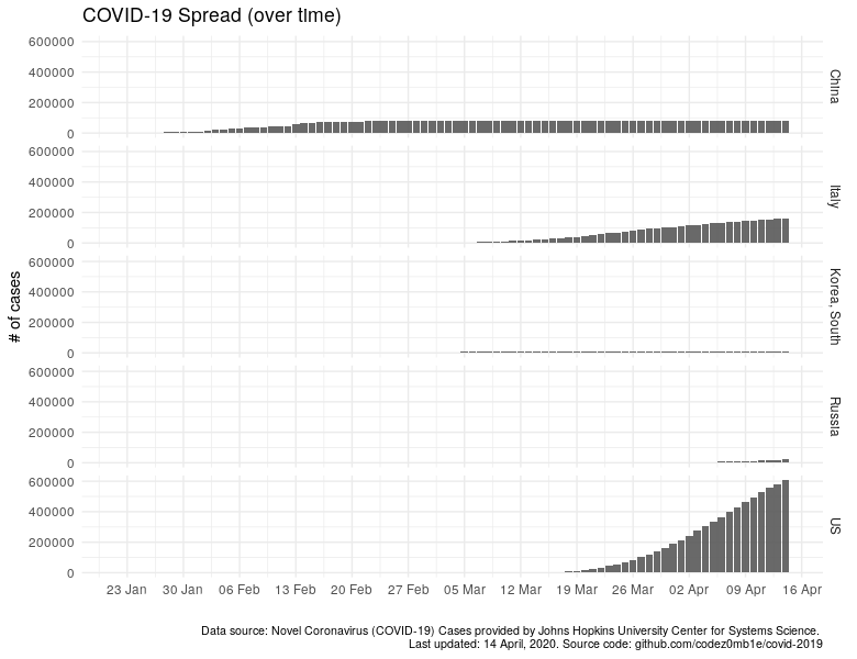
In countries that do not have many cases, it is impossible to make out anything: no growth, no decline, and even more so, the tipping points in the pandemic population of the country. Let’s do logarithmic scale the number of cases, hoping to see something, but it will become as if everyone has about 100K diseases.
ggplot(data %>% filter_countries, aes(x = date)) +
  geom_col(aes(y = confirmed_n), alpha = .9) +

  scale_x_date(date_labels = "%d %b", date_breaks = "7 days") +
  scale_y_log10() +

  facet_grid(country ~ .) +

  labs(x = "", y = "# of cases",
       title = "COVID-19 Spread (over time)",
       caption = lab_caption) +

  theme(plot.caption = element_text(size = 8))
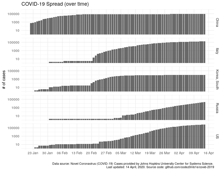
Now it is the same, only with the number of sick people per 1 million of the population.
ggplot(data  %>% filter_countries, aes(x = date)) +
  geom_col(aes(y = confirmed_n_per_1M), alpha = .9) +

  scale_x_date(date_labels = "%d %b", date_breaks = "7 days") +

  facet_grid(country ~ .) +

  labs(x = "", y = "# of cases per 1M",
       subtitle = "Infected cases per 1 million popultation",
       title = "COVID-19 Spread (over time)",
       caption = lab_caption) +

  theme(plot.caption = element_text(size = 8))
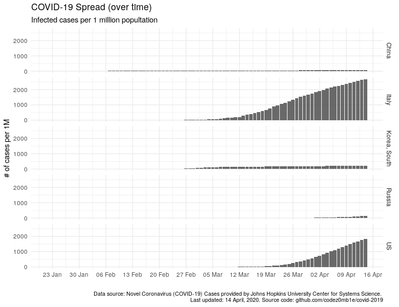
And the same thing on a logarithmic scale:
ggplot(data  %>% filter_countries, aes(x = date)) +
  geom_col(aes(y = confirmed_n_per_1M), alpha = .9) +

  scale_x_date(date_labels = "%d %b", date_breaks = "7 days") +
  scale_y_log10() +

  facet_grid(country ~ .) +

  labs(x = "", y = "# of cases per 1M",
       subtitle = "Infected cases per 1 million popultation",
       title = "COVID-19 Spread (over time)",
       caption = lab_caption) +

  theme(plot.caption = element_text(size = 8))
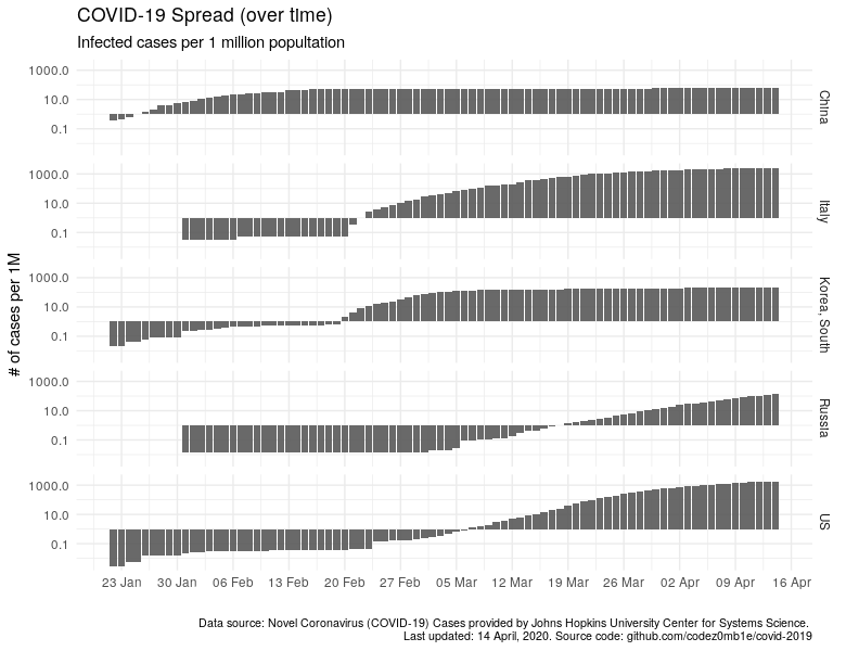
I think it is not necessary to indicate how much better the "quiet" harbors and countries where the epidemiological situation is not so calm have become visible.
Issue II: Reference date
Issue: when comparing the epidemiological situation, there is used the date of the first COVID infected case in the country as a reference date.
Motivation: a) the effect of a low base (there was one case, it became 3, total growth +200%); b) we miss the moment when the epidemic in the country took on a pandemic; 3) it is hard or even impossible to compare the speed of spread between countries.
Solution: we use the dates when >1 infected per million of the country's population, >0.1 dead per million of the population, as the reference date.
Similarly, let's look at the dynamics of increasing the number of cases of the disease, starting with the first detected case.
ggplot(
  data %>% filter_countries %>% filter(!is.na(since_1st_confirmed_date_n_days)),
  aes(x = since_1st_confirmed_date_n_days)
  ) +

  geom_col(aes(y = confirmed_n), alpha = .9) +
  scale_y_log10() +

  facet_grid(country ~ .) +

  labs(x = "# of days since 1st infected case", y = "# of cases",
       subtitle = "Infected cases since 1st infected case",
       title = "COVID-19 Spread",
       caption = lab_caption) +

  theme(plot.caption = element_text(size = 8))
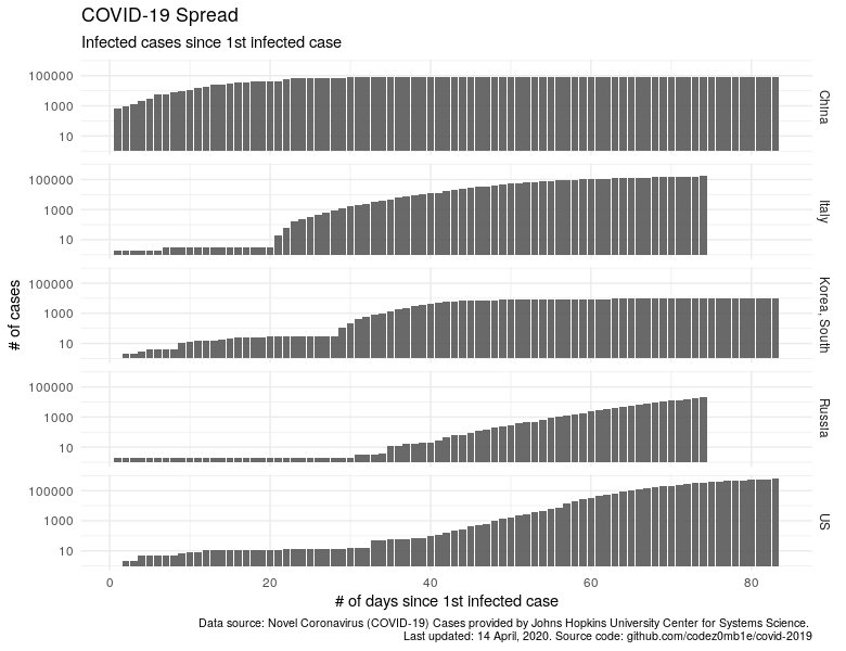
Let's plot the dynamics of the increase in the number of cases per 1 million population, starting from the moment when we had at least 1 infected per million population.
ggplot(
  data %>% filter_countries %>% filter(!is.na(since_1_confirmed_per_1M_date_n_days)),
  aes(x = since_1_confirmed_per_1M_date_n_days)
  ) +

  geom_col(aes(y = confirmed_n_per_1M), alpha = .9) +

  scale_y_log10() +
  xlim(c(0, 55)) +

  facet_grid(country ~ .) +

  labs(x = "# of days since 1 infected cases per 1M", y = "# of cases per 1M",
       title = "COVID-19 Spread",
       subtitle = "Since 1 infected cases per 1 million popultation",
       caption = lab_caption) +

  theme(plot.caption = element_text(size = 8))
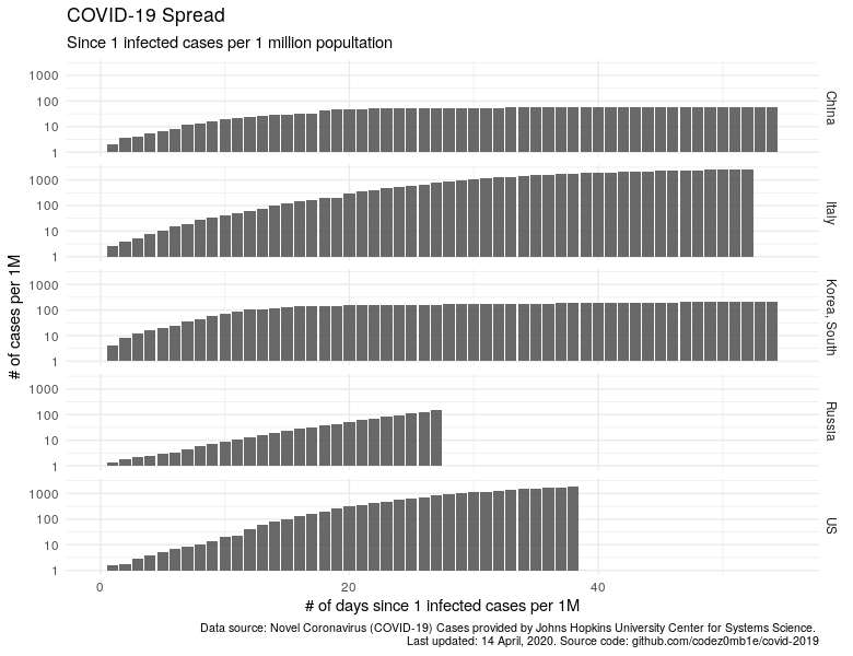
China and South Korea have significantly dropped, the trend in Russia is growing, and trends for "calming" the situation in Italy and the United States are visible.
Issue III: Infected vs active cases
Issue: a forecast is based on the number of infected people to solve the problem "when it's all over".
Motivation: the recovered patients and the fatal cases will no longer infect anyone, no one will go to the hospital because of them.
Solution: we make forecasts based on the number of active cases (infected cases minus the sum of fatal and recovered cases).
Let's build a plot where we will display infected cases, recovered, fatal, and the number of active cases (blue line).
plot_data <- data %>%
  filter_countries %>%
  filter(!is.na(since_1_confirmed_per_1M_date_n_days)) %>%
  mutate(
    confirmed_n_per_1M = confirmed_n_per_1M,
    recovered_n_per_1M = -recovered_n_per_1M,
    deaths_n_per_1M = -deaths_n_per_1M
  ) %>%
  select(
    country, since_1_confirmed_per_1M_date_n_days, ends_with("_n_per_1M")
  ) %>%
  gather(
    key = "case_state", value = "n_per_1M", -c(country, since_1_confirmed_per_1M_date_n_days, active_n_per_1M)
  )

ggplot(plot_data, aes(x = since_1_confirmed_per_1M_date_n_days)) +

  geom_col(aes(y = n_per_1M, fill = case_state), alpha = .9) +
  geom_line(aes(y = active_n_per_1M), color = "#0080FF", size = .25) +

  scale_fill_manual(element_blank(),
                    labels = c("confirmed_n_per_1M" = "Infected cases", "recovered_n_per_1M" = "Recovered cases", "deaths_n_per_1M" = "Fatal cases"),
                    values = c("confirmed_n_per_1M" = "grey", "recovered_n_per_1M" = "gold", "deaths_n_per_1M" = "black")) +

  xlim(c(0, 55)) +

  facet_grid(country ~ ., scales = "free") +

  labs(x = "# of days since 1 infected cases per 1M", y = "# of cases per 1M",
       title = "COVID-19 Spread by Countries",
       subtitle = "Active cases trend since 1 infected cases per 1 million popultation. \nBlue line - infected cases minus recovered and fatal.\nNegative values indicate recovered and fatal cases.",
       caption = lab_caption) +

  theme(
    legend.position = "top",
    plot.caption = element_text(size = 8)
  )
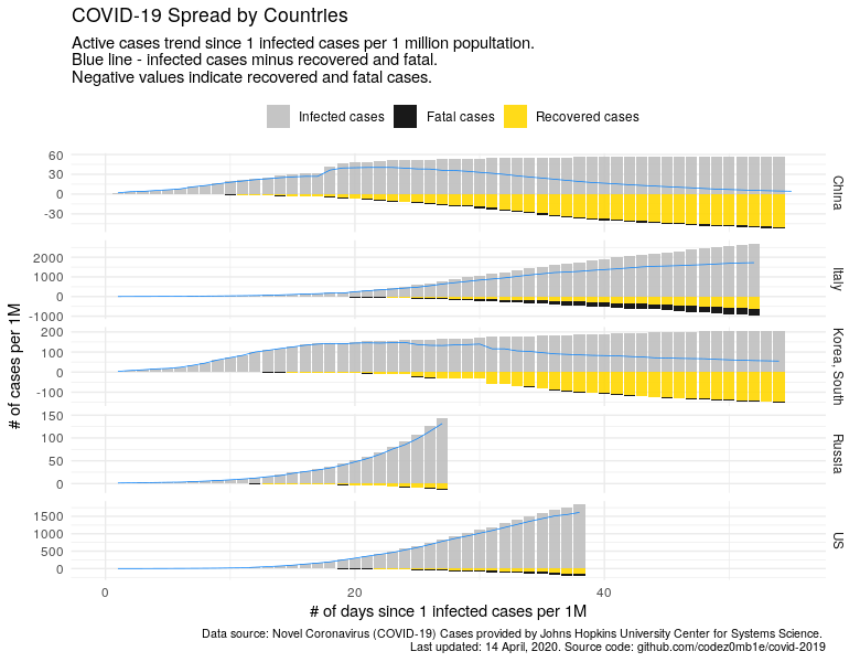
The graph shows how important information about the number of active cases is for a full understanding of the development of the epidemiological situation in the corresponding camp.
Issue IV: This is the past
Issue: the number of infected cases today is just a record of the fact that it was at least a week ago (probably about 10 days ago [I don't know how to calculate this figure]).
Solution: modeling based on data from a week ago, checking the prediction for today; searching for insights (for example, the ratio of the number of cases found on a day to the number of tests made on that day). There is probably no simple solution here.
Let's try using the ARIMA autoregression model to look a week ahead:
forecast_cases <- function(.country, .after_date, .forecast_horizont, .fun, ...) {

  dt <- data %>%
    # filter rows and cols
    filter(
      country == .country &
      date < .after_date
    ) %>%
    # convert to time-series
    arrange(date) %>%
    select(active_n_per_1M)

  dt %>%
    ts(frequency = 7) %>%
    # ARIMA model
    .fun(...) %>%
    # forecast
    forecast(h = .forecast_horizont)
}

forecast_horizont <- 7
after_date <- max(data$date) + days()

countries_list <- c("Belgium", "France", "Italy", "Netherlands", "Norway", "Portugal", "Spain", "Switzerland", "US", "Russia", "China", "Korea, South")

pred <- countries_list  %>%
  map_dfr(
    function(.x) {

      m <- forecast_cases(.x, after_date, forecast_horizont, auto.arima)

      n_days_max <- max(data[data$country == .x, ]$since_1_confirmed_per_1M_date_n_days, na.rm = T)

      tibble(
        country = rep(.x, forecast_horizont),
        since_1_confirmed_per_1M_date_n_days = seq(n_days_max + 1, n_days_max + forecast_horizont, by = 1),
        pred = m$mean %>% as.numeric %>% round %>% as.integer,
        data_type = "Forecast"
      )
    }
  )

plot_data <- data %>%
  filter(country %in% countries_list) %>%
  transmute(
    country, active_n_per_1M, since_1_confirmed_per_1M_date_n_days,
    data_type = "Historical data"
  ) %>%
  bind_rows(
    pred %>% rename(active_n_per_1M = pred)
  ) %>%
  mutate(
    double_every_14d = (1 + 1/14)^since_1_confirmed_per_1M_date_n_days, # double every 2 weeks
    double_every_7d = (1 + 1/7)^since_1_confirmed_per_1M_date_n_days, # double every week
    double_every_3d = (1 + 1/3)^since_1_confirmed_per_1M_date_n_days, # double every 3 days
    double_every_2d = (1 + 1/2)^since_1_confirmed_per_1M_date_n_days # double every 2 days
  )

active_n_per_1M_last <- plot_data %>%
  group_by(country) %>%
  arrange(desc(since_1_confirmed_per_1M_date_n_days)) %>%
  filter(row_number() == 1) %>%
  ungroup

plot_data %<>%
  left_join(
    active_n_per_1M_last %>% transmute(country, active_n_per_1M_last = active_n_per_1M, since_1_confirmed_per_1M_date_n_days),
    by = c("country", "since_1_confirmed_per_1M_date_n_days")
  )
ggplot(plot_data, aes(x = since_1_confirmed_per_1M_date_n_days)) +

  geom_line(aes(y = double_every_7d), linetype = "dotted", color = "red", alpha = .65) +
  geom_line(aes(y = double_every_3d), linetype = "dotted", color = "red", alpha = .75) +
  geom_line(aes(y = double_every_2d), linetype = "dotted", color = "red", alpha = .85) +

  geom_line(aes(y = active_n_per_1M, color = country, linetype = data_type), show.legend = T) +
  geom_text(aes(y = active_n_per_1M_last + 20, label = country, color = country),
            hjust = 0.5, vjust = 0, check_overlap = T, show.legend = F, fontface = "bold", size = 3.6) +

  annotate(geom = "text", label = "Cases double \n every 2 days", x = 17, y = 1550, vjust = 0, size = 3.1) +
  annotate(geom = "text", label = "...every 3 days", x = 25, y = 1800, vjust = 0, size = 3.1) +
  annotate(geom = "text", label = "...every week", x = 50, y = 1500, vjust = 0, size = 3.1) +

  scale_linetype_manual(values = c("longdash", "solid")) +

  xlim(c(10, 55)) +
  ylim(c(0, max(plot_data$active_n_per_1M))) +

  labs(x = "# of days since 1 infected cases per 1M", y = "# of cases per 1M",
       title = "COVID-19 Spread by Countries",
       subtitle = "Active cases trend since 1 infected cases per 1 million popultation.",
       caption = lab_caption) +

  theme(
    legend.position = "bottom",
    legend.title = element_blank(),
    plot.caption = element_text(size = 8)
  )
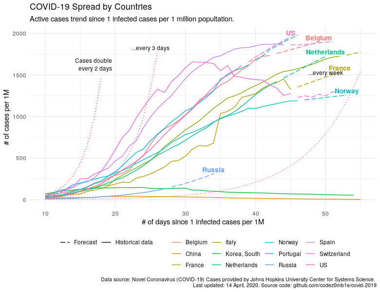
Switzerland and Belgium demonstrate an amazing turnaround in the fight against COVID-19, Portugal is not much better than the United States, and Russia has a poor chance of growing faster than many Europeans, which are shown on the chart.
Results
Let's compare 2 approaches for assessing and predicting the development of the epidemiological situation in the country.
Number of cases by time (naive approach):
ggplot(data %>% filter(country %in% countries_list), aes(x = date)) +

  geom_line(aes(y = confirmed_n, color = country), show.legend = T) +

  scale_x_date(date_labels = "%d %b", date_breaks = "7 days") +

  labs(x = "", y = "# of cases",
       title = "COVID-19 Spread by Country",
       subtitle = "Infected cases over time",
       caption = lab_caption) +

  theme(
    legend.position = "bottom",
    legend.title = element_blank(),
    plot.caption = element_text(size = 8)
  )
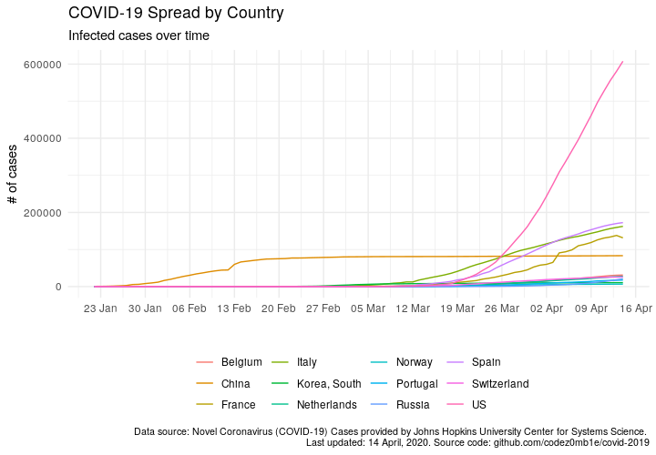
Density of cases in the population to the number of days after 1 case of infection per 1 million population (the approach described in this post):

Compare approaches and find your way :)
You can to reproduce the result, experiment with other countries, dig into the source code, make a pull-request [in this repo] (https://github.com/codez0mb1e/covid-19/blob/master/src/covid-19-yaaa.Rmd).
References
- COVID-19 Data Repository by Johns Hopkins CSSE, GitHub.
- Forecasting competitions: Kaggle COVID19 Global Forecasting, Sberbank COVID-19 Forecast.
- Source code and data sources, GitHub.
Take care of yourself!