In the realm of data visualization, where insight meets aesthetics, Matplotlib stands as a towering beacon of versatility and creativity. As one of the most popular plotting libraries in Python, Matplotlib empowers data scientists, analysts, and enthusiasts alike to transform raw data into captivating visual narratives. Let us embark on a journey through the vibrant landscapes of Matplotlib, exploring its features, capabilities, and the artistry it inspires.

The Genesis of Matplotlib:
Born out of the need for a flexible and intuitive plotting tool for scientific computing, Matplotlib was conceived by John D. Hunter in 2002. Inspired by MATLAB's plotting capabilities, Hunter sought to create a Python library that would empower users to generate publication-quality plots with ease. What began as a personal project has since evolved into a cornerstone of the Python ecosystem, embraced by researchers, educators, and practitioners across diverse fields.
A Palette of Possibilities:
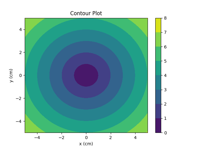
At the heart of Matplotlib lies its rich palette of plotting functions, each a brushstroke in the canvas of visualization. From simple line plots and scatter plots to intricate heatmaps and contour plots, Matplotlib offers a plethora of options to suit every data visualization need. With intuitive APIs and extensive documentation, users can effortlessly craft visual representations that convey complex insights with clarity and precision.
Customization and Creativity:
One of Matplotlib's defining features is its unparalleled flexibility and customizability. Every aspect of a plot, from axes and labels to colors and markers, can be tailored to reflect the creator's vision. Through the use of style sheets, themes, and interactive tools, users can imbue their plots with personality and flair, transcending the boundaries of conventional visualization. Whether striving for elegance and simplicity or boldness and innovation, Matplotlib empowers users to express their creativity without constraint.

Seamless Integration and Interactivity:
In a world where interdisciplinary collaboration is paramount, Matplotlib's seamless integration with other Python libraries fosters synergy and innovation. From data manipulation and analysis with NumPy and Pandas to machine learning and statistical modeling with scikit-learn and Statsmodels, Matplotlib serves as a visual bridge between disparate domains. Furthermore, the incorporation of interactive elements such as widgets and animations elevates the user experience, enabling dynamic exploration and engagement with data.
From Concept to Creation:
Let us illuminate the path from concept to creation through a brief exploration of Matplotlib's workflow:
Import and Setup: Begin by importing Matplotlib's pyplot module and configuring the desired plot settings, such as figure size and resolution.
Data Preparation: Prepare the data to be visualized, ensuring that it is clean, formatted, and relevant to the intended message.
Plotting: Select the appropriate plotting function based on the nature of the data and the desired visualization style. Customize the plot aesthetics and layout to enhance clarity and visual appeal.
Annotation and Interpretation: Add labels, annotations, and legends to contextualize the plot and guide the viewer's interpretation. Incorporate color schemes and visual cues to highlight key insights and trends within the data.
Review and Refinement: Review the plot for accuracy, coherence, and effectiveness in conveying the intended message. Iterate on the design and layout as needed to optimize visual impact and communicative clarity.
Publication and Sharing: Once satisfied with the final plot, save it in the desired format (e.g., PNG, PDF) for publication or sharing with collaborators and stakeholders.
Embracing the Art of Visualization:
In the hands of a skilled practitioner, Matplotlib transcends mere utility to become a medium of expression and discovery. Its canvas is a blank slate upon which ideas flourish, insights emerge, and stories unfold. Whether unraveling the mysteries of the cosmos or charting the rhythms of the natural world, Matplotlib invites us to explore, create, and reimagine the boundaries of what is possible in the realm of data visualization.
As we conclude our journey through the vibrant landscapes of Matplotlib, let us embrace the artistry and ingenuity it inspires. For in the convergence of data and design lies the promise of illumination, transformation, and understanding. Let us wield the brush of visualization with boldness and humility, for in the hands of the visionary, every plot is a masterpiece waiting to be unveiled.