Introduction
Every single one of us gives presentations from time to time. What can be difficult about creating a couple of slides with great UI and nice content, right? Well… not really actually. In real life, things may get difficult.
You want to cover the whole topic and give as much information as fits on a slide. Then you go to Google to find some awesome pictures, and finally, cover it all with some fancy animation. And here is where things start falling apart: how do you balance all this stuff?
Take our helping hand, as we are here to show you how to create a presentation with both perfect user experience and user interface. Let's find out how to create perfect UI & UX design in a presentation.
Original article — Giving a presentation with perfect UI/UX design
Main principles of perfect UI/UX in presentation
1. Your personality
This article is not about public speaking, or how to sound great. Instead, we'll concentrate on visual and UX design of presenting.
But the main thing to remember is that your presentation is you. Think of your personality as a part of the presentation as a whole. Your voice, facial expressions, gestures, clothes matter. Do you want to be the center of attention, or should your slides attract the audience? Should your colorful clothes and bright lipstick grab the attention, or do you want listeners to concentrate only on your slides?

2. Right Place, Time and People
There are a few points from marketing which you should consider while making your presentation. Use Market segmentation, analyze the target audience and try to create user personas. You don't have to go deep with this, but at least try to understand the needs and behaviors of your listeners. This will help you with setting general style, choosing pictures and templates, color schemes, etc. For example, there is a huge difference in designing slides for iOS developers' conferences, business proposal or meet up for graphic designers. When you pitch your startup idea, your UX design in presentation will look different as well. Same applies to giving presentations at conferences.

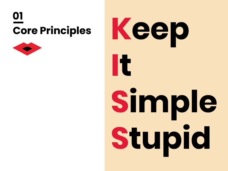
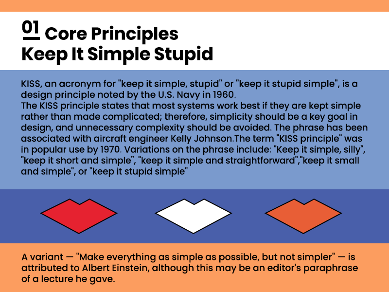
3. KISS and Less is More
Slides work best if you keep them simple rather than overcomplicate. Emphasize every part of your slide, and you lose the user's attention at all.
How to ruin your presentation and make slides hard to understand? Do the following:
Overuse animation
Add lots of pictures
Don't forget about huge paragraphs that are hard to read
What your users see are different attention catchers that compete for priority. Keep them to a minimum to draw the attention of more users. So what's the secret? Keep it simply stupid: make the presentation design clean and to the point.
So let's see how it works:
|  |
|  |
|
| Do | Don't |
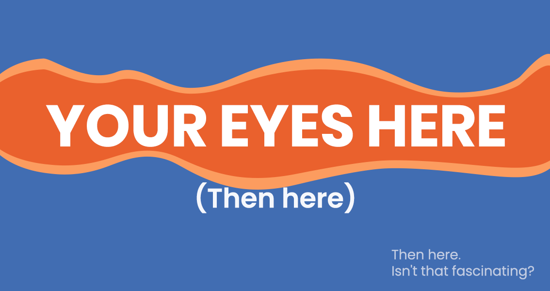
4. Use white space and play with user attention
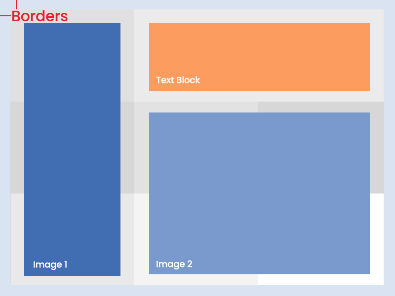
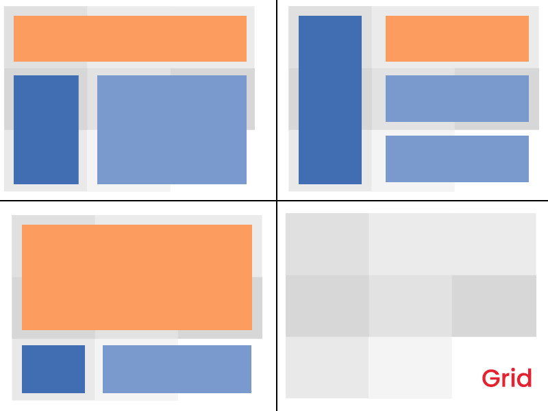
Whitespace is not white parts of your slide. Whitespace is any section of a slide that is free of text, images, charts, etc. or simply space around these objects. Use it, and your presentation will look less crowded and more easy-to-read. Also, whitespace helps to separate content into logical blocks.
Don't place all the text from your speech on the slides. Most people just don't read it. Concentrate on the main points: 3-4 sentences will be OK. It's ok to put only 1 sentence, few words or just one picture if they are very important. You can also do it to achieve the maximum focus of listeners.
Typography
Picking the right typeface is probably one of the first steps of creating a presentation.
Font types
First of all, select only well-readable fonts. Of course, you can use some experimental ones or spend a lot of time finding the best one to suit your slides. But if you want to play safe or you don't have time/desire to do it, here are time-proved fonts with the best readability:
- Helvetica
- Poppins
- Open Sans
- Verdana
- Roboto
- Lato
- Futura
Create your font-system for the presentation, but don't overdo it. One-two fonts will be enough.
Font size
Be accurate with the font size. The best way to avoid mistakes is to avoid thin, delicate typefaces at a small size — use 14-16 as min.
Create a system for titles, subtitles, and textual blocks and try to keep it on every slide. Here's the safe recipe for Poppins font:
Titles — 24
Subtitles — 18
Main text — 14-16
These tips will help you avoid drowning your audience with the crazy amount of combinations and focus on the content instead.
And last font hint
Never use Comic Sans and don't graphically modify the text. You can use bevel, drop shadow, emboss and outline, but you rather not.
These font styles are outdated and their star time passed around 1998.
Images
Use high-quality images with a big resolution. Don't steal them and never use photos with watermarks in your presentation. I bet your listeners will notice nothing except watermarks or pixel-detailed photos and will giggle instead of listening.
There are several websites with stock photos that are free to use. I use several of them
Also, try to avoid using images as a background for text. Sometimes it can work very well, but in most cases, it just lowers the level of readability. If you want to go with images as a background, then be ready to spend some time on photo editing and to use masks, shadows, and gradients.
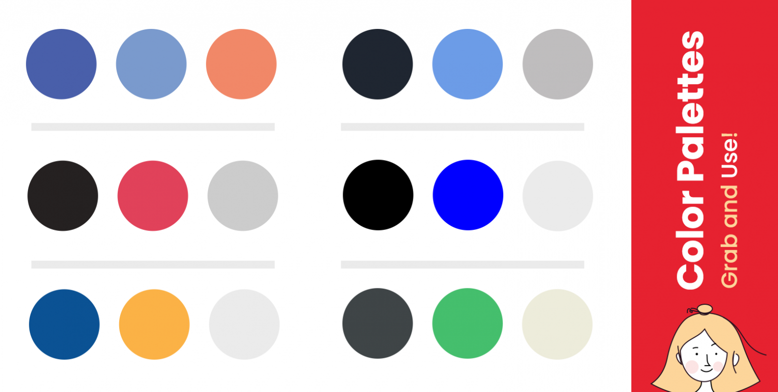
Colors
Picking colors for your presentation is not rocket science. The main point is to pick the colors with adequate contrast. Complementary pairs such as red-cyan, green--magenta, and blue-yellow will work well for sure.
Concentrate on two or three colors for contrast elements and keep the main textual content black (or dark grey) for light mode and white for dark mode. Keep in mind that paragraph text should always be in one color. Pay attention that usually projectors make colors paler so light grey text on a white background will not work at all in this case.
Slide composition
Don't overload the slide and try to define the main accent object. Arranging it on Golden Ratio always works well. Divide the space into three equal sections horizontally and three vertically. Also, don't forget about symmetry and equal whitespace for borders. Rearrange main content blocks to align with this greed, so you can keep the audience's attention. Similar slides make them feel bored and tire eyes.
Conclusion
Treat your presentation as a visual object. A bit of marketing research on your audience, font system, color scheme, grid composition of elements and whitespace will make magic. But always remember that you and your personality make your presentation work. CrEATe!
