Introduction
Beginners in web-development usually use px as the main size unit for HTML elements and text. But this is not entirely correct. There are other useful units for the font-size in CSS. Let's look at the most widely-used ones and find out when and where we can use them.

Overview
If you familiar with size units in CSS and want to check your knowledge you can look at The Full Summary Table.
But if you don 't know the differences between these units, I strongly recommend that you read this article and share your opinion about it in the comments below.
In this article, we will discuss such size units as:
Furthermore, we will look at obsolete and unsuitable for the web-development size units. This will help you to make the right choice and use modern development practices. Let's get started!
The most widely used size units
px
px (pix element) is a main and base absolute size unit. The browser converts all other units in px by default.
The main advantage of px is its accuracy. It is not hard to guess that 1px is equal to 1px of the screen. If you zoom any raster image you will see little squares. There are pixels.

But the disadvantage is that pixel is an absolute unit. It means that pixel doesn't set the ratio.
Let's look at the simple example.

HTML of this example:
<div class="element1">
    Hello,
    <div class="element2">
      Habr Reader!
    </div>
</div>
CSS:
.element1 {
  font-size: 20px;
}

.element2 {
  font-size: 20px;
}
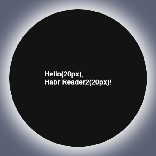
Element with class='element2' is nested in parent with class='element1'. For the both elements font-size is equal to 20px. On the image above you can see that sizes of the words 'Hello' and 'Habr Reader' are the same.
What can this example say about a pixel? Pixel sets a specific text size and does not depend on the parent element.
Note: the full code of this and the next examples you can find here. I don't show you all styles of the element on the picture above because our theme is the size units.
em
em is a more powerful unit size than px because it is relative. It means that we can set a ration for it.
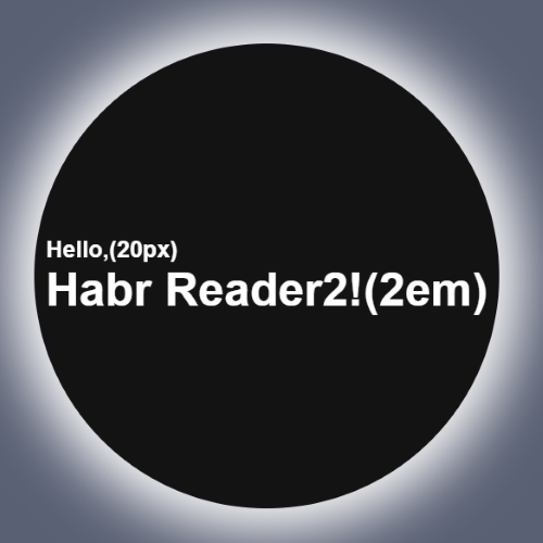
Let's look at our previous example to fully understand the sense of em. We will change font-size of .element1 and .element2 to 2em.
.element1 {
  font-size: 2em;
}

.element2 {
  font-size: 2em;
}
The result:

What do we see? The size of the text 'Habr Reader!' is 2 times more than 'Hello'.
It means that em sets the size by looking at the size of the parent element.
For example, we set to .element1 font-size: 20px and to .element2 — 2em. If we convert 2em to px, how many pixels will be the value of the .element2?
Congratulations if you answered 40px!
Let's give a conclusion for the em unit. em asks the question: How many times I bigger or less than the value of my parent element?
rem
It is easier to understand the sense of rem by comparing it with em.
rem asks the question: How many times I bigger or less than the value of <html>?
For example, if we set:
html {
   font-size: 20px;
}
And for two elements:
.element1 {
  font-size: 2rem;
}

.element2 {
  font-size: 2rem;
}
The Result:

Let's convert the size of .element1 and .element2 to pixels.
The answer is 40px. I seem it was easy for you.
percent
% is a another relative unit. But this is more unpredictable than em and rem. Why? Because it has a lot of side cases.
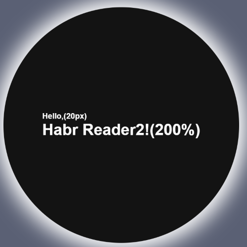
In the majority of cases, % takes ratio from the parent element like em. It works for the width, height or font-size properties. If we look at our example it will work like an example with em.
.element1 {
  font-size: 20px;
}

.element2 {
  font-size: 200%;
}
The result:

Let's conve… No, no. I'm just kidding. I'm sure you can calculate the simple ratio with percent.
The answer is still 40px.
Let's look at some other cases with %. For the property margin, it takes the width of the parent element; for the line-height — from the current font-size. In such cases, it is better and more rational to use em instead.
vw and vh
- 1vw means 1% of the screen width.
- 1vh means 1% of the screen height.
These units are usually used for mobile platform support.
The simple example is the block below.
  background-color: red;
  width: 50vw;
  height: 5vh;
Check the example here.
Even if you resize the screen the block always will contain 50% of the screen width and height.
Rarely used units
- 1mm = 3.8px
- 1cm = 38px
- 1in (inch) = 96px
- 1pt (Typographic point) = 4/3px ~ 1.33px
- 1pc (typographic peak) = 16px
- 1vmin = the lowest value from vh and vm
- 1vmax = the highest value from vh and vm
- 1ex = exactly the height of a lowercase letter “x”
- 1ch = the advance measure of the character ‘0’ in a font
The Full Summary Table
| Unit | Unit Type | The Parent for which the Ratio is set | Example |
|---|---|---|---|
| px | absolute | - |  |
| em | relative | the First Parent element |  |
| rem | relative | <html> |  |
| % | relative | the First Parent element *(look at the exceptions) |  |
| vw and vh | relative | the screen width and height | CodePen |
Conclusion
Today we discussed a lot of useful size units that can relieve your development process.
If this article was useful to you and gave you new knowledge about CSS I would be great to see likes or comments below with feedback.
I’ll also be glad to read some proposals for my articles.