Every development environment has a tool called «Output». There is no need to describe what it does, since all developers without exception use it in their work on a daily basis. It is simple and conservative.
It has remained essentially unchanged for decades, and to this day looks something like this:

Text, text, and more text. Lots of text...
Even in this tiny example the line containing the error is not immediately apparent. Finding it takes time and effort. Simply because one has to read through the text and search for the words «error», «exception» or «warning». The programmer has to search, and the client has to pay for the time spent searching.
What if the text were highlighted red in these messages, but highlighted yellow when warnings are present? This would be an improvement. So thought the authors of the extensions VSColorOutput and Output Enhancer for Visual Studio (this IDE will be used from here on for illustration).
The result was as follows:

Errors and warnings have become noticeable with no effort on the part of developers.
Excellent work; our thanks for the useful tool.
This certainly makes life easier for programmers, but it doesn't go far enough. Lots of information is displayed, including some that is quite useless.
For example, why show a list of compiled files? Could this be hidden somehow?
This question was addressed by the author of the extension Output Window Filter
This resulted in the following:

The result is smaller, making it simpler to manage. Questions remain regarding implementation, but it is an excellent idea.
Microsoft developers likewise contributed to the evolution of this tool by adding timestamps to it. To do this they created the extension Time Stamp Margin.
This produced the following:

It has become easier to use. Now one can see what was done and when, as well as how much time has passed between events.
It's all great, but there is one problem.
These terrific extensions cannot function simultaneously, complementing each other's advantages. Still more lamentable is that progress on the completed solutions has stopped here, leaving a number of issues unresolved.
Here is an approximate list of these issues:
1. Operating data is displayed along with useful information;

2. There is no visual rendering of messages of the same type;

3. There is no feature for searching and highlighting desired data;
4. It is not obvious from which messages one can switch to the source code;
5. There is no way to quickly switch to the error description;
6. With multi-project compilations it is not clear to which project messages pertain;

7. For long messages horizontal scrolling must be used;
8. Stack trace display is not at all optimized;
9. There is no way to mask messages by type (errors, warnings, messages).
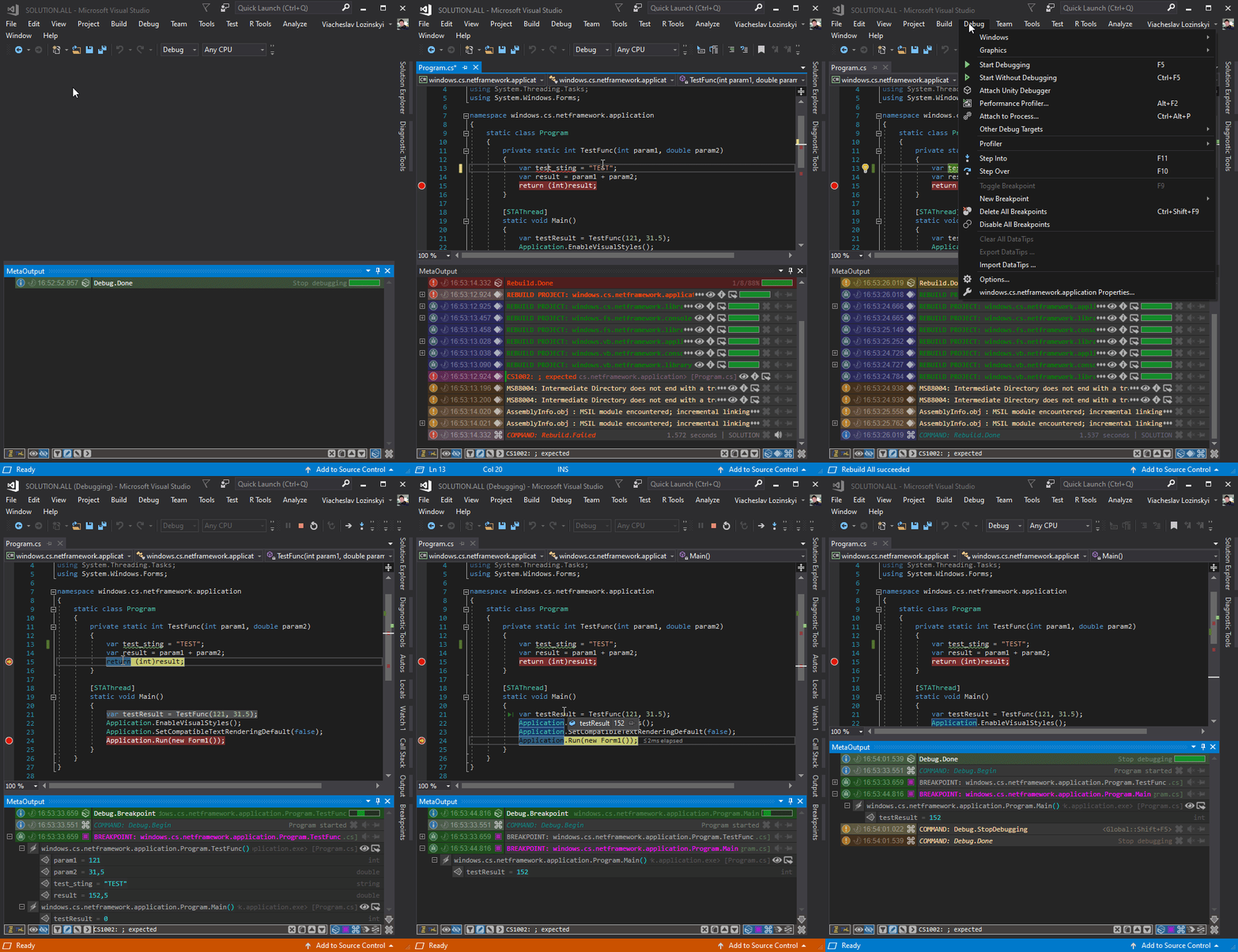
It's easy to see that for some time no progress has been made on improving this tool. For decades this essential tool has remained unchanged, with only isolated enthusiasts attempting to make improvements. It was this that led to the creation of the MetaOutput extension. This extension attempts to solve all the problems mentioned above.

The result may be seen in the following example:

Don't ignore extensions to the development environment. They may include some very useful tools that can save developers a tremendous amount of time, while saving clients considerable money.
Especially since practically all these extensions are completely free.
It has remained essentially unchanged for decades, and to this day looks something like this:

Text, text, and more text. Lots of text...
Even in this tiny example the line containing the error is not immediately apparent. Finding it takes time and effort. Simply because one has to read through the text and search for the words «error», «exception» or «warning». The programmer has to search, and the client has to pay for the time spent searching.
Solution
What if the text were highlighted red in these messages, but highlighted yellow when warnings are present? This would be an improvement. So thought the authors of the extensions VSColorOutput and Output Enhancer for Visual Studio (this IDE will be used from here on for illustration).
The result was as follows:

Errors and warnings have become noticeable with no effort on the part of developers.
Excellent work; our thanks for the useful tool.
This certainly makes life easier for programmers, but it doesn't go far enough. Lots of information is displayed, including some that is quite useless.
For example, why show a list of compiled files? Could this be hidden somehow?
This question was addressed by the author of the extension Output Window Filter
This resulted in the following:

The result is smaller, making it simpler to manage. Questions remain regarding implementation, but it is an excellent idea.
Microsoft developers likewise contributed to the evolution of this tool by adding timestamps to it. To do this they created the extension Time Stamp Margin.
This produced the following:

It has become easier to use. Now one can see what was done and when, as well as how much time has passed between events.
Unresolved issues
It's all great, but there is one problem.
These terrific extensions cannot function simultaneously, complementing each other's advantages. Still more lamentable is that progress on the completed solutions has stopped here, leaving a number of issues unresolved.
Here is an approximate list of these issues:
1. Operating data is displayed along with useful information;

2. There is no visual rendering of messages of the same type;

3. There is no feature for searching and highlighting desired data;
4. It is not obvious from which messages one can switch to the source code;
5. There is no way to quickly switch to the error description;
6. With multi-project compilations it is not clear to which project messages pertain;

7. For long messages horizontal scrolling must be used;
8. Stack trace display is not at all optimized;
9. There is no way to mask messages by type (errors, warnings, messages).
Summary
It's easy to see that for some time no progress has been made on improving this tool. For decades this essential tool has remained unchanged, with only isolated enthusiasts attempting to make improvements. It was this that led to the creation of the MetaOutput extension. This extension attempts to solve all the problems mentioned above.
The result may be seen in the following example:

Conclusion
Don't ignore extensions to the development environment. They may include some very useful tools that can save developers a tremendous amount of time, while saving clients considerable money.
Especially since practically all these extensions are completely free.