With the introduction of Android 10, the Dark mode option in Android phones is becoming more popular. The latest Android versions running on mobile devices are readily supporting the dark mode feature. Dark mode themes not only provide a distinct visual impact but also aids human vision and device energy. It is proven that Dark themes on mobile UI reduce eye strain on low-lighting conditions. These types of themes also offer brightness scope reduction which conserves the battery of the device.
This proves that dark mode in mobile applications is not just for show but also useful for the visual health aspect of the user.
In this post, we are going to learn how to implement dark mode in an Android app built by using Flutter/dart programming.
Create a new Flutter project
First, we need to create a new Flutter project. For that, make sure that the Flutter SDK and other flutter app development-related requirements are properly installed. If everything is properly set up, then in order to create a project, we can simply run the following command in the desired local directory:
flutter create flutterDarkMode After the project has been set up, we can navigate inside the project directory and execute the following command in the terminal to run the project in either an available emulator or an actual device:
flutter runAfter successfully build, we will get the following result in the emulator screen:

Scaffolding the Home Page
Now, we are going to scaffold the main screen template in order to capture the influence of dark mode on different UI widgets of Flutter.
For that, we need to remove the default MyApp stateless widget as well as the HomePageState stateful widget from the main.dart file.
Instead, we are going to add a new App class extending to the Stateful widget which is to be called in the main() function inside the runApp method. The basic scaffolding is provided in the code snippet below:
void main() {
  runApp(App());
}

class App extends StatefulWidget {
  @override
  _AppState createState() => _AppState();
}

class _AppState extends State<App> {
  @override
  Widget build(BuildContext context) {
    return MaterialApp(
      title: 'Flutter Demo',
      debugShowCheckedModeBanner: false,
      home: Scaffold(
        appBar: AppBar(
          title : Text("Flutter Dark Mode"),
        ),
        body: Container(),
      ),
    );
  }
}
Here, we have returned the MaterialApp widget as the primary parent widget from the AppState class which contains the Scaffold widget as a child. In the Scaffold widget, we have added a basic AppBar and Container widget as a body.
Now once we re-run the app, we will get the following result on the emulator screen:

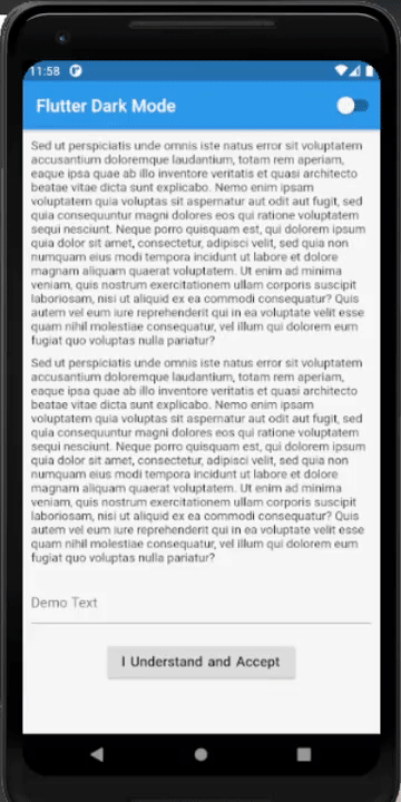
Now, we are going to work on creating the Scaffold body. Here, we are going to add some Text widgets, a button, and an input field so that, we can see what becomes of them when we switch the app themes. The overall coding implementation is provided in the code snippet below:
body: Container(
  padding: EdgeInsets.all(10),
  child: SingleChildScrollView(
    child: Column(
      mainAxisAlignment: MainAxisAlignment.center,
      children: [
        Text("Sed ut perspiciatis unde omnis iste natus error sit voluptatem accusantium doloremque laudantium, totam rem aperiam, eaque ipsa quae ab illo inventore veritatis et quasi architecto beatae vitae dicta sunt explicabo. Nemo enim ipsam voluptatem quia voluptas sit aspernatur aut odit aut fugit, sed quia consequuntur magni dolores eos qui ratione voluptatem sequi nesciunt. Neque porro quisquam est, qui dolorem ipsum quia dolor sit amet, consectetur, adipisci velit, sed quia non numquam eius modi tempora incidunt ut labore et dolore magnam aliquam quaerat voluptatem. Ut enim ad minima veniam, quis nostrum exercitationem ullam corporis suscipit laboriosam, nisi ut aliquid ex ea commodi consequatur? Quis autem vel eum iure reprehenderit qui in ea voluptate velit esse quam nihil molestiae consequatur, vel illum qui dolorem eum fugiat quo voluptas nulla pariatur?"),
        SizedBox(height: 10,),
        Text("Sed ut perspiciatis unde omnis iste natus error sit voluptatem accusantium doloremque laudantium, totam rem aperiam, eaque ipsa quae ab illo inventore veritatis et quasi architecto beatae vitae dicta sunt explicabo. Nemo enim ipsam voluptatem quia voluptas sit aspernatur aut odit aut fugit, sed quia consequuntur magni dolores eos qui ratione voluptatem sequi nesciunt. Neque porro quisquam est, qui dolorem ipsum quia dolor sit amet, consectetur, adipisci velit, sed quia non numquam eius modi tempora incidunt ut labore et dolore magnam aliquam quaerat voluptatem. Ut enim ad minima veniam, quis nostrum exercitationem ullam corporis suscipit laboriosam, nisi ut aliquid ex ea commodi consequatur? Quis autem vel eum iure reprehenderit qui in ea voluptate velit esse quam nihil molestiae consequatur, vel illum qui dolorem eum fugiat quo voluptas nulla pariatur?"),
        SizedBox(height : 20),
        TextField(
          controller: controller,
          decoration: InputDecoration(
            hintText: "Demo Text",
          ),
        ),
        SizedBox(height : 20),
        RaisedButton(
          onPressed: () {  },
          child: Text("I Understand and Accept", style: TextStyle(fontSize: 16, wordSpacing: 2),),
        ),
        SizedBox(height : 50)
      ],
    ),
  ),
),
),
Here, we have some Text widgets, a RaisedButton, and a TextField. Moreover, we have used the Column widget to structure other widgets vertically on the screen.
Hence, the result is shown in the emulator screenshot below:

Adding Theme changer Switch to App Bar
Now, we are going to add a Switch widget through which we will control the theme changes in the app. But first, we need to define a Boolean state variable that controls the value of the switch whether the switch is ON or OFF. Here, we are going to define it as darkModeActive which is initialized to false as shown in the code snippet below:
bool darkModeActive = false;
Next, we are going to add the Switch widget at the right end of the App bar using the actions property provided by the AppBar widget:
Scaffold(
        appBar: AppBar(
          title : Text("Flutter Dark Mode"),
          actions: [
            Switch(
              value: darkModeActive,
              onChanged: (toggle){
              setState(() {
                darkModeActive= toggle;
              });
            }),
          ],
        ),
        body: Container(
Here, flicking the switch On/Off will trigger the onChanged event which will assign a toggle value to our darkModeActive state. The setState() method is used to re-render the whole widget tree so that the changes to the app display reflect on the screen. The value property in the Switch widget reflects the value of the darkModeActive state.
Thus, the idea is to change the theme to dark when darkModeActive state is true and to light mode when darkModeActive is false.
Initializing Theme Properties
This step is the major step in which we are going to define our theme properties using the Themedata class object.
The ThemeData class enables us to define the configuration of the overall visual Theme for a MaterialApp or a widget subtree within the app. It lets us define the color properties as well as widget themes for other widgets as well. Once assigned to the theme property of the MaterialApp widget, the properties in the ThemeData class will reflect on the overall app. The light and dark mode theme configuration properties that we are going to use on this app is provided in the code snippet below:
ThemeData darkThemeProperties = ThemeData(
  accentColor: Colors.red,
  brightness: Brightness.dark,
  primaryColor: Colors.black,
  textTheme: TextTheme(bodyText1: TextStyle(color: Colors.white)),
  buttonTheme: ButtonThemeData(
    buttonColor: Colors.black,
  )
);

ThemeData lightThemeProperties = ThemeData(
  accentColor: Colors.pink,
  brightness: Brightness.light,
  primaryColor: Colors.blue,
  textTheme: TextTheme(bodyText1: TextStyle(color: Colors.black)),
);
Here, we define the accentColor, brightness, and primaryColor properties for both themes. For the dark theme, we define a custom theme for buttons as well using ButtonThemeData class on buttonTheme property. Moreover, we apply custom text themes for both theme modes as well using TextTheme class.
Most Importantly, the major theme property that provides the dark and light theme appearance is the brightness property.
Applying the Theme properties to the App
Finally, the last thing left is to add these theme properties to our MaterialApp. The MaterialApp widget provides a theme property. This theme property allows us to assign the custom theme properties that reflect on the entire app widget tree. Here, we are going the assign the theme properties based on darkModeActive conditional status as shown in the code snippet below:
Widget build(BuildContext context) {
    return MaterialApp(
      title: 'Flutter Demo',
      debugShowCheckedModeBanner: false,
      **theme: !darkModeActive ? lightThemeProperties : darkThemeProperties,**
      home: Scaffold(
        appBar: AppBar(
If the darkModeActive status is false, then we display the light theme else the dark mode.
Now if we re-run the app, we can use the switch to change the theme as demonstrated in the demo below:
As we can notice, the theme for text, button, and the Text field also changes along with the entire appearance of the app.
Finally, we have successfully implemented the dark mode in the Flutter environment without using any third-party plugins.
Conclusion
The main goal of this article post was to demonstrated how to implement a dark mode theme to the Flutter application. Apart from adding a dark theme, we can also add our own customized theme based on the need of the app. We can customize the theme using ThemeData class which makes things much easier and efficient.