I was looking for a way to check if the page opened from a desktop or device such as mobile or tabled. As I did not want to use JavaScript to calculate the solutions must be with CSS media queries. Page size comparing did not fit for me so I planed to detect touch properties. There are several articles on different resources with authors' recommendations to use hover media features.
/* touchscreens */
@media (hover: none) {
	/* ... */
}

/* mouse */
@media (hover: hover) {
	/* ... */
}
However, it did not work on my Samsung Z Flip because @medua hover: hover was input on my phone and on my desktop. So I could not use it.
To figure it out I collected all media features in the list and start to test their behavior on different devices.
@media (pointer: coarse)
@media (pointer: fine)
@media (pointer: none)
@media (hover: hover)
@media (hover: none)
@media (any-hover: hover)
@media (any-hover: on-demand)
@media (any-hover: none)
@media (any-pointer: coarse)
@media (any-pointer: fine)
@media (any-pointer: none)
In order to find a proper solution, we need at least one media feature that works differently on desktop and mobile.

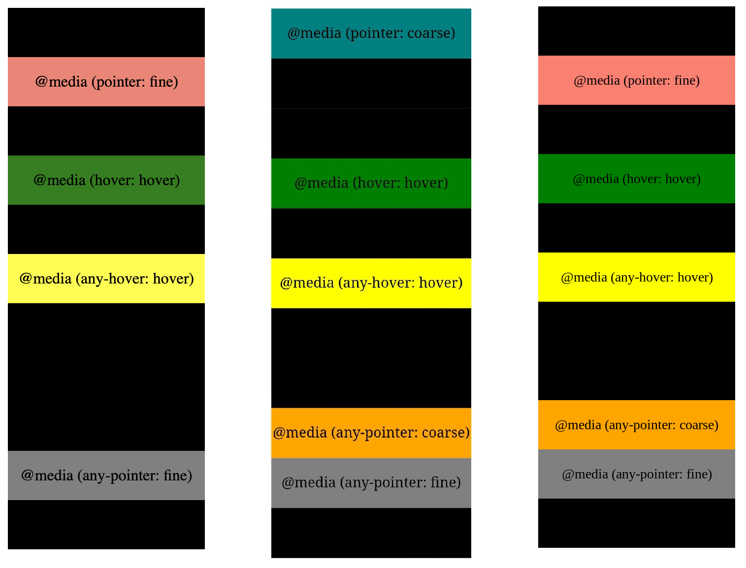
As a result of the tests, I found several features that input on devices and desktops: (hover: hover), (any-hover: hover), (any-pointer: fine). And I could not use them to detect.
However, (pointer: coarse) inputs on devices only and (pointer: fine) inputs on desktop only. Also, we can use (any-pointer: coarse) in cases if we need touch desktops.
The test page code is located here.
It is time to take stock of this research. The final solution looks simple. Please note we don't have to forget about the 3rd type of pointer feature: (pointer: none). It makes sense to set desktop styles for this feature.
@media (pointer: coarse)  {
	/* mobile device */
}

@media (pointer: fine), (pointer: none) {
	/* desktop */
}

@media (pointer: fine) and (any-pointer: coarse) {
	/* touch desktop */
}
The solution page code is located here.
CSS media interaction supporting is more than 96%.