Since we began work on the next version of Microsoft Edge based on Chromium, we’ve been investigating ways to modernize form controls to provide a modern appearance as well as the touch friendliness and accessibility that our users expect from Microsoft Edge today.
Over the past few months, we’ve been collaborating closely with the Google Chrome team on this project, and are excited to share the refreshed controls that will be coming to Microsoft Edge Insider builds, or other Chromium browsers near you.

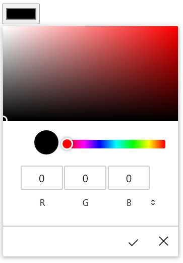
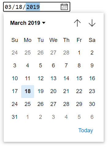
This change brings an improved polish to the form controls and helps bring continuity of design and user experience with the rest of the browser. We have been collaborating closely with the Google Chrome design team to strike a balance between our design languages with a modern look and feel that feels at home in a variety of Chromium browsers. Below is a comparison of the default controls in Chromium today, compared to the updated controls we’re rolling out:
Windows devices come in a rich array of form factors and input modalities, including traditional desktop and laptop PCs, 2-in-1 devices, and other tablets and pen devices. We heard your feedback looking for a better touch input experience in our early Chromium preview builds, and set out to take an inventory of the controls to identify opportunities to improve the touch experience.

A good example of the touch improvements is the time input; currently, Chromium provides a text input, a clear button and a spinner. Our research found that with the large surface area of the fingertip, small controls that are too close together can be difficult to target precisely, recommending a control size of 23×23 pixels (13×13 DLUs) is a good minimum interactive control size for any input device. By contrast, the spin controls at 15×11 pixels are much too small to be used effectively with touch. The new time input we’re introducing includes a flyout with expected touch affordances, like inertia when scrolling and larger touch targets. Other inputs such as date, color, range received subtle size increases to important touch targets as well.
Another area we examined is the focus rectangle that wraps a control when a user focuses the control. This is an important accessibility feature, as it allows the user to track where they’re actively focused, especially while navigating via keyboard.
Our team identified three different potential focus indicators that aligned with Microsoft’s design language, guaranteed high contrast on any background content, and provided a clean and aesthetically pleasing appearance.
We then ran interactive user studies to identify the best option, compared against Chromium’s current default focus rectangle as a baseline. We found that, while preferences were split for aesthetics, one option was the clear leader for accessibility. We’ve chosen that option as the new focus rectangle in Microsoft Edge, which you can see below:

Additionally, all these controls now support Windows High Contrast, which allows the user to define specific colors to improve the visual experience. All sites that utilize the built-in controls will benefit from these updated controls whenever the user is in High Contrast mode, without web developers doing any extra work. However, webdevelopers can adjust these styles if they want by utilizing the new CSS forced-color-adjust property and the prefers-contrastmedia query that are actively being standardized.

We’ve also updated our implementation to ensure great keyboard support across each control. For example, in the new color input, you can either navigate a single value using the arrow keys with the color well selected; if you hold the Ctrl key on Windows (Cmd key on Mac), it will move by 10 values allowing for quick traversal of the color well.
Finally, we updated the mappings for the controls to map to the HTML Accessibility API Mappings specification, to ensure a great experience for users who use assistive technologies (such as screen readers).
Over the past few months, we’ve been collaborating closely with the Google Chrome team on this project, and are excited to share the refreshed controls that will be coming to Microsoft Edge Insider builds, or other Chromium browsers near you.

A more modern appearance
This change brings an improved polish to the form controls and helps bring continuity of design and user experience with the rest of the browser. We have been collaborating closely with the Google Chrome design team to strike a balance between our design languages with a modern look and feel that feels at home in a variety of Chromium browsers. Below is a comparison of the default controls in Chromium today, compared to the updated controls we’re rolling out:
| Current | Upcoming | |
| Radio |  |
 |
| Checkbox |  |
 |
| Text |  |
 |
| Buttons |  |
 |
| Select |  |
 |
| Password |  |
 |
| Color |  |
 |
| Meter |  |
 |
| Progress |  |
 |
| Range |  |
 |
| Date |  |
 |
| Time |  |
 |
Better touch support
Windows devices come in a rich array of form factors and input modalities, including traditional desktop and laptop PCs, 2-in-1 devices, and other tablets and pen devices. We heard your feedback looking for a better touch input experience in our early Chromium preview builds, and set out to take an inventory of the controls to identify opportunities to improve the touch experience.
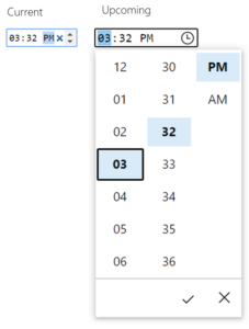
A good example of the touch improvements is the time input; currently, Chromium provides a text input, a clear button and a spinner. Our research found that with the large surface area of the fingertip, small controls that are too close together can be difficult to target precisely, recommending a control size of 23×23 pixels (13×13 DLUs) is a good minimum interactive control size for any input device. By contrast, the spin controls at 15×11 pixels are much too small to be used effectively with touch. The new time input we’re introducing includes a flyout with expected touch affordances, like inertia when scrolling and larger touch targets. Other inputs such as date, color, range received subtle size increases to important touch targets as well.
More accessible controls
Another area we examined is the focus rectangle that wraps a control when a user focuses the control. This is an important accessibility feature, as it allows the user to track where they’re actively focused, especially while navigating via keyboard.
Our team identified three different potential focus indicators that aligned with Microsoft’s design language, guaranteed high contrast on any background content, and provided a clean and aesthetically pleasing appearance.
We then ran interactive user studies to identify the best option, compared against Chromium’s current default focus rectangle as a baseline. We found that, while preferences were split for aesthetics, one option was the clear leader for accessibility. We’ve chosen that option as the new focus rectangle in Microsoft Edge, which you can see below:

Additionally, all these controls now support Windows High Contrast, which allows the user to define specific colors to improve the visual experience. All sites that utilize the built-in controls will benefit from these updated controls whenever the user is in High Contrast mode, without web developers doing any extra work. However, webdevelopers can adjust these styles if they want by utilizing the new CSS forced-color-adjust property and the prefers-contrastmedia query that are actively being standardized.
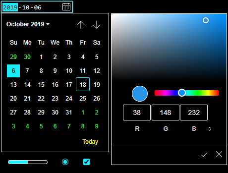
We’ve also updated our implementation to ensure great keyboard support across each control. For example, in the new color input, you can either navigate a single value using the arrow keys with the color well selected; if you hold the Ctrl key on Windows (Cmd key on Mac), it will move by 10 values allowing for quick traversal of the color well.
Finally, we updated the mappings for the controls to map to the HTML Accessibility API Mappings specification, to ensure a great experience for users who use assistive technologies (such as screen readers).