
In 2016, I came across Oliver Byrne's “The first six books of the Elements of Euclid.” The main feature of this book is that instead of ordinary letter designations such as “triangle ABC,” it employs inclusions of miniature pictures directly in the text, that is, for example, an image of a triangle. As difficult as it probably was in the XIX century, as easy, with the right tools, it should be to make such a book nowadays. And so I decided to find out by myself whether that's the case.

The most obvious option—to draw all the illustrations in Illustrator and compose the whole thing in InDesign—was promptly rejected. Geometrical constructions are not exactly the easiest thing to do in Illustrator, and no obvious way to automatically connect the main image to miniatures came to my mind. As for InDesign, although it's very good at dealing with such visually rich layouts, it promised to scare the hell out of me by the overcrowded “Links” panel. So, without thinking twice, I decided to use other tools that I was familiar with—MetaPost, which made it relatively easy to deal with geometry, and LaTeX, which I knew could do the job. Due to some problems with MetaPost libs for LaTeX, I replaced the latter with ConTeXt that enjoys an out-of-the-box merry relationship with MetaPost.
How does it work in general
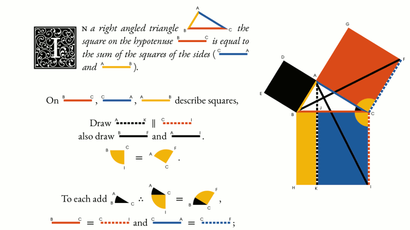
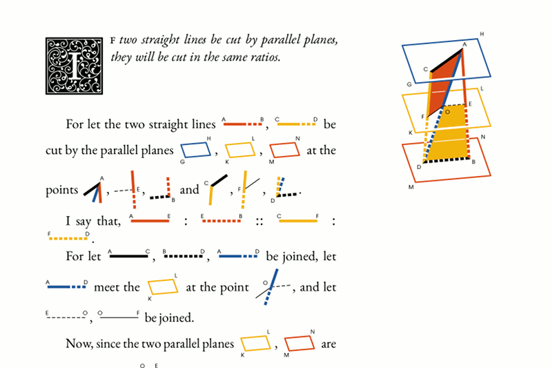
The “Elements” have 13 parts, called “books,” of which Byrne only made the first six. A book mostly consists of “propositions”—theorems and problems. Every proposition has a diagram (usually one) and some text, in which the diagram is referenced.
For constructions, I made a ConTeXt macro that creates a new MetaPost instance. And in MetaPost, a bunch of functions to create these constructions. Their use looks somewhat like this:
\defineNewPicture{ % Inside this thing you put the construction
    pair A, B, C, D; % MetaPost has a special type of variables for coordinates
    numeric d;
    d := 2u;
    A := (0, 0);                %
    B := A shifted (d, 0);      % Point coordinates are set here
    C := A shifted (0, -d);     %
    D := A shifted (d, -d);     %
    byAngleDefine(B, A, C, byblack, 0);     % These define angles:
    byAngleDefine(D, B, A, byblue, 0);      % first—angle points,
    byAngleDefine(C, D, B, byred, 0);       % then color,
    byAngleDefine(A, C, D, byyellow, 0);    % then style.
    draw byNamedAngleResized();     % This thing draws all the angles.
    byLineDefine(A, B, byred, 0, 0);        % These define line segments:
    byLineDefine(B, D, byyellow, 0, 0);     % first—ends,
    byLineDefine(D, C, byblack, 0, 0);      % then color and style,
    byLineDefine(C, A, byblue, 0, 0);       % then thickness.
    draw byNamedLineSeq(0)(AB,BD,DC,CA);    % This thing draws a sequence of lines.
}
\drawCurrentPicture % And this thing draws the whole picture.

For proposition texts, I made a series of macros that draw pictures in the same MetaPost instance. In general, they execute arbitrary MetaPost code, but most of the time, they take object names as arguments. Like this:
% Names are automatically assigned to line segments but can be assigned manually.
Draw $\drawUnitLine{CA} \perp \mbox{ and } = \drawUnitLine{DC}$.\\
Draw $\drawUnitLine{AB} \parallel \drawUnitLine{DC}$,\\
and meeting \drawUnitLine{BD} drawn $\parallel \drawUnitLine{CA}$.

This is how these parts work together:

Some features
Pictures in the book are not overly complicated, but some parts required special attention.
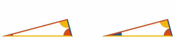
If line segments touch each other with their ends, the touching point needs a nice representation. For now, the connection of only two lines is supported. Other lines can simply be put under such a joint. Although the original book employs at least two types of joints, in my opinion, just one is enough.

Angles are depicted as circular sectors. If an angle is small enough, the sector with the same radius may look tiny so it makes sense to enlarge it. Currently, the radius stays the same for angles above 60 degrees, and for smaller angles, this formula is used:
 .
.
To look nice, dashed lines should begin and end with full dashes. To achieve this, the dash pattern is scaled a bit to fit a line length nicely (Illustrator has a similar feature, but its dashed lines begin and end with half-dashes instead of full dashes.)

There are various ways to depict line segments in text: you can make them all the same length, keeping only their colors, or you can somehow show their length as well. Byrne does both. I have the following formula for this:
 , where
  is a line length in text,
  is original line length,
  is a desired line length and
  is some number between 0 and 1. If
  , then
  , that is, any line segment will have length . If
  , then
  . If
. If  , then with
  ,
,  and with
  ,
,  , that is, shorter segments become longer, and longer ones become shorter. You may want this if you want to retain relative line lengths while avoiding 2 mm lines next to 2 cm ones. (To be honest, everything is a bit more complicated, but the general idea is the same.)
Although Byrne decided not to use letter designations at all, Edward Tufte in one of his books, while praising Byrne's work, suggested that small labels would actually help. And since many things are automated anyway, adding small letters wasn't too big of a deal. By default, the point names are those of variables holding their coordinates. Labels can be placed on the vertices of polygons, on the ends of line segments &c. Of course, labels can be turned on and off (unfortunately, affecting the layout).
Most of the code, however, is devoted to things less visible to a reader and much more to an author/editor. These include correct recognition of line segment and angle synonyms, automatic letter placement around polygon groups, and other stuff like that.
There are also initials and vignettes in the original edition. On one hand, they were reasonably easy to recreate (at least, it wouldn't take a lot of thought to do this), but I decided to go with a more interesting (albeit hopeless) option—automatically generating the initials and vignettes with a random ornament. Not only is it fun, but also, the Russian translation would require adapting the style of the original initials to the Cyrillic script, which was not something I'd prefer to do. So, long story short, when you compile the book, a list of initial letters is written to the disk, and a separate MetaPost script can process it (very slowly) to produce the initials and vignettes. No two of them have the exact same ornament.

The idea is pretty straightforward: place curls on parts of a letter and on the frame, as large as they can grow. This is done several times. All the curves are included in the subsequent iterations. After that, some “leafs” are grown in the same manner. The form and the properties of different sprouts are adjustable.

I can't say I'm happy with the results, but slowly I'm improving the algorithm and hoping for the best (in any case, you can replace the generated initials with pictures of your choice). As a bonus, the script can also produce random tiles.

Translation
To find more typos and mistakes, and just for the sake of it, I decided to translate the book into Russian. At first, I used the well-known Murduhai-Boltovskoi's translation as a reference but soon found that Byrne changed too much in Euclid's theorems for a reference translation to be very useful. To be honest, I didn't work too hard on the translation, especially that of the Introduction, and only recently have found some time to smooth it out.
Putting aside the really unpleasant fifth book (which happens to be designed separately several years before the other five), it wasn't terribly difficult. The process of translation did help with catching bugs, both mine and Byrne's. For instance, the diagram for proposition 9 in the sixth book doesn't match the text, making the proof incorrect, so I had to change it.
One amusing thing I stumbled upon during the translation: in the Introduction, where the author brags about the benefits of his method, he quoted Horace's words regarding the superiority of vision over other senses. A few pages later he decided (I assume, to be even more convincing) to quote a “modern poet's” verse with similar meaning. This verse turned out to be another translation of the same Horace's verse. Luckily, for the Russian translation, my wife found a fitting verse by an English author. Naturally, in the English version, I didn't change the thing.

Another feature the Russian translation has is that letter designations are turned on by default. Someone, however, asked to make an English version with letters turned on too, and I'm considering making it the default option since a “letterless” version (and more than one, actually) exists anyway.
One guy from Poland started to make a Polish translation of the book and made many extremely valuable contributions on the way (scaling angles, for instance, was his idea). I hope his translation will go smoothly. He also helped me with the English version of this article quite a bit.
Interim results
Having played with this book for a while I can tell the following. Inline pictures are indeed easy to read. Now I use this technique in other situations, too. Considering that I only worked on this project in the evenings after a full-time job and on the weekends, it didn't take too much time: about six months for the first English version and about three for the Russian translation, with all the planning and coding. Although I catch bugs and fix typos to this day.
Since the day I published the first version a campaign on kickstarter intended to “complete Byrne's work” (i. e., as the authors understand it, to make all the thirteen Euclid's books in Byrne's style) has started and finished. They seem to use InDesign for layout. What they use to draw diagrams, I couldn't find out. Hopefully, they will succeed in making this book as good as their other works. And much more recently a U.S. designer made a very neat online version. He used Illustrator to draw diagrams.
Plans
Byrne's book doesn't contain any solid geometry (save an image of a parallelepiped in the Introduction). Neither did I make any tools for it, but at some point, I decided to add some, so I started to “byrnify” books 11–13 to have something to use the new tools on. For now, only a bit more than half of the 11th book is roughly made, along with some functions to make solid constructions and project them onto the screen plane. Solid constructions, though, on the average are substantially more complex than plane ones, and I'm not yet sure if Byrne's approach would fit them well and if MetaPost is a reasonably convenient tool for the job.
Pictures in text ofttimes need some kerning. Similarly, yet trickier, taller pictures on adjacent lines spread the lines very wide, which is appropriate only if these pictures collide. I don't yet know how and if I can make an automated solution for these issues, but I definitely want to because fixing them by hand is really tedious.

MetaPost can also be used from within LaTeX and as a standalone program. In the future, I plan to make LaTeX macros similar to ConTeXt ones, to allow using them in a more common environment. In theory, MetaPost can be used with InDesign as well. It's possible to produce pictures with MetaPost and link them in an InDesign file now, but this process begs to be automated with some InDesign scripts. It does look pretty perverse, but I caught myself thinking about this more than once, so I find it worth considering.
Last but not least, I want to apply the tools to something more modern and practical than “the Elements.”
All the stuff can by found here, pdf-s are in the “releases” section.
