Today we will discuss the silver bullet of software development: the program settings.
Everybody understands what settings are, more or less. Every computer user is going to stumble upon them, eventually. But the user does not always end up a winner in this encounter. There are 3 major problems to tackle: it's hard to find the right setting, the required setting does not exist, and it's unclear what this or that setting's responsible for.
To understand this, let's first think about the origin of settings. In theory, settings provide a way for the developer to adapt a program to a certain use case. The users are different though, one wants it his way, another demands her own, and even though the differences are miniscule, the decision is left up to the user. As a result, you must know about user tasks and their goals to create the right settings window.
That's the theory so far. What about the practice?
The main problem is the misunderstanding of users' goals and tasks. Therefore the developer (in a broader sense, the company developing a software product) makes a wrong choice regarding any setting in particular: what's unnecessary is added and what is needed — isn't. A lack of settings is sad, but not bad. The users will rectify this mistake after release: call for a new setting.
Yet there's more compelling case of an abundance of settings. Having proclaimed software settings a «silver bullet» at the beginning, I referred to a common misconception: it is considered, when there're multiple ways to implement a certain functionality, and it's unclear what to choose, that one should let the user decide via a setting. It would seem to be a safe bet, no matter what the users want, they will make the right choice themselves and we're off the hook. Well, let's examine this misconception a little closer.
First of all, given multiple choices, it is not clear what to choose. Here you need to do one simple thing: think about your users.
«What will they use? Will they be fine with just 'A'? or variant 'B'?» — these are plain and simple questions, but it terrifies me, even when it's possible to get them answered (quite often), in reality, people responsible for product interfaces don't raise them. Ain't it simpler to add a setting, lifting the responsibility off themselves… and you don't need to think about it!
If, based on usage, the options are equivalent, sensibly you should choose one, implement just that one and stop bothering your users with it (this topic is well discussed in [1]). Only add a setting if there are differences based on usage scenarios when users might require both.
By the way, if you answer this for yourself: it will shatter the idealistic dream of creating a single program for all users — different users and different tasks often need mutually exclusive solutions, and the settings won't help you out there: this is how different the products must be.
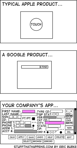
While thinking about this issue, I came to a conclusion that life has an interesting self-regulating mechanism: if a company has someone who understands interface design, or there had been a user study, then the right settings will be added naturally. Otherwise the developer plays it safe and adds as many settings as he can think of, and oddly, this is what allows people to use the software the way they want to (having found a good combination of settings) despite the lack of any interface design.
Depiction of the problem (relatable, right?)
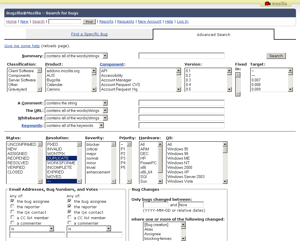
Secondly, about the «safe bet». Each setting has its own price. It's not an objective for a user to keep digging in settings. Subsequently, the time spent working on configuration is written off as wasted, and rightly so. It's the product developers who bear the responsibility for a user wasting this time. Therefore you should strive to minimize this time, and thanks to psychology we know: when choosing from multiple alternative signals, the reaction time increases proportionally to the logarithm of their number (Hick's law). That means: the more settings, the harder it is to choose the right one. Oh and human reading speed is limited too (ca. 5 words per second).
Bugzilla screenshot:
Thirdly, it appears the developer should strive to reduce the amount of settings, after all each of them must be developed and a separate logic branch supported, implying additional work and, in the end, money spent. However this consideration is often ignored for a simpler decision making process, I will call it «The Great Settings Paradox».
It is easy to encounter the «silver bullet» myth. In every interface-related discussion someone will come up with the idea «let's make it a setting» (it didn't take long, just google «add option site:habr.com» and found: [the links are in Russian] one, two, three et cetera). I think you've encountered this myth many times yourself, not just as a question but as a result in software products as well.
A screenshot:

Yet another screenshot (isn't this just a program to shutdown your computer?):

There's one more problem to do with settings, at the beginning of the article I phrased it as «unclear what this or that option's responsible for». I mean the problem of disconnection between the implementation model and the user's mental model. A program user has a general understanding how the program works. This is called user's mental model. The point is, this model does not necessarily (actually rarely) corresponds with what the program actually does (implementation model). The derived rule is that the interface (and settings too) should be based on user's mental model, and not the implementation model, otherwise the users will experience difficulties. For example, when I drag an image from Safari to Mail, a new e-mail with that picture is created. In my mental model the image was transferred from one program to another. Had Safari had a setting «temporary folder for file dragging operations», then I'd not have understood its meaning, because these are implementation details which do not exist in my mental model.
Illustration (imaginary):
Illustration (real):

The screenshot shows the «plentiful» settings of the mail.ru interface (dated ca. 2010), it'd make no sense to read it, let alone translate.
The best ones:
The problem of settings bloat at mail.ru is obvious, but let's look at them from the implementation/mental model point of view. They've got three (!) different places to select the city/time zone. As far as I understand, the reason being they have three modules that need this information (implementation model). However in my mental model mail.ru is an interface to my personal inbox, after all I live in one city and don't get why I'd need to specify this information three times. Funnily enough, even if you choose a city in all three places, then the time of e-mail arrival will still be that of Moscow: the exact case when the setting you need is missing.
To summarize. The settings window is part of your program's interface, thus it must follow all rules of an interface. It must be designed under consideration of users' goals and tasks. Keep in mind, users' communication with settings is not one of their tasks, try to reduce the time of this «conversation», leaving only the needed settings up to them. Finally, when you design the settings, name them according to users' tasks, keeping it within their mental model.
P.S. If someone has examples of exceptionally poorly designed settings, I'd be glad to see them in comments (twice as glad if it's screenshots).
Links:
Everybody understands what settings are, more or less. Every computer user is going to stumble upon them, eventually. But the user does not always end up a winner in this encounter. There are 3 major problems to tackle: it's hard to find the right setting, the required setting does not exist, and it's unclear what this or that setting's responsible for.
To understand this, let's first think about the origin of settings. In theory, settings provide a way for the developer to adapt a program to a certain use case. The users are different though, one wants it his way, another demands her own, and even though the differences are miniscule, the decision is left up to the user. As a result, you must know about user tasks and their goals to create the right settings window.
That's the theory so far. What about the practice?
Translator's note
If you do notice typos, you can submit them by highlighting them and pressing Ctrl+Enter. Other suggestions are welcome per PM.
The main problem is the misunderstanding of users' goals and tasks. Therefore the developer (in a broader sense, the company developing a software product) makes a wrong choice regarding any setting in particular: what's unnecessary is added and what is needed — isn't. A lack of settings is sad, but not bad. The users will rectify this mistake after release: call for a new setting.
Yet there's more compelling case of an abundance of settings. Having proclaimed software settings a «silver bullet» at the beginning, I referred to a common misconception: it is considered, when there're multiple ways to implement a certain functionality, and it's unclear what to choose, that one should let the user decide via a setting. It would seem to be a safe bet, no matter what the users want, they will make the right choice themselves and we're off the hook. Well, let's examine this misconception a little closer.
First of all, given multiple choices, it is not clear what to choose. Here you need to do one simple thing: think about your users.
«What will they use? Will they be fine with just 'A'? or variant 'B'?» — these are plain and simple questions, but it terrifies me, even when it's possible to get them answered (quite often), in reality, people responsible for product interfaces don't raise them. Ain't it simpler to add a setting, lifting the responsibility off themselves… and you don't need to think about it!
If, based on usage, the options are equivalent, sensibly you should choose one, implement just that one and stop bothering your users with it (this topic is well discussed in [1]). Only add a setting if there are differences based on usage scenarios when users might require both.
By the way, if you answer this for yourself: it will shatter the idealistic dream of creating a single program for all users — different users and different tasks often need mutually exclusive solutions, and the settings won't help you out there: this is how different the products must be.
While thinking about this issue, I came to a conclusion that life has an interesting self-regulating mechanism: if a company has someone who understands interface design, or there had been a user study, then the right settings will be added naturally. Otherwise the developer plays it safe and adds as many settings as he can think of, and oddly, this is what allows people to use the software the way they want to (having found a good combination of settings) despite the lack of any interface design.
Depiction of the problem (relatable, right?)
Secondly, about the «safe bet». Each setting has its own price. It's not an objective for a user to keep digging in settings. Subsequently, the time spent working on configuration is written off as wasted, and rightly so. It's the product developers who bear the responsibility for a user wasting this time. Therefore you should strive to minimize this time, and thanks to psychology we know: when choosing from multiple alternative signals, the reaction time increases proportionally to the logarithm of their number (Hick's law). That means: the more settings, the harder it is to choose the right one. Oh and human reading speed is limited too (ca. 5 words per second).
Bugzilla screenshot:
Thirdly, it appears the developer should strive to reduce the amount of settings, after all each of them must be developed and a separate logic branch supported, implying additional work and, in the end, money spent. However this consideration is often ignored for a simpler decision making process, I will call it «The Great Settings Paradox».
It is easy to encounter the «silver bullet» myth. In every interface-related discussion someone will come up with the idea «let's make it a setting» (it didn't take long, just google «add option site:habr.com» and found: [the links are in Russian] one, two, three et cetera). I think you've encountered this myth many times yourself, not just as a question but as a result in software products as well.
A screenshot:
Yet another screenshot (isn't this just a program to shutdown your computer?):
There's one more problem to do with settings, at the beginning of the article I phrased it as «unclear what this or that option's responsible for». I mean the problem of disconnection between the implementation model and the user's mental model. A program user has a general understanding how the program works. This is called user's mental model. The point is, this model does not necessarily (actually rarely) corresponds with what the program actually does (implementation model). The derived rule is that the interface (and settings too) should be based on user's mental model, and not the implementation model, otherwise the users will experience difficulties. For example, when I drag an image from Safari to Mail, a new e-mail with that picture is created. In my mental model the image was transferred from one program to another. Had Safari had a setting «temporary folder for file dragging operations», then I'd not have understood its meaning, because these are implementation details which do not exist in my mental model.
Illustration (imaginary):
Illustration (real):
The screenshot shows the «plentiful» settings of the mail.ru interface (dated ca. 2010), it'd make no sense to read it, let alone translate.
The best ones:
- There's one setting called «Filters» for automatic e-mail filtering and below it another, separate setting for «spam filtering»
- There's separate pages for «password», «password recovery options» and «security»
- Also 3 entries for «identity information», «personal information and interests» and «contact information»
The problem of settings bloat at mail.ru is obvious, but let's look at them from the implementation/mental model point of view. They've got three (!) different places to select the city/time zone. As far as I understand, the reason being they have three modules that need this information (implementation model). However in my mental model mail.ru is an interface to my personal inbox, after all I live in one city and don't get why I'd need to specify this information three times. Funnily enough, even if you choose a city in all three places, then the time of e-mail arrival will still be that of Moscow: the exact case when the setting you need is missing.
To summarize. The settings window is part of your program's interface, thus it must follow all rules of an interface. It must be designed under consideration of users' goals and tasks. Keep in mind, users' communication with settings is not one of their tasks, try to reduce the time of this «conversation», leaving only the needed settings up to them. Finally, when you design the settings, name them according to users' tasks, keeping it within their mental model.
P.S. If someone has examples of exceptionally poorly designed settings, I'd be glad to see them in comments (twice as glad if it's screenshots).
Links:
