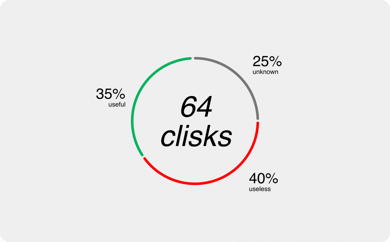
On average, online store users make 64 clicks before adding a product to the cart. Some clicks are useful - so-called discovery clicks that help lead to users finding a product they wish to buy, and some are useless that come as the result of poor UX. With great competition for convenience and increasingly reducing attention spans of users, each useless click reduces the number of visitors that will reach checkout.
This makes it obvious that it’s crucial to reduce the number of those useless clicks that distract or annoy users, and increase the number of clicks that deliver the feeling of success. Let’s look at the main problems that can make a visitor feel not happy.
Failing 1: Load More
It’s common knowledge that the speed at which pages load is crucial for user experience, and the bounce rate increases with every second taken up by page loading. That’s why adding a Load More button on product listing pages is especially dangerous, thus making your users experience impatience after every 8 product cards. In fact, one of DataMilk's research studies shows that about 30% bounce after clicking Load More.

To create an uninterrupted experience for your users and allow them to calmly explore your stock, remove all possible loading-involved elements like the Load More button from the product listing pages. To keep the footer accessible, allow automatic loading of the next block of products if the user has not gone to the footer within 2 seconds.
Failing 2: Wrong Content
Social media, with its personalized feeds, have taught today’s users that they will always see content that is interesting to them, without any effort made. If you like cats, the algorithms will soon figure it out and you will start seeing them in your feed.
In online stores, on the contrary, it still takes effort to find an interesting product. Despite the abundance of data that is collected from us, stores still show products as they are loaded into the database.
The best way to deliver the most fitting content to every user is an AI solution for e-commerce, but something can be done with good old UX design. Instead of a long vertical product listing page, add horizontal carousels that would suggest exploring your catalog or services.
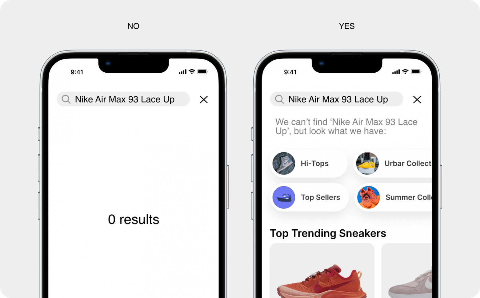
Failing 3: No Matches
Search is extremely useful for e-commerce. If users come to a site with a particular product in mind, they won’t go tap at the burger menu to navigate to your catalog, choose a category and then a subcategory… They will go to the search bar. The success of the search depends on how sophisticated the search engine is, but first and foremost, there should be a UX solution for cases if there is nothing that matches the search.
An empty dead-end page is a huge turn-off for the users that makes them emotionally start shopping all over. Always add a carousel or product listing page with other products for a no-match situation. It may not be the answer to what your users have in mind, but something might come up that will eventually lead them to other purchases.
Failing 4: No optimization for mobile
Today, a great deal of purchases are made from mobile devices. In fact, m-commerce has a nearly 73% market share of total eCommerce sales as of 2022. Most e-commerce stores on mobile phones look pretty much like smaller desktop versions, but If we think about the environment of m-commerce experience we will see that more should be done there to adapt to mobile.
In mobile, every click is critical, because if the users don’t like where they got to and want to get back, they will need to click on an inconvenient back button at the bottom left (that normally makes you use your other hand help you hold the phone).
The product listing pages suffer the most here and as a result, many products will be overlooked due to a user’s reluctance to click on it and see closer. A solution here would be a page preview pop-up in the middle of the screen that can be easily closed with a cross icon, allowing continued experience with the chosen category. The other obvious case is the cart page. The stakes are even higher here, as once your users get there, they might choose to finish shopping earlier only to avoid the annoying left-side ‘back’ button tapping (especially, if their left hand is busy holding a bag or a sandwich).
Alex Kalashnikov, designer
