Introduction
People use their gadgets every day. And the main attribute of any gadget is a keyboard. But have you ever thought about creating a keyboard that would display on your screen?
In this article, we will create a 3D Keyboard Key with awesome animation after clicking on it. And yes, we will not use any programming language. Our key will be on the power of CSS! Let’s get started!
Implementation
At first, we need to create a HTML layout. It’s just simple.
<div class="container">
  <div class="key">
    1
  </div>
</div>
Okay, It’s great. We have a layout for our key “1”. Now we need to add CSS styles. For better key display we will add styles for the .container class.
.container {
  height: 100vh;
  display: flex;
  justify-content: center;
  align-items: center;
}
Now our key will be at the center of our page. Let’s add CSS for the key.
.container .key {
  position: relative;

  display: flex;
  justify-content: center;
  align-items: center;
  width: 100px;
  height: 100px;
  padding: 4px 7px;
  font-size: 4rem;
  color: #ffffff;
  background-color: #495057;
  border-radius: 10px;
  cursor: pointer;
}
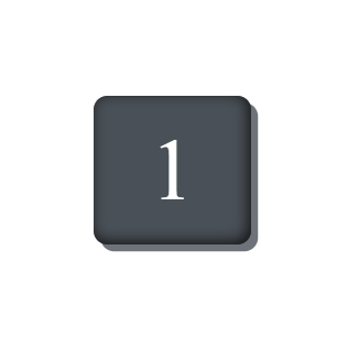
It will look so:

But we also need to add the 3D effect (because I wrote about it in the title). In order to do so, we will add one CSS property. It’s box-shadow. Let’s add it to the .key class.
box-shadow:
   5px 5px 0 rgba(73, 80, 87, 0.8),
   inset -2px -2px 10px #131313;
The first value of box-shadow 5px 5px 0 rgba(73, 80, 87, 0.8) adds an external shadow. And inset -2px -2px 10px #131313 adds internal shadow. It’s great! Let’s look at the result:
Not bad, not bad. But I also promised you that we would add a key down effect after mouse click on the key. Let’s make it!
.container .key:active {
  box-shadow:
     3px 3px 0 rgba(73, 80, 87, 0.8),
     inset -7px -7px 10px #131313;
  transform: translate(2px, 2px);
  transition: 0.2s;
}
We use pseudo-class :active to add this effect. Also, you need to pay attention to changes in box-shadow and adding the transform property.
At first, transform: translate(2px, 2px) moves our key by 2 pixels on the X-axis and 2 pixels on the Y-axis. It is the template: transform: translate(X-axis, Y-axis).
Secondly, we just change the value of the box-shadow that it stays fixed. We need to subtract the X-axis and Y-axis translate values from the X-axis and Y-axis offset values of the box-shadow. Just simple mathematics:
For the X-axis:
5px (box-shadow) — 2px (transform: translate) = 3px.
And the same is for the Y-axis.
And thirdly, transition: 0.2s adds smooth to our effect.
It will look so:

Just compare it with inactive variant:
It’s great, isn’t it? And, as the last part, for the best display of our key, we just need to add extra symbol. It is “!” for the key “1”.
We just will add one tag span in HTML with class .extra inside the class .key.
<div class="key">
    1 <span class="extra">!</span>
</div>
And we need some CSS for the correct display of it inside the key “1”.
.key .extra {
  position: absolute;
  top: 10%;
  left: 15%;
font-size: 2.5rem;
}
It is worth noting that position: absolute works correctly if we will add position: relative to the parent of the .extra class, i.e. the .key class.
The result:

Yes, we finished it! Congratulations! If you want to check the full code of our tutorial you can check it on CodePen.
More usable content
It is my first article on Habr but I also publish fascinating articles on Medium. It would be if you check my articles and write some feedback in the comments.
Medium: https://medium.com/@maxim_filanovich
You receive interesting and cognitive material if you will subscribe to Habr and follow me on Medium.
If you have questions or you interested in my articles, you can check and subscribe on my social media:
GitHub
Telegram
VK
