
In the previous part of this article, I talked about the research background, goals, assumptions, source data, and used tools. Today, without further ado, let's say together…
Chocks Away!
We start by importing the required packages and defining the root folder where the source data sit:
import pandas as pd, numpy as np

# root folder path (change for your own!)
ROOT_FOLDER = r'c:\_PROG_\Projects\us_crimes'
Lethal Force Fatalities
First let's look into the use of lethal force data. Load the CSV into a new DataFrame:
# FENC source CSV
FENC_FILE = ROOT_FOLDER + '\\fatal_enc_db.csv'

# read to DataFrame
df_fenc = pd.read_csv(FENC_FILE, sep=';', header=0, usecols=["Date (Year)", "Subject's race with imputations", "Cause of death", "Intentional Use of Force (Developing)", "Location of death (state)"])
You will note that not all the fields are loaded, but only those we'll need in the research: year, victim race (with imputations), cause of death (not used now but may come in useful later on), intentional use of force flag, and the state where the death took place.
It's worth understanding what «subject's race with imputations» means. The fact is, the official / media sources that FENC uses to glean data don't always report the victim's race, resulting in data gaps. To compensate these gaps, the FENC community involves third-party experts who estimate the race by the other available data (with some degree of error). You can read more on this on the FENC website or see notes in the original Excel spreadsheet (sheet 2).
We'll then give the columns handier titles and drop the rows with missing data:
df_fenc.columns = ['Race', 'State', 'Cause', 'UOF', 'Year']
df_fenc.dropna(inplace=True)
Now we hava to unify the race categories with those used in the crime and population datasets we are going to match with, since these datasets use somewhat different racial classifications. The FENC database, for one, singles out the Hispanic/Latino ethnicity, as well as Asian/Pacific Islanders and Middle Easterns. But in this research, we're focusing on Blacks and Whites only. So we must make some aggregation / renaming:
df_fenc = df_fenc.replace({'Race': {'European-American/White': 'White',
                          'African-American/Black': 'Black',
                          'Hispanic/Latino': 'White', 'Native American/Alaskan': 'American Indian',
                          'Asian/Pacific Islander': 'Asian', 'Middle Eastern': 'Asian',
                          'NA': 'Unknown', 'Race unspecified': 'Unknown'}}, value=None)
We are leaving only White (now including Hispanic/Latino) and Black victims:
df_fenc = df_fenc.loc[df_fenc['Race'].isin(['White', 'Black'])]
What's the purpose of the UOF (Use Of Force) field? For this research, we want to analyze only those cases when the police (or other law enforcement agencies) intentionally used lethal force. We leave out cases when the death was the result of suicide (for example, when sieged by the police) or pursuit and crash in a vehicle. This constraint follows from two criteria:
1) the circumstances of deaths not directly resulting from use of force don't normally allow of a transparent cause-and-effect link between the acts of the law enforcement officers and the ensuing death (one example could be when a man dies from a heart attack when held at gun-point by a police officer; another common example is when a suspect being arrested shoots him/herself in the head);
2) it is only intentional use of force that counts in official statistics; thus, for instance, the future FBI database I mentioned in the previous part of the article will collect only such cases.
So to leave only intentional use of force cases:
df_fenc = df_fenc.loc[df_fenc['UOF'].isin(['Deadly force', 'Intentional use of force'])]
For convenience we'll add the full state names. I made a separate CSV file for that purpose, which we're now merging with our data:
df_state_names = pd.read_csv(ROOT_FOLDER + '\\us_states.csv', sep=';', header=0)
df_fenc = df_fenc.merge(df_state_names, how='inner', left_on='State', right_on='state_abbr')
Type
df_fenc.head() to peek at the resulting dataset:| Race | State | Cause | UOF | Year | state_name | state_abbr | |
|---|---|---|---|---|---|---|---|
| 0 | Black | GA | Gunshot | Deadly force | 2000 | Georgia | GA |
| 1 | Black | GA | Gunshot | Deadly force | 2000 | Georgia | GA |
| 2 | Black | GA | Gunshot | Deadly force | 2000 | Georgia | GA |
| 3 | Black | GA | Gunshot | Deadly force | 2000 | Georgia | GA |
| 4 | Black | GA | Gunshot | Deadly force | 2000 | Georgia | GA |
Since we're not going to investigate the individual cases, let's aggregate the data by years and victim races:
# group by year and race
ds_fenc_agg = df_fenc.groupby(['Year', 'Race']).count()['Cause']
df_fenc_agg = ds_fenc_agg.unstack(level=1)
# cast numericals to UINT16 to save memory
df_fenc_agg = df_fenc_agg.astype('uint16')
The resulting table is indexed by years (2000 — 2020) and contains two columns: 'White' (number of white victims) and 'Black' (number of black victims). Let's take a look at the corresponding plot:
plt = df_fenc_agg.plot(xticks=df_fenc_agg.index, color=['olive', 'g'])
plt.set_xticklabels(df_fenc_agg.index, rotation='vertical')
plt.set_xlabel('')
plt.set_ylabel('Number of police victims')
plt
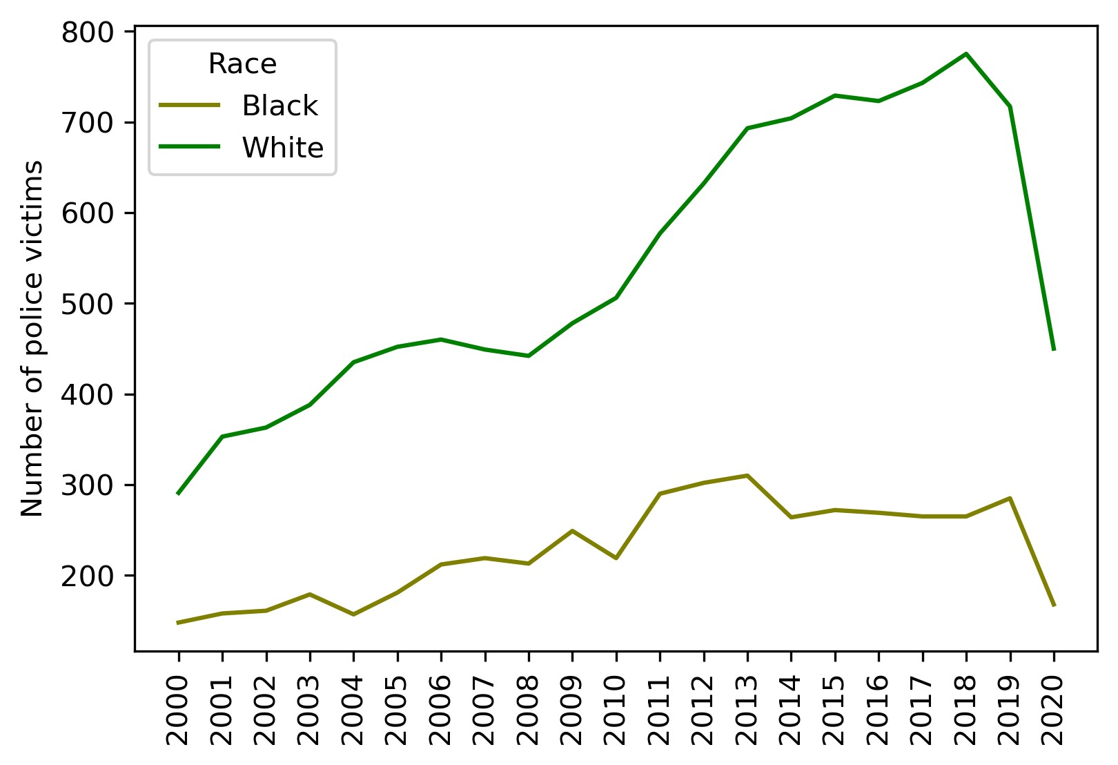
Intermediate conclusion:
White police victims outnumber black victims in absolute figures.
The average difference factor between the two is about 2.4. It's not a far guess that this is due to the difference between the population of the two races in the US. Well, let's look at per capita values then.
Load the population data:
# population CSV file (1991 - 2018 data points)
POP_FILE = ROOT_FOLDER + '\\us_pop_1991-2018.csv'
df_pop = pd.read_csv(POP_FILE, index_col=0, dtype='int64')
Then merge the data with our dataset:
# take only Black and White population for 2000 - 2018
df_pop = df_pop.loc[2000:2018, ['White_pop', 'Black_pop']]

# join dataframes and drop rows with missing values
df_fenc_agg = df_fenc_agg.join(df_pop)
df_fenc_agg.dropna(inplace=True)

# cast population numbers to integer type
df_fenc_agg = df_fenc_agg.astype({'White_pop': 'uint32', 'Black_pop': 'uint32'})
OK. Finally, create two new columns with per capita (per million) values dividing the abosulte victim counts by the respective race population and multiplying by one million:
df_fenc_agg['White_promln'] = df_fenc_agg['White'] * 1e6 / df_fenc_agg['White_pop']
df_fenc_agg['Black_promln'] = df_fenc_agg['Black'] * 1e6 / df_fenc_agg['Black_pop']
Let's see what we get:
| Black | White | White_pop | Black_pop | White_promln | Black_promln | |
|---|---|---|---|---|---|---|
| Year | ||||||
| 2000 | 148 | 291 | 218756353 | 35410436 | 1.330247 | 4.179559 |
| 2001 | 158 | 353 | 219843871 | 35758783 | 1.605685 | 4.418495 |
| 2002 | 161 | 363 | 220931389 | 36107130 | 1.643044 | 4.458953 |
| 2003 | 179 | 388 | 222018906 | 36455476 | 1.747599 | 4.910099 |
| 2004 | 157 | 435 | 223106424 | 36803823 | 1.949742 | 4.265861 |
| 2005 | 181 | 452 | 224193942 | 37152170 | 2.016112 | 4.871855 |
| 2006 | 212 | 460 | 225281460 | 37500517 | 2.041890 | 5.653255 |
| 2007 | 219 | 449 | 226368978 | 37848864 | 1.983487 | 5.786171 |
| 2008 | 213 | 442 | 227456495 | 38197211 | 1.943229 | 5.576323 |
| 2009 | 249 | 478 | 228544013 | 38545558 | 2.091501 | 6.459888 |
| 2010 | 219 | 506 | 229397472 | 38874625 | 2.205778 | 5.633495 |
| 2011 | 290 | 577 | 230838975 | 39189528 | 2.499578 | 7.399936 |
| 2012 | 302 | 632 | 231992377 | 39623138 | 2.724227 | 7.621809 |
| 2013 | 310 | 693 | 232969901 | 39919371 | 2.974633 | 7.765653 |
| 2014 | 264 | 704 | 233963128 | 40379066 | 3.009021 | 6.538041 |
| 2015 | 272 | 729 | 234940100 | 40695277 | 3.102919 | 6.683822 |
| 2016 | 269 | 723 | 234644039 | 40893369 | 3.081263 | 6.578084 |
| 2017 | 265 | 743 | 235507457 | 41393491 | 3.154889 | 6.401973 |
| 2018 | 265 | 775 | 236173020 | 41617764 | 3.281493 | 6.367473 |
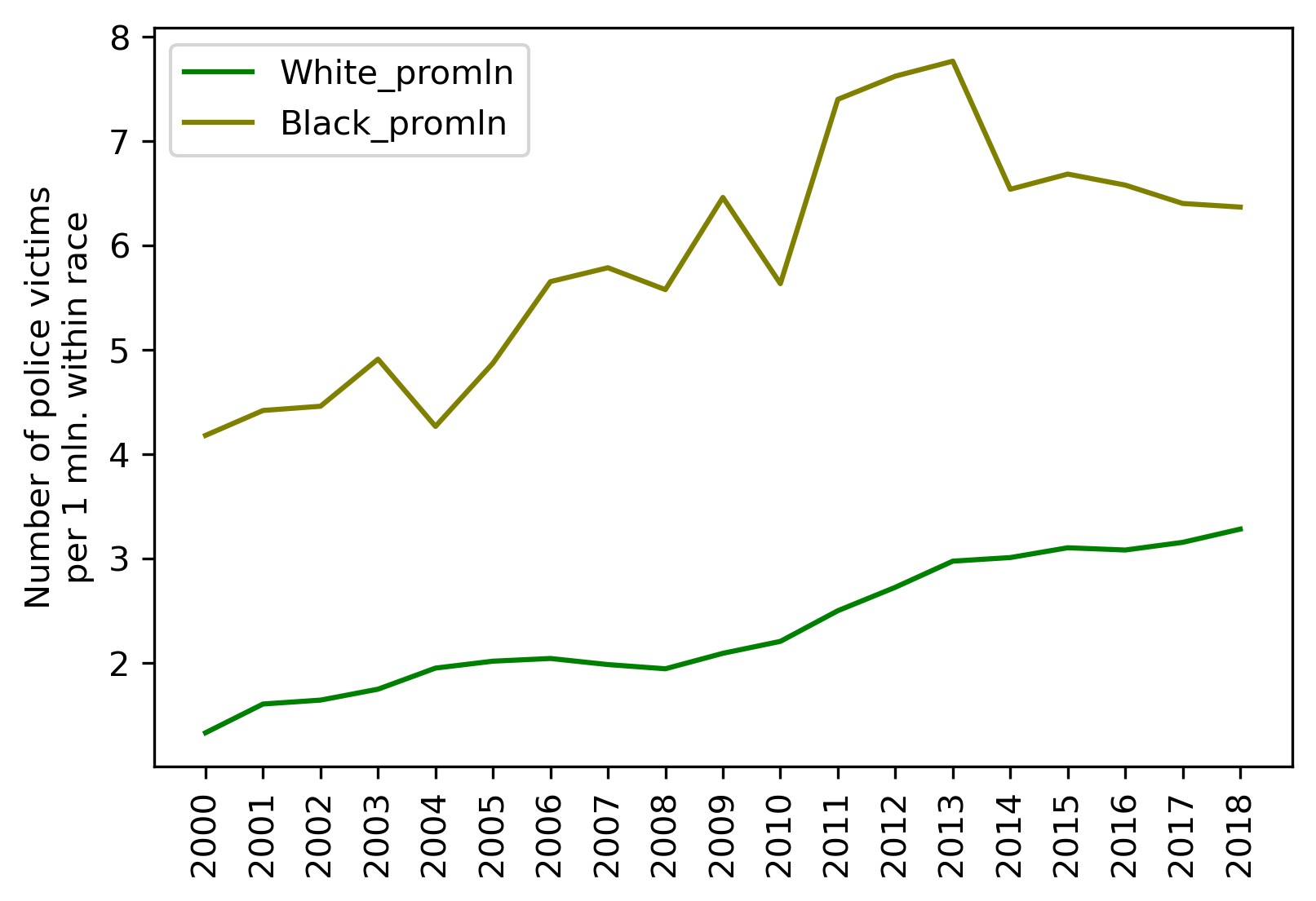
The two rightmost columns now contain per million victim counts for both races. Time to visualize that:
plt = df_fenc_agg.loc[:, ['White_promln', 'Black_promln']].plot(xticks=df_fenc_agg.index, color=['g', 'olive'])
plt.set_xticklabels(df_fenc_agg.index, rotation='vertical')
plt.set_xlabel('')
plt.set_ylabel('Number of police victims\nper 1 mln. within race')
plt
We'll also display the basic stats for this data by running:
df_fenc_agg.loc[:, ['White_promln', 'Black_promln']].describe()
| White_promln | Black_promln | |
|---|---|---|
| count | 19.000000 | 19.000000 |
| mean | 2.336123 | 5.872145 |
| std | 0.615133 | 1.133677 |
| min | 1.330247 | 4.179559 |
| 25% | 1.946485 | 4.890977 |
| 50% | 2.091501 | 5.786171 |
| 75% | 2.991827 | 6.558062 |
| max | 3.281493 | 7.765653 |
Intermediate conclusions:
- Lethal force results on average in 5.9 per one million Black deaths and 2.3 per one million White deaths (Black victim count is 2.6 greater in unit values).
- Data deviation (scatter) for Blacks is 1.8 higher than for Whites — you can see that the green curve representing White victims is considerably smoother.
- Black victims peaked in 2013 at 7.7 per million; White victims peaked in 2018 at 3.3 per million.
- White victims grow continuously from year to year (by 0.1 — 0.2 per million on average), while Black victims rolled back to their 2009 level after a climax in 2011 — 2013.
Thus, we can answer our first question:
— Can one say the police kill Blacks more frequently than Whites?
— Yes, it is a correct inference. Blacks are 2.6 times more likely to meet death by the hands of law enforcement agencies than Whites.
Bearing in mind this inference, let's go ahead and look at the crime data to see if (and how) they are related to lethal force fatalities and races.
Crime Data
Let's load our crime CSV:
CRIMES_FILE = ROOT_FOLDER + '\\culprits_victims.csv'
df_crimes = pd.read_csv(CRIMES_FILE, sep=';', header=0,
                        index_col=0, usecols=['Year', 'Offense', 'Offender/Victim', 'White',
                                       'White pro capita', 'Black', 'Black pro capita'])
Again, as before, we're using only the relevant fields: year, offense type, offender / victim classifier and offense counts for each race (absolute — 'White', 'Black' and per capita — 'White pro capita', 'Black pro capita').
Let's look what we have here (with
df_crimes.head()):| Offense | Offender/Victim | Black | White | Black pro capita | White pro capita | |
|---|---|---|---|---|---|---|
| Year | ||||||
| 1991 | All Offenses | Offender | 490 | 598 | 1.518188e-05 | 2.861673e-06 |
| 1991 | All Offenses | Offender | 4 | 4 | 1.239337e-07 | 1.914160e-08 |
| 1991 | All Offenses | Offender | 508 | 122 | 1.573958e-05 | 5.838195e-07 |
| 1991 | All Offenses | Offender | 155 | 176 | 4.802432e-06 | 8.422314e-07 |
| 1991 | All Offenses | Offender | 13 | 19 | 4.027846e-07 | 9.092270e-08 |
We won't need data on offense victims so far, so get rid of them:
# leave only offenders
df_crimes1 = df_crimes.loc[df_crimes['Offender/Victim'] == 'Offender']
# leave only 2000 - 2018 data years and remove redundant columns
df_crimes1 = df_crimes1.loc[2000:2018, ['Offense', 'White', 'White pro capita', 'Black', 'Black pro capita']]
Here's the resulting dataset (1295 rows * 5 columns):
| Offense | White | White pro capita | Black | Black pro capita | |
|---|---|---|---|---|---|
| Year | |||||
| 2000 | All Offenses | 679 | 0.000003 | 651 | 0.000018 |
| 2000 | All Offenses | 11458 | 0.000052 | 30199 | 0.000853 |
| 2000 | All Offenses | 4439 | 0.000020 | 3188 | 0.000090 |
| 2000 | All Offenses | 10481 | 0.000048 | 5153 | 0.000146 |
| 2000 | All Offenses | 746 | 0.000003 | 63 | 0.000002 |
| ... | ... | ... | ... | ... | ... |
| 2018 | Larceny Theft Offenses | 1961 | 0.000008 | 1669 | 0.000040 |
| 2018 | Larceny Theft Offenses | 48616 | 0.000206 | 30048 | 0.000722 |
| 2018 | Drugs Narcotic Offenses | 555974 | 0.002354 | 223398 | 0.005368 |
| 2018 | Drugs Narcotic Offenses | 305052 | 0.001292 | 63785 | 0.001533 |
| 2018 | Weapon Law Violation | 70034 | 0.000297 | 58353 | 0.001402 |
Now we need to convert the per capita (per 1 person) values to per million values (in keeping with the unit data we use throughout the research). Just multiply the per capita columns by one million:
df_crimes1['White_promln'] = df_crimes1['White pro capita'] * 1e6
df_crimes1['Black_promln'] = df_crimes1['Black pro capita'] * 1e6
To see the whole picture — how crimes committed by Whites and Blacks are distributed across the offense types, let's aggregate the absolute crime counts by years:
df_crimes_agg = df_crimes1.groupby(['Offense']).sum().loc[:, ['White', 'Black']]
| White | Black | |
|---|---|---|
| Offense | ||
| All Offenses | 44594795 | 22323144 |
| Assault Offenses | 12475830 | 7462272 |
| Drugs Narcotic Offenses | 9624596 | 3453140 |
| Larceny Theft Offenses | 9563917 | 4202235 |
| Murder And Nonnegligent Manslaughter | 28913 | 39617 |
| Sex Offenses | 833088 | 319366 |
| Weapon Law Violation | 829485 | 678861 |
Or in a graph:
plt = df_crimes_agg.plot.barh(color=['g', 'olive'])
plt.set_ylabel('')
plt.set_xlabel('Number of offenses (sum for 2000-2018)')
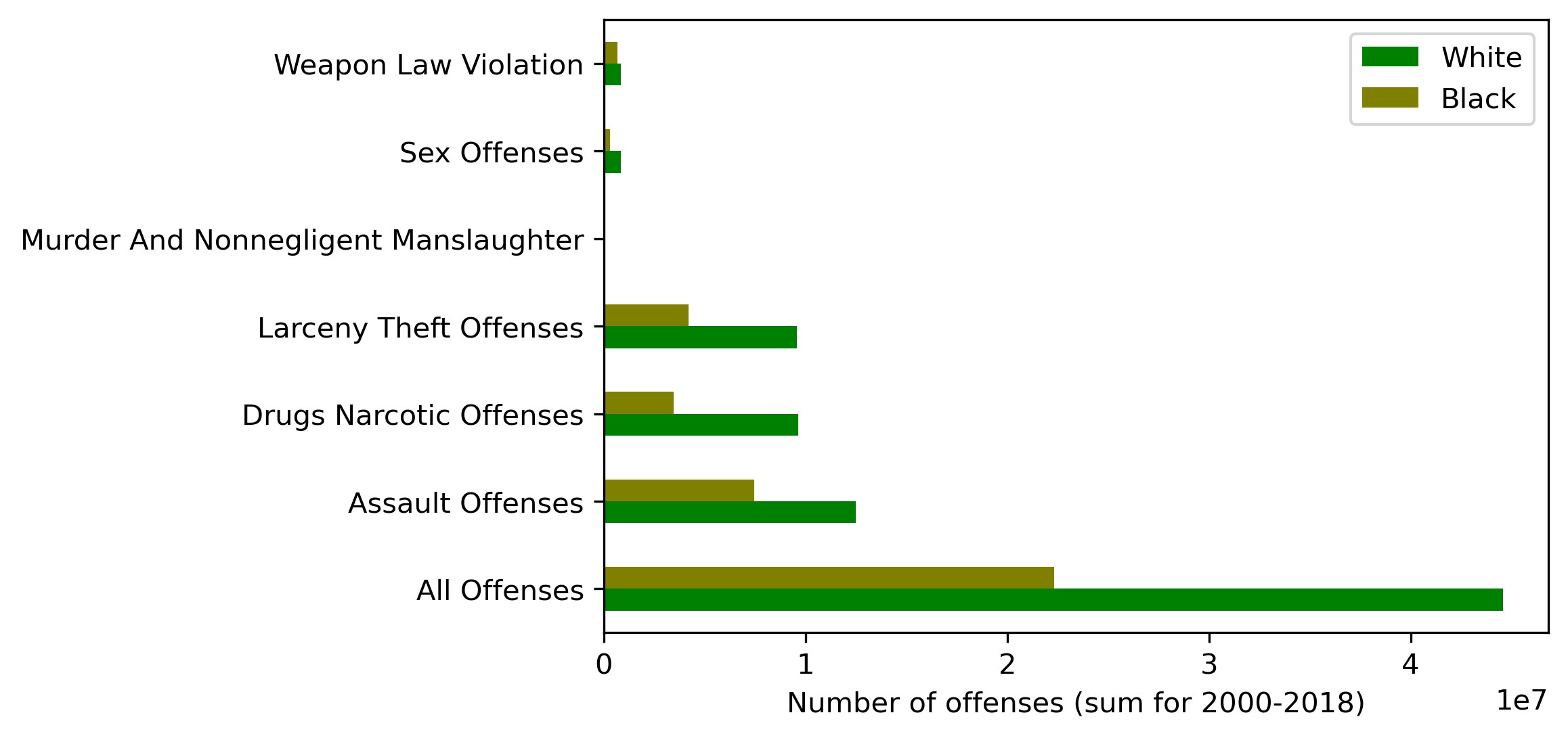
We can observe here that:
- drug offenses, assaults and 'All Offenses' dominate over the other offense types (murder, weapon law violations and sex offenses)
- in absolute figures, Whites commit more crimes than Blacks (exactly twice as much for the 'All Offenses' category)
Again we realize that no robust conclusions can be made about 'race criminality' without population data. So we're looking at per capita (per million) values:
df_crimes_agg1 = df_crimes1.groupby(['Offense']).sum().loc[:, ['White_promln', 'Black_promln']]
| White_promln | Black_promln | |
|---|---|---|
| Offense | ||
| All Offenses | 194522.307758 | 574905.952459 |
| Assault Offenses | 54513.398833 | 192454.602875 |
| Drugs Narcotic Offenses | 41845.758869 | 88575.523095 |
| Larceny Theft Offenses | 41697.303725 | 108189.184125 |
| Murder And Nonnegligent Manslaughter | 125.943007 | 1016.403706 |
| Sex Offenses | 3633.777035 | 8225.144985 |
| Weapon Law Violation | 3612.671402 | 17389.163849 |
Or as a graph:
plt = df_crimes_agg1.plot.barh(color=['g', 'olive'])
plt.set_ylabel('')
plt.set_xlabel('Number of offenses (sum for 2000-2018) per 1 mln. within race')
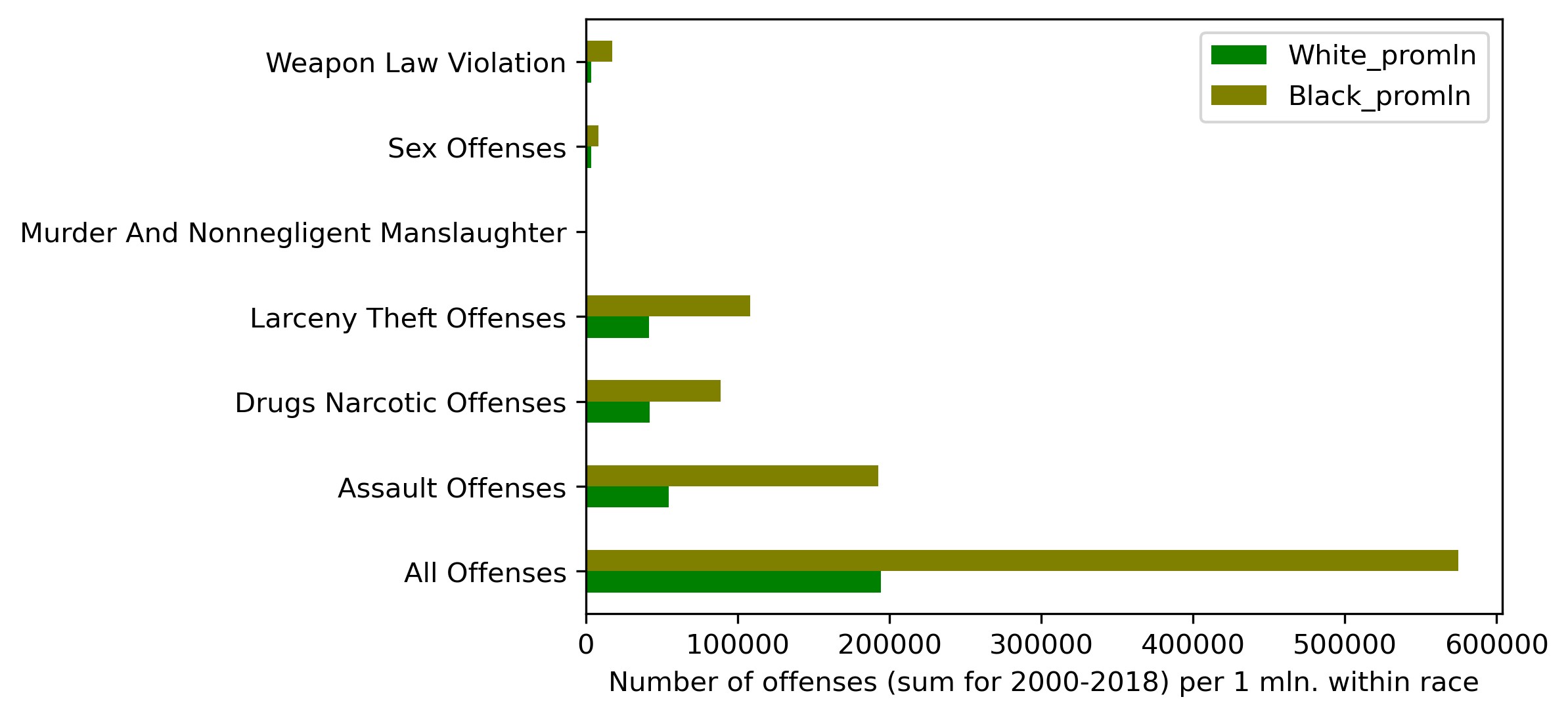
We've got quite a different picture this time. Blacks commit more crimes for each analyzed category than Whites, approaching a triple difference for 'All Offenses'.
We will now leave only the 'All Offenses' category as the most representative of the 7 and sum up the rows by years (since the source data may feature several entries per year, matching the number of reporting agencies).
# leave only 'All Offenses' category
df_crimes1 = df_crimes1.loc[df_crimes1['Offense'] == 'All Offenses']
# could also have left assault and murder (try as experiment!)
#df_crimes1 = df_crimes1.loc[df_crimes1['Offense'].str.contains('Assault|Murder')]

# drop absolute columns and aggregate data by years
df_crimes1 = df_crimes1.groupby(level=0).sum().loc[:, ['White_promln', 'Black_promln']]
The resulting dataset:
| White_promln | Black_promln | |
|---|---|---|
| Year | ||
| 2000 | 6115.058976 | 17697.409882 |
| 2001 | 6829.701429 | 20431.707645 |
| 2002 | 7282.333249 | 20972.838329 |
| 2003 | 7857.691182 | 22218.966500 |
| 2004 | 8826.576863 | 26308.815799 |
| 2005 | 9713.826255 | 30616.569637 |
| 2006 | 10252.894313 | 33189.382429 |
| 2007 | 10566.527362 | 34100.495064 |
| 2008 | 10580.520024 | 34052.276749 |
| 2009 | 10889.263592 | 33954.651792 |
| 2010 | 10977.017218 | 33884.236826 |
| 2011 | 11035.346176 | 32946.454471 |
| 2012 | 11562.836825 | 33150.706035 |
| 2013 | 11211.113491 | 32207.571607 |
| 2014 | 11227.354594 | 31517.346141 |
| 2015 | 11564.786088 | 31764.865490 |
| 2016 | 12193.026562 | 33186.064958 |
| 2017 | 12656.261666 | 34900.390499 |
| 2018 | 13180.171893 | 37805.202605 |
Let's see how it looks on a plot:
plt = df_crimes1.plot(xticks=df_crimes1.index, color=['g', 'olive'])
plt.set_xticklabels(df_fenc_agg.index, rotation='vertical')
plt.set_xlabel('')
plt.set_ylabel('Number of offenses\nper 1 mln. within race')
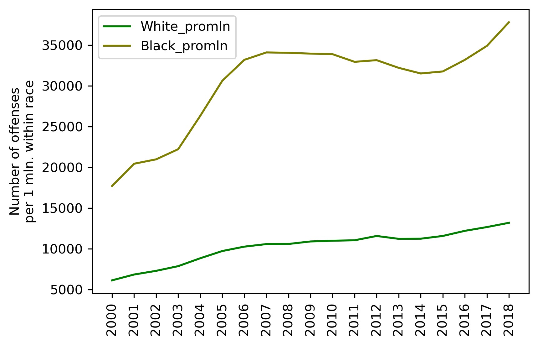
Intermediate conclusions:
- Whites commit twice as many offenses as Blacks in absolute numbers, but three times as fewer in per capita numbers (per 1 million population within that race).
- Criminality among Whites grows more or less steadily over the entire period of investigation (doubled over 19 years). Criminality among Blacks also grows, but by leaps and starts, showing steep growth from 2001 to 2006, then abating slightly over 2007 — 2016 and plummeting again after 2017. Over the entire period, however, the growth factor is also 2, like with Whites.
- But for the period of decrease in 2007 — 2016, criminality among Blacks grows at a higher rate than that among Whites.
We can therefore answer our second question:
— Which race is statistically more prone to crime?
— Crimes committed by Blacks are three times more frequent than crimes committed by Whites.
Criminality and Lethal Force Fatalities
We've now come to the most important part. Let's see if we can answer the third question: Can one say the police kills in proportion to the number of crimes?
The question boils down to looking at the correlation between our two datasets — use of force data (from the FENC database) and crime data (from the FBI database).
We start by routinely merging the two datasets into one:
# glue together the FENC and CRIMES dataframes
df_uof_crimes = df_fenc_agg.join(df_crimes1, lsuffix='_uof', rsuffix='_cr')
# we won't need the first 2 columns (absolute FENC values), so get rid of them
df_uof_crimes = df_uof_crimes.loc[:, 'White_pop':'Black_promln_cr']
The resulting combined data:
| White_pop | Black_pop | White_promln_uof | Black_promln_uof | White_promln_cr | Black_promln_cr | |
|---|---|---|---|---|---|---|
| Year | ||||||
| 2000 | 218756353 | 35410436 | 1.330247 | 4.179559 | 6115.058976 | 17697.409882 |
| 2001 | 219843871 | 35758783 | 1.605685 | 4.418495 | 6829.701429 | 20431.707645 |
| 2002 | 220931389 | 36107130 | 1.643044 | 4.458953 | 7282.333249 | 20972.838329 |
| 2003 | 222018906 | 36455476 | 1.747599 | 4.910099 | 7857.691182 | 22218.966500 |
| 2004 | 223106424 | 36803823 | 1.949742 | 4.265861 | 8826.576863 | 26308.815799 |
| 2005 | 224193942 | 37152170 | 2.016112 | 4.871855 | 9713.826255 | 30616.569637 |
| 2006 | 225281460 | 37500517 | 2.041890 | 5.653255 | 10252.894313 | 33189.382429 |
| 2007 | 226368978 | 37848864 | 1.983487 | 5.786171 | 10566.527362 | 34100.495064 |
| 2008 | 227456495 | 38197211 | 1.943229 | 5.576323 | 10580.520024 | 34052.276749 |
| 2009 | 228544013 | 38545558 | 2.091501 | 6.459888 | 10889.263592 | 33954.651792 |
| 2010 | 229397472 | 38874625 | 2.205778 | 5.633495 | 10977.017218 | 33884.236826 |
| 2011 | 230838975 | 39189528 | 2.499578 | 7.399936 | 11035.346176 | 32946.454471 |
| 2012 | 231992377 | 39623138 | 2.724227 | 7.621809 | 11562.836825 | 33150.706035 |
| 2013 | 232969901 | 39919371 | 2.974633 | 7.765653 | 11211.113491 | 32207.571607 |
| 2014 | 233963128 | 40379066 | 3.009021 | 6.538041 | 11227.354594 | 31517.346141 |
| 2015 | 234940100 | 40695277 | 3.102919 | 6.683822 | 11564.786088 | 31764.865490 |
| 2016 | 234644039 | 40893369 | 3.081263 | 6.578084 | 12193.026562 | 33186.064958 |
| 2017 | 235507457 | 41393491 | 3.154889 | 6.401973 | 12656.261666 | 34900.390499 |
| 2018 | 236173020 | 41617764 | 3.281493 | 6.367473 | 13180.171893 | 37805.202605 |
Let me refresh you memory on the individual columns here:
- White_pop — White population
- Black_pop — Black population
- White_promln_uof — White lethal force victims per 1 million Whites
- Black_promln_uof — Black lethal force victims per 1 million Blacks
- White_promln_cr — Number of crimes committed by Whites per 1 million Whites
- Black_promln_cr — Number of crimes committed by Blacks per 1 million Blacks
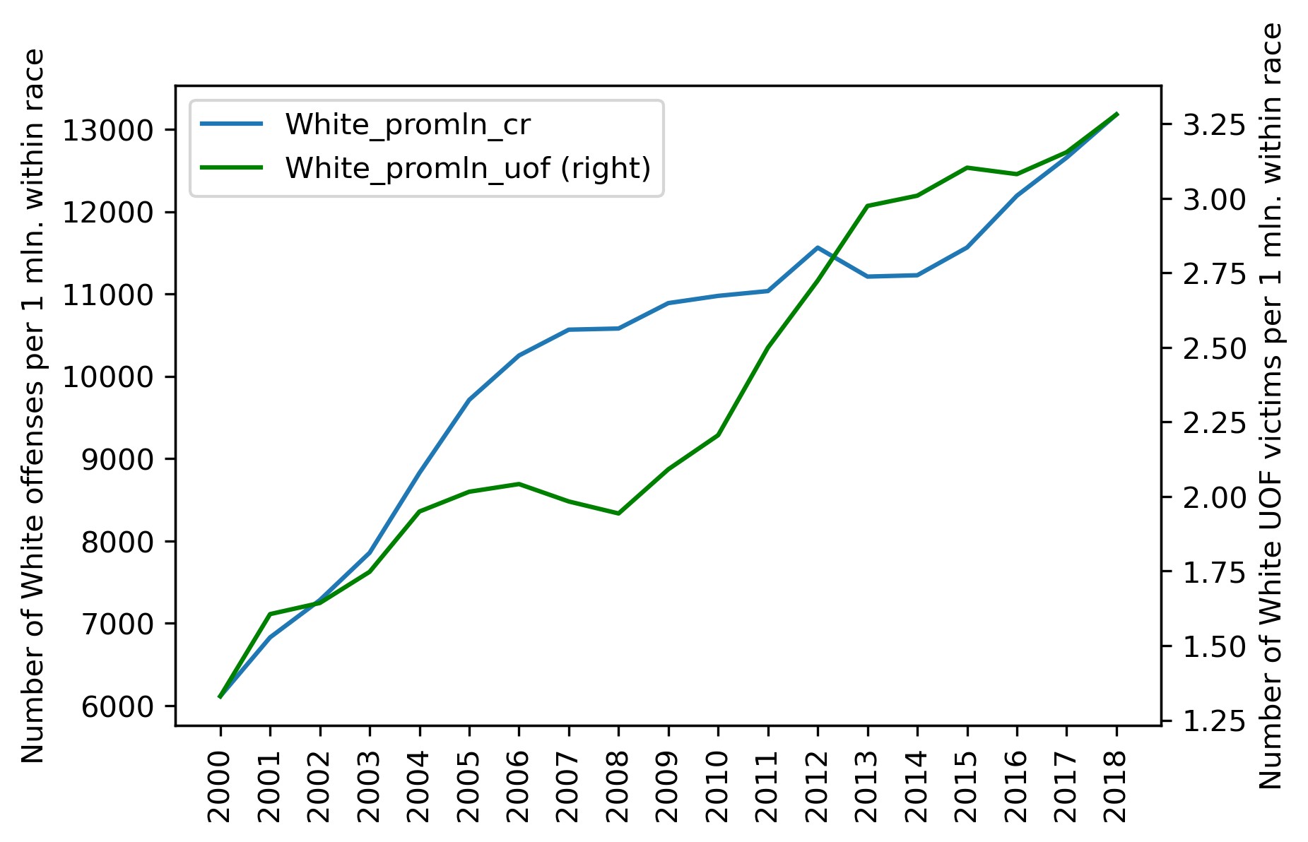
We next want to see how the police victim and crime curves compare on one plot. For Whites:
plt = df_uof_crimes['White_promln_cr'].plot(xticks=df_uof_crimes.index, legend=True)
plt.set_ylabel('Number of White offenses per 1 mln. within race')
plt2 = df_uof_crimes['White_promln_uof'].plot(xticks=df_uof_crimes.index, legend=True, secondary_y=True, style='g')
plt2.set_ylabel('Number of White UOF victims per 1 mln. within race', rotation=90)
plt2.set_xlabel('')
plt.set_xlabel('')
plt.set_xticklabels(df_uof_crimes.index, rotation='vertical')
The same on a scatter plot:
plt = df_uof_crimes.plot.scatter(x='White_promln_cr', y='White_promln_uof')
plt.set_xlabel('Number of White offenses per 1 mln. within race')
plt.set_ylabel('Number of White UOF victims per 1 mln. within race')
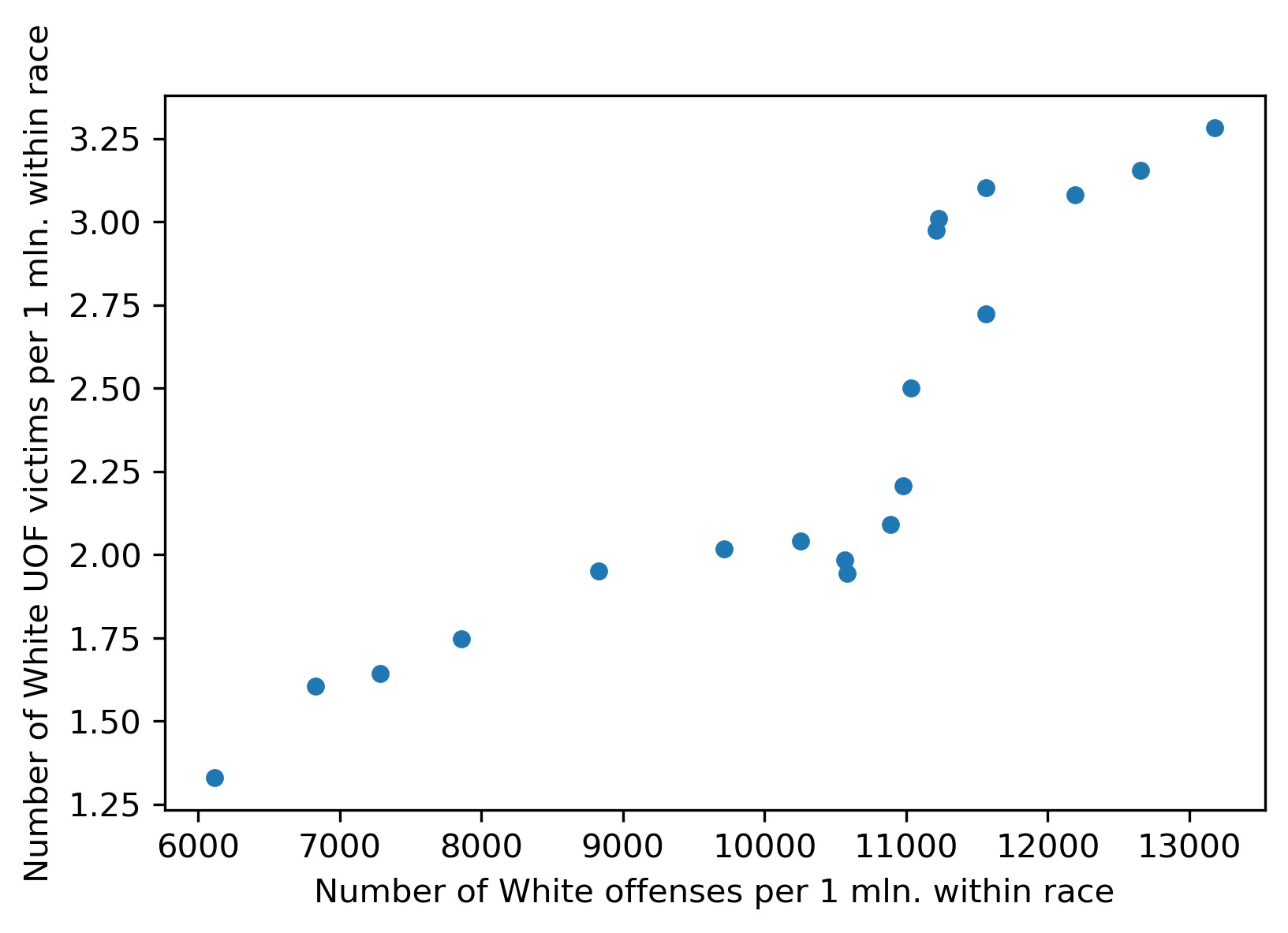
A quick look at the graphs shows that some correlation is present. OK, now for Blacks:
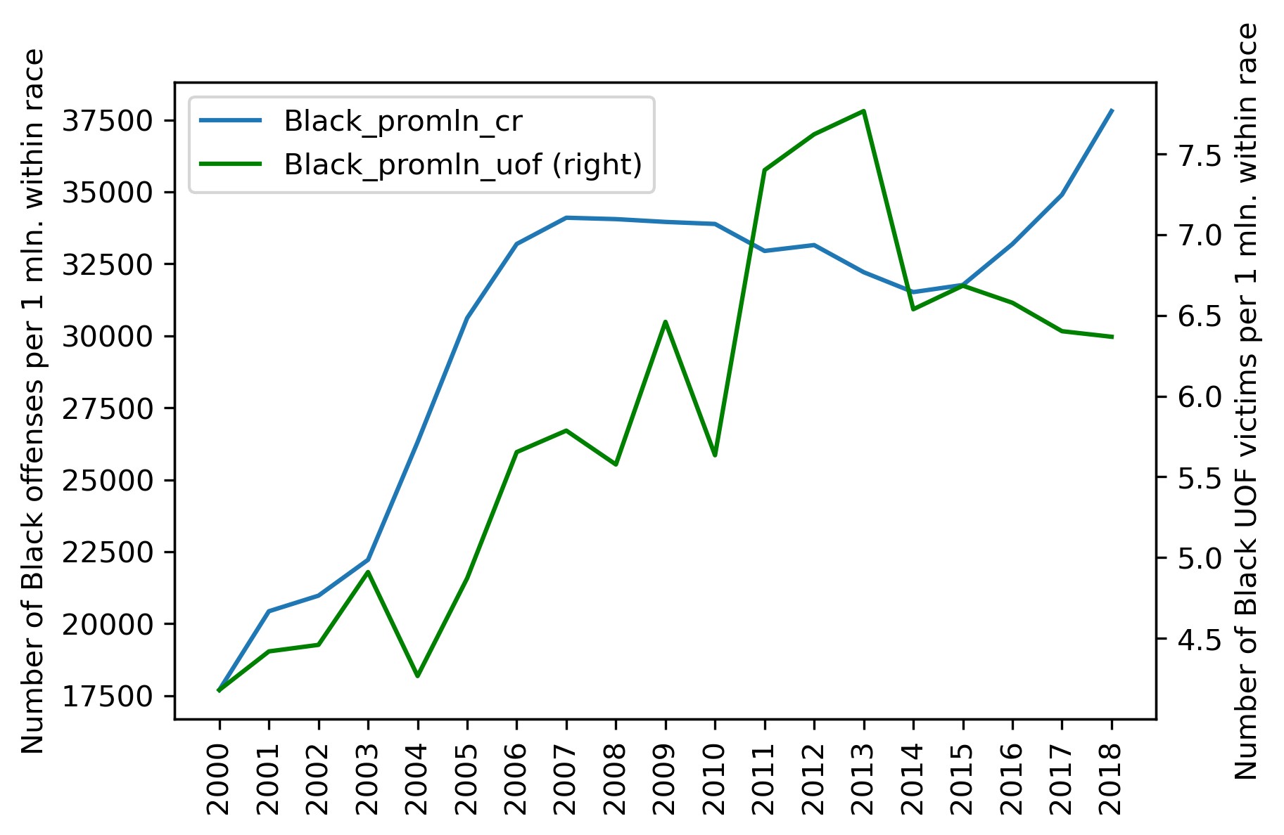
plt = df_uof_crimes['Black_promln_cr'].plot(xticks=df_uof_crimes.index, legend=True)
plt.set_ylabel('Number of Black offenses per 1 mln. within race')
plt2 = df_uof_crimes['Black_promln_uof'].plot(xticks=df_uof_crimes.index, legend=True, secondary_y=True, style='g')
plt2.set_ylabel('Number of Black UOF victims per 1 mln. within race', rotation=90)
plt2.set_xlabel('')
plt.set_xlabel('')
plt.set_xticklabels(df_uof_crimes.index, rotation='vertical')
And on a scatter plot:
plt = df_uof_crimes.plot.scatter(x='Black_promln_cr', y='Black_promln_uof')
plt.set_xlabel('Number of Black offenses per 1 mln. within race')
plt.set_ylabel('Number of Black UOF victims per 1 mln. within race')
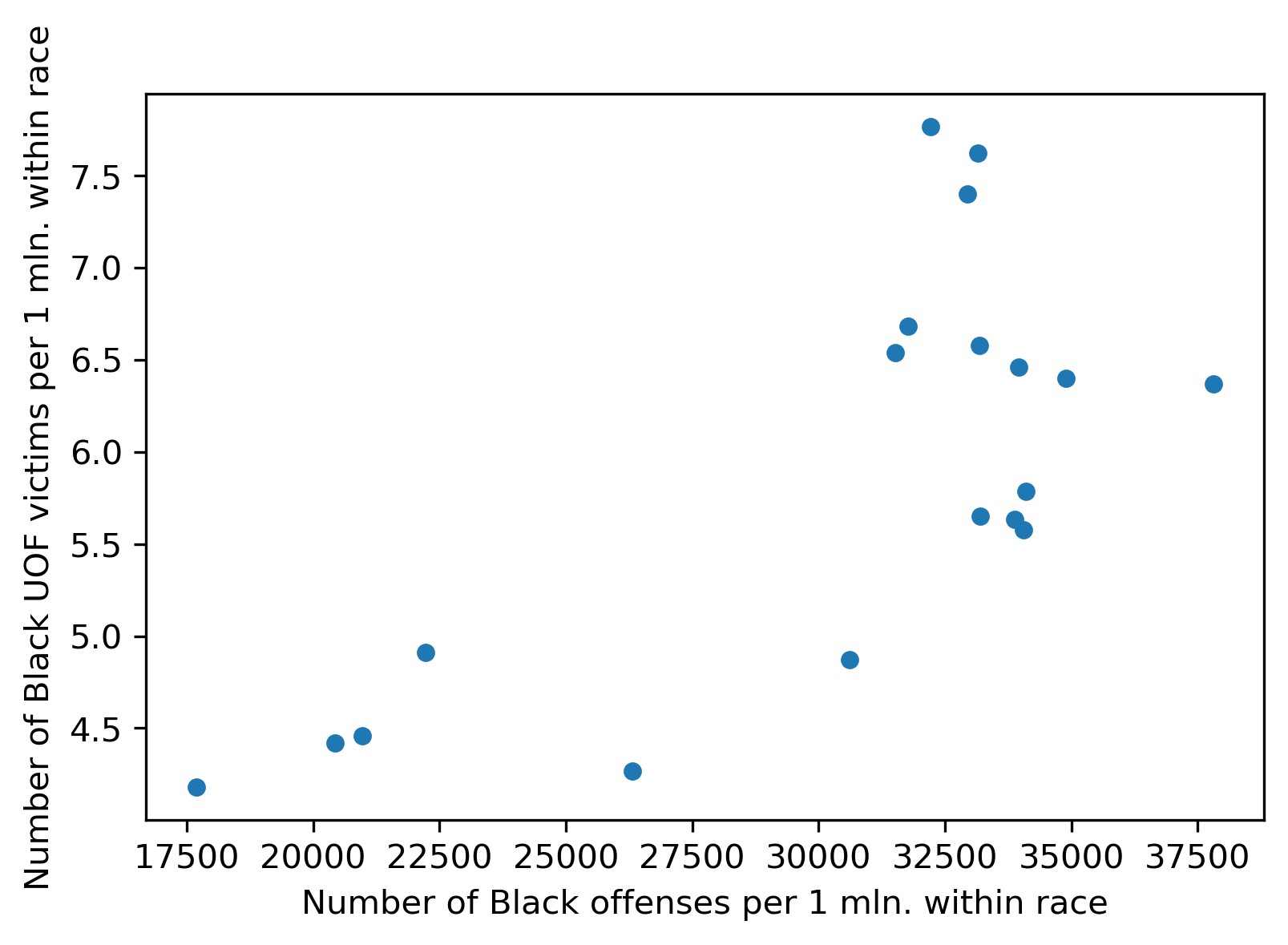
Things are much worse here: the two trends duck and bob a lot, though the principle correlation is still visible, the proportion is positive, if non-linear.
We will make use of statistical methods to quantify these correlations, making correlation matrices estimated with the Pearson correlation coefficient:
df_corr = df_uof_crimes.loc[:, ['White_promln_cr', 'White_promln_uof',
                         'Black_promln_cr', 'Black_promln_uof']].corr(method='pearson')
df_corr.style.background_gradient(cmap='PuBu')
We get this table:
| White_promln_cr | White_promln_uof | Black_promln_cr | Black_promln_uof | |
|---|---|---|---|---|
| White_promln_cr | 1.000000 | 0.885470 | 0.949909 | 0.802529 |
| White_promln_uof | 0.885470 | 1.000000 | 0.710052 | 0.795486 |
| Black_promln_cr | 0.949909 | 0.710052 | 1.000000 | 0.722170 |
| Black_promln_uof | 0.802529 | 0.795486 | 0.722170 | 1.000000 |
The correlation coefficients for both races are in bold: it is 0.885 for Whites and 0.722 for Blacks. Thus a positive correlation between lethal force victims and criminality is observed for both races, but it is more prominent for Whites (probably significant) and nears non-significant for Blacks. The latter result is, of course, due to the higher data heterogeneity (scatter) for Black crimes and police victims.
As a final step, let's try to estimate the probability of Black and White offenders to get shot by the police. We have no direct ways to do that, since we don't have information on the criminality of the lethal force victims (who of them was found to be an offender and who was judicially clear). So we can only take the easy path and divide the per capita victim counts by the per capita crime counts for each race and multiply by 100 to show percentage values.
# let's look at the aggregate data (with individual year observations collapsed)
df_uof_crimes_agg = df_uof_crimes.loc[:, ['White_promln_cr', 'White_promln_uof',
                 'Black_promln_cr', 'Black_promln_uof']].agg(['mean', 'sum', 'min', 'max'])
# now calculate the percentage of fatal encounters from the total crime count in each race
df_uof_crimes_agg['White_uof_cr'] = df_uof_crimes_agg['White_promln_uof'] * 100. /
                 df_uof_crimes_agg['White_promln_cr']
df_uof_crimes_agg['Black_uof_cr'] = df_uof_crimes_agg['Black_promln_uof'] * 100. /
                 df_uof_crimes_agg['Black_promln_cr']
We get this table:
| White_promln_cr | White_promln_uof | Black_promln_cr | Black_promln_uof | White_uof_cr | Black_uof_cr | |
|---|---|---|---|---|---|---|
| mean | 10238.016198 | 2.336123 | 30258.208024 | 5.872145 | 0.022818 | 0.019407 |
| sum | 194522.307758 | 44.386338 | 574905.952459 | 111.570747 | 0.022818 | 0.019407 |
| min | 6115.058976 | 1.330247 | 17697.409882 | 4.179559 | 0.021754 | 0.023617 |
| max | 13180.171893 | 3.281493 | 37805.202605 | 7.765653 | 0.024897 | 0.020541 |
Let's show the means (in bold above) as a bar chart:
plt = df_uof_crimes_agg.loc['mean', ['White_uof_cr', 'Black_uof_cr']].plot.bar(color=['g', 'olive'])
plt.set_ylabel('Ratio of UOF victims to offense count')
plt.set_xticklabels(['White', 'Black'], rotation=0)

Looking at this chart, you can see that the probability of a White offender to be shot dead by the police is somewhat higher than that of a Black offender. This estimate is certainly quite tentative, but it can give at least some idea.
Intermediate conclusions:
- Fatal encounters with law enforcement are connected with criminality (number of offenses committed). The correlation though differs between the two races: for Whites, it is almost perfect, for Blacks — far from perfect.
- Looking at the combined police victim / crime charts, it becomes obvious that lethal force victims grow 'in reply to' criminality growth, generally with a few years' lag (this is more conspicuous in the Black data). This phenomenon chimes in with the reasonable notion that the authorities 'react' on criminality (more crimes > more impunity > more closeups with law enforcement > more lethal outcomes).
- White offenders tend to meet death from the police more frequently than Black offenders, although the difference is almost negligible.
Finally, the answer to our third question:
— Can one say the police kills in proportion to the number of crimes?
— Yes, this proportion can be observed, though different between the two races: for Whites, it is almost perfect, for Blacks — far from perfect.
In the next (and final) part of the narrative, we will look into the geographical distribution of the analyzed data across the states.
