Pull to refresh
181.55

Design

Design will save the world

Show first
Period
Level of difficulty

A small notebook for a system administrator

Reading time21 min
Views163K
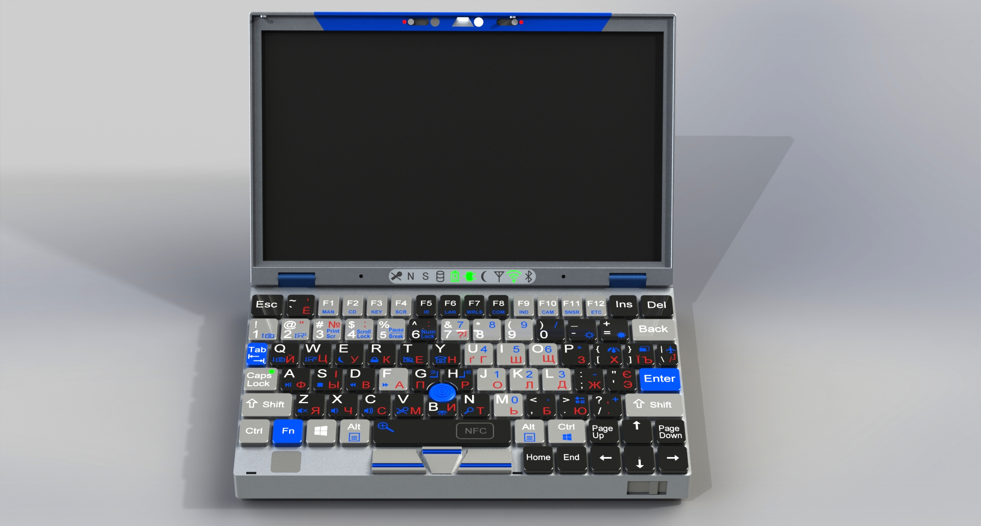
I am a system administrator, and I need a small, lightweight notebook for every day carrying. Of course, not just to carry it, but for use it to work.

I already have a ThinkPad x200, but it’s heavier than I would like. And among the lightweight notebooks, I did not find anything suitable. All of them imitate the MacBook Air: thin, shiny, glamorous, and they all critically lack ports. Such notebook is suitable for posting photos on Instagram, but not for work. At least not for mine.

After not finding anything suitable, I thought about how a notebook would turn out if it were developed not with design, but the needs of real users in mind. System administrators, for example. Or people serving telecommunications equipment in hard-to-reach places — on roofs, masts, in the woods, literally in the middle of nowhere.

The results of my thoughts are presented in this article.

Figure to attract attention
Read more →

7 tips to make video learning more effective

Level of difficultyEasy
Reading time5 min
Views7.1K

While video-based learning continues to rank high in the latest trends, there are a few points that are regularly overlooked in the production of learning videos, with a focus on user experience (UX) and user interaction 

People really enjoy watching videos. According to a survey conducted among consumers worldwide, respondents watched an average of 19 hours of online video content per week in 2022. And nearly half of all internet users watch online videos at least once a week.

Read more

Designing for Success: Crafting Effective Learning Experiences

Level of difficultyMedium
Reading time7 min
Views6.6K

The Challenge of Mandatory Learning
Once we had several mandatory learning courses designed to be passed successfully by all employees. Still, many of them struggled to do so. Reminder emails to all participants could not solve the issue. And that is when my team was summoned to develop a thorough plan to reduce the number of overdue courses to a minimum. Of course, we were asked to develop something fun and engaging.

Uncovering the Root Problems
While working on the project, we managed to uncover several problems with course assignments, including the fact that they were not offered just in time, there were too many of them, and all of them had different due dates, which made it impossible to remember when to complete them. Additionally, we found that the content itself was often dry and unengaging, further contributing to the lack of motivation among employees. Finally, we came up with a system of notifications that included clear explanatory reminder emails, an escalation system, and a redesign of the course content to make it more interactive and relevant to employees' daily work. The result was almost no overdue courses after system integration.

The Myth of Mandatory Fun
So the case first seemed to be about motivation and engagement, but it is actually about smart course design that allows people to worry about work tasks instead of worrying about course assignments. It's also about creating content that resonates with the learners and helps them see the value in the training.

Read more

How to create a dark theme without breaking things: learning with the Yandex Mail team

Reading time8 min
Views8.9K


My name is Vladimir, and I develop mobile front-end for Yandex Mail. Our apps have had a dark theme for a while, but it was incomplete: only the interface and plain emails were dark. Messages with custom formatting remained light and stood out against the dark interface, hurting our users’ eyes at night.


Today I'll tell you how we fixed this problem. You will learn about two simple techniques that didn't work for us and the method that finally did the trick — adaptive page recoloring. I'll also share some ideas about adapting images to a dark theme. To be fair, darkening pages with custom CSS is a rather peculiar task, but I believe some of you may find our experience helpful.

Read more →

Dobroshrift

Reading time2 min
Views2.6K
What one gets easily and for free can be a real struggle for others — these are the thoughts every letter of the «Dobroshrift» [Kindness Font] evolves. It was developed for the World Cerebral Palsy Day with the participation of children with this diagnosis. So we decided to take part in this charity action and changed the website logo till the end of the day.


Read more →

Giving a presentation with perfect UI/UX design

Reading time4 min
Views5.7K

Introduction


Every single one of us gives presentations from time to time. What can be difficult about creating a couple of slides with great UI and nice content, right? Well… not really actually. In real life, things may get difficult.


You want to cover the whole topic and give as much information as fits on a slide. Then you go to Google to find some awesome pictures, and finally, cover it all with some fancy animation. And here is where things start falling apart: how do you balance all this stuff?


Take our helping hand, as we are here to show you how to create a presentation with both perfect user experience and user interface. Let's find out how to create perfect UI & UX design in a presentation.

Read more →

How to get the team to search for more productive ideas

Reading time4 min
Views1.7K
The creation of design models as well as visualization of solutions is for some reason always a subject of great interest among all members of a productive team, be it a manager eager to master Sketch, or a developer who wants to make cool interfaces without the need to go to a designer. But we all know what happens when it comes to actually doing stuff.


My way


Hi, everybody!

My name is Anna and I work for an American company Scentbird NY as a product designer. Prior to that I was involved in developing flagship products in Alfa-Bank design team.

I was probably born under a lucky star but all my life I've been working with the developers who suggest the best product solutions, better than a lot of product managers and product owners. But anyway, my observation is that the earlier you involve developers into working on a particular task, the better off you are.

What you are about to read is actually a blueprint on how to conduct brainstorm sessions and generate not-so-obvious yet effective solutions, which are apparently really easy to reach and not that time-consuming.
Read more →

An Unexpected Article About Our Unicorn: Who Is the PVS-Studio Mascot?

Reading time5 min
Views2K

PVS-Studio has a mascot that became inseparable from the brand - a unicorn. Lately we've been getting many questions about our magic steed: why the unicorn, why has he changed so much, does he have hooves, how come he doesn't wear pants, and how do we draw him. The answers are finally here, in this very article.

Attention: there will be a lot of pictures. And I mean A LOT.

Read more

Designing Converting Landing Pages

Reading time6 min
Views4K

It feels like everything about LPs has already been said, however, I still keep seeing the same mistakes being made over and over again both by start-ups and established companies. Here are some tips, backed up by my 10-year experience as a UX/UI Director in agencies and product-led companies. These alone will give a nice increase in your conversion rate, I guarantee. 

Use a descriptive, not a salesy hero header 

Answer the questions “What?” and “For whom?” as early on the page as possible. A very common pattern is the largest copy being an inspirational abstract slogan and below it in smaller font the actual statement about what the product is and what it does. 

Get More Tips

Weak UI, weak programmer

Reading time2 min
Views3.1K

UI facepalm


Why do so many programmers hate UI work? Because it is tedious. Especially, for the Web, but other types of UI are only slightly easier. Layouts, margins, paddings — neverending stream of little tweaks to make it look OK on all sane environments, and somehow this freaking button sometimes overlaps that input field. Rrrr! And yes, it should not hang on button clicks, which means a lot of asynchronous programming, which is a nightmare.


And don’t even speak about aesthetics and usability! Choose right colours, element sizes and locations, find/draw images and put them where they fit, think about user workflows — isn’t it a designers’ or Ux specialists’ job?! Leave me alone, I’m a programmer. I work with backend layers, where everything is straightforward and linear, there are no buttloads of different environments to adjust to, and design is guided by mere logic without pesky fussing with ‘user friendliness’ and ’beauty’!

Read more →

UX Copy: Writing for Non-Readers

Reading time6 min
Views1.9K

Getting a task from a client, UX designers tend to pay attention to the design goals, not the contents of the website/app itself. There’s something completely wrong with it because the visual part might be superb, but when it frames a vague or wordy message, the client's goals won’t be reached.

To avoid this, a UX designer should dive deeper into the content, analyze it, and restructure it in an interface-friendly way. It doesn’t mean doing the copywriter’s job, it means collaborating. The reality is that sometimes the writing team is used to praising the product (because clients like that), or there is no copywriter involved in the project at all.

Provide proof instead of opinion

An impression is more powerful when the customer can conclude the product’s benefits on their own. Instead of a colorful line of adjectives like “ultimate” or “leading” you should aim at what exactly makes the product that cool. The trick is to be precise, preferably with an example.

Get More Tips

Plugins in Figma. From idea to 1000 installs

Reading time5 min
Views3.1K
About a year ago, Figma added the ability to develop and publish your own plugins. Those who would like to please themselves and everyone around them with additional features or just to have the experience of lifetime with Figma have longed for this feature to appear. 

Inside the plugin, you can do whatever is available to the developer on the web. There are practically no restrictions on the possibilities, except for those related to the system. Fortunately, they are all detailed in the documentation. Many detailed articles have already been written on the topic of technical implementation of plugins, for example, here or here. As product designers, Lev Bruk and I wanted to go through all the stages of plugin release, from the idea and coding to promoting and working with feedback from real users. That’s exactly what we’re going to cover in the article.

image
Read more →

Don't spoil Desktop Software Engineers with your Mobile First solutions, think about it

Reading time4 min
Views2.1K

image


English translation of Philip Ranzim's post at his blog page here. (With author's permission)


Once upon a time, my girlfriend started using Instagram. She asked me to sign up for it and subscribe to it. I tried — I couldn't do it because you couldn't register at Instagram from a desktop computer. I then thought — how weird people are. Well, what kind of fool would make a software product that can't be used with a normal computer? They won't succeed, and this Instagram will be a marginal service for a bunch of strange women, who for some reason don't like desktops.


It has only been a few years, the market has put everything in place — and the biggest fool was me. And the geniuses at Instagram predicted how and where everything would develop. Today, most of the user applications are made primarily for mobile platforms. At best, they include a universal web client, which is still optimized for mobile phones. Because users love iPhones, not computers. Business people sat down, counted, and made a decision — let's make more money, let's have mobile First everywhere.

Read more →

UX Tips for Designing an Online Digital Product Store

Reading time4 min
Views1.3K
The future of business is digital. E-commerce business is gaining popularity with more and more people getting comfortable buying things online. While there are many factors that define the success of an E-commerce business, a major factor is E-Commerce UX, which refers to the overall experience of a user while shopping through an E-commerce platform. For the user experience to be enjoyable, it has to be personalized, relevant, and seamless. Hence there is a need to understand the target audience- their age, culture, level of tech literacy, channels they use, and their trust to online shopping. E-commerce UX should be data-driven, customer-driven, and user-centered. It should be built on research and validation. The main factors that influence the success of an E-commerce business are the quality of the product or service offered, how it is presented to the customer and how approachable is the design of the electronic platform through which sales are being done.
Read More

The mystery of Telegram

Level of difficultyEasy
Reading time12 min
Views2.3K

This article was originally posted at Product Identity.

What comes to your mind when you hear the word Telegram?

I wouldn’t be surprised if drugs, sex, or crypto are your first associations. Throughout the years, Telegram earned a shady reputation, perhaps not strategically, but for a “good” reason.

I feel like Telegram is a mystery. On the outside, it might be perceived as a platform designed for drug traffickers, crypto scammers, and sexual abusers.

I shared this feeling when I joined the early team of Bancor in 2016, as I also joined its internal group chat, needless to say, on Telegram.

However, the app was quickly removed from my list of stigmas. Instead, I started to appreciate Telegram for its well-crafted product and care for design. From its meticulous attention to small details to have a unique brand — it stands as a dogma of an opinionated product (and a company) in many aspects. In addition, it helped me recognize the benefits of separating my private and professional lives early on.

After using Telegram extensively over the past 7+ years, I feel the urge to write about it, but this time not in the spirit of its typical news headlines.

Read more

The wave method of building color scheme

Reading time7 min
Views2.2K
image

In life we often face the challenge of choosing the right colors. This happens when we need to choose clothes suitable for each other, shoes suitable for clothes, choose different wallpapers for the children's room, makeup, choose colors for our site and much more. The process of selecting several colors that combine with each other is called the construction of a color palette (gamut).

In colouristics there are several methods for constructing a color palette (color gamma) based on the arrangement of colors relative to each other in the color circle and, usually, having the same brightness. Harmonious perception of which is not sufficiently substantiated from the physical point of view.

The wave method of building color palette based on the relationship of color and acoustic waves, and also the concept of consonance (harmony) in music theory. Below is a more detailed description of the method.

This site allows you to choose the most harmonious combination of colors for your site, clothing, interior, etc.

The corresponding article was published on the site arxiv.orghttps://arxiv.org/abs/1709.04752. Results are available on our sitewavepalette.com.
Read more →

An introduction to the world of AI for designers

Level of difficultyEasy
Reading time5 min
Views1.7K

Every day a new neural network appears and every day more opportunities are opened to designers to simplify their workflow. Someone fundamentally refuses to use them, because “there is no life in machinex and technologies”, and someone is only happy to find a way to reduce the amount of work. Personally, I belong to the second type and want to share the most detailed gait on neurons I have acquired lately. 

Read more

A tale of how PVS-Studio reimagined the bug

Reading time4 min
Views1.1K

You all know our mascot — a unicorn — many people grew fond of him! However, PVS-Studio has a supporting character who is also the antagonist of our product — a bug! Well, a bug is not omnipresent, indestructible evil. It's more like an everyday or a work-related trouble. In this article, you'll learn how we created a new character, and why he looks like a ladybug. Oh, and if you wonder why the hell he has a belly button — keep reading!

Read more

Technology and the real world: 4 Start-ups that are changing the future of interior design

Reading time2 min
Views1.3K
image

Internet and new tech are currently disrupting many industries, even some that you might not think are prone to such changes. For interior design, which may seem like an utterly offline and personal thing, many people have become accustomed to sharing their homes with strangers across the world for inspiration and to simply show off their style.

Here is a comprehensive list of startups that are changing the whole interior design industry and making everything quicker, more affordable, and more convenient for customers. Let's check them out!
Read more →