Dobroshrift


Design will save the world


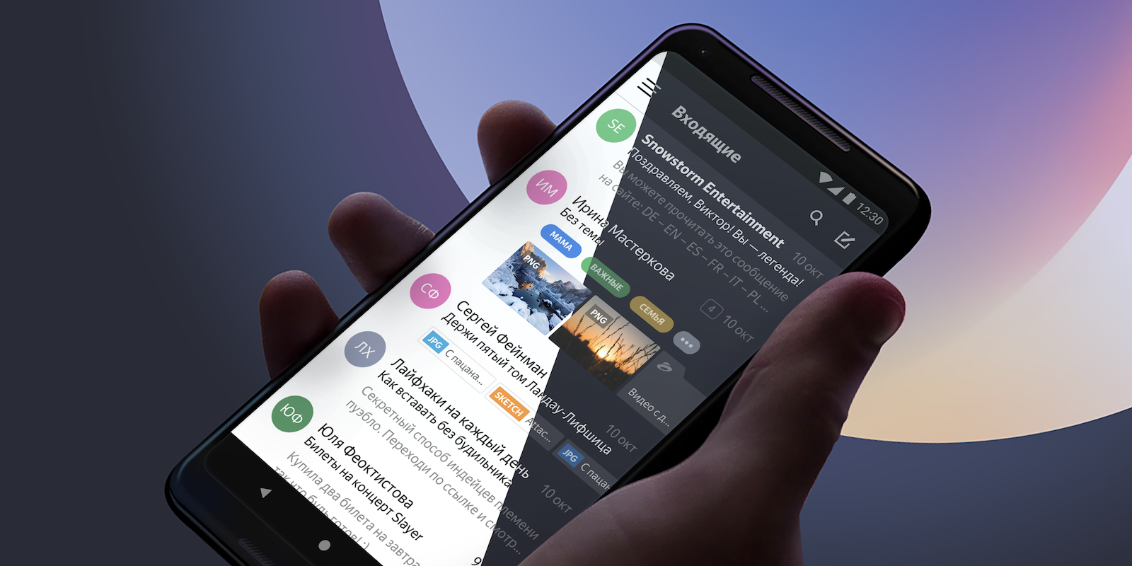
My name is Vladimir, and I develop mobile front-end for Yandex Mail. Our apps have had a dark theme for a while, but it was incomplete: only the interface and plain emails were dark. Messages with custom formatting remained light and stood out against the dark interface, hurting our users’ eyes at night.
Today I'll tell you how we fixed this problem. You will learn about two simple techniques that didn't work for us and the method that finally did the trick — adaptive page recoloring. I'll also share some ideas about adapting images to a dark theme. To be fair, darkening pages with custom CSS is a rather peculiar task, but I believe some of you may find our experience helpful.

Why do so many programmers hate UI work? Because it is tedious. Especially, for the Web, but other types of UI are only slightly easier. Layouts, margins, paddings — neverending stream of little tweaks to make it look OK on all sane environments, and somehow this freaking button sometimes overlaps that input field. Rrrr! And yes, it should not hang on button clicks, which means a lot of asynchronous programming, which is a nightmare.
And don’t even speak about aesthetics and usability! Choose right colours, element sizes and locations, find/draw images and put them where they fit, think about user workflows — isn’t it a designers’ or Ux specialists’ job?! Leave me alone, I’m a programmer. I work with backend layers, where everything is straightforward and linear, there are no buttloads of different environments to adjust to, and design is guided by mere logic without pesky fussing with ‘user friendliness’ and ’beauty’!
